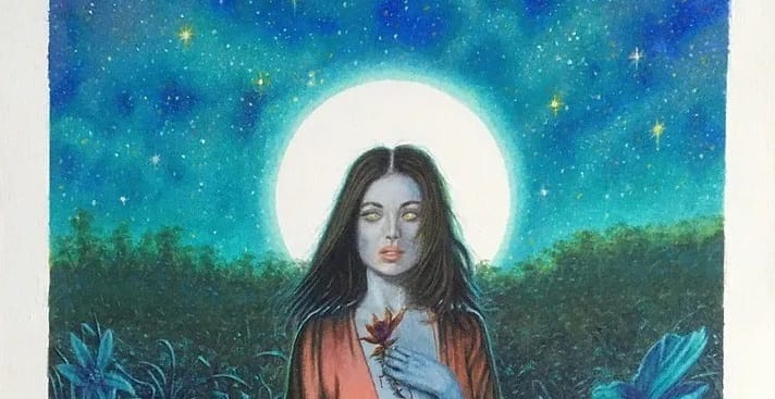
Terry Oakes, "Nocturne"

Welsh artist Terry Oakes is known for 1980s-era horror cover art, as well as a solid amount of science fiction and fantasy covers – I included two of his artworks in Worlds Beyond Time.
He's still working today, and his agent Jane Frank just emailed out his most recent artwork, which I thought I'd feature here.
She writes: "I also must include here a brand-new masterpiece by Terry Oakes - he is slowly returning to painting in color, and here is his most recent effort - inspired by one of his black-and-white beauties from 2022. One of his best!"
It's inspired by "Rappaccini's Daughter," the Gothic short story by Nathaniel Hawthorne. It's a great execution of an interesting concept, and it's very satisfying to see a seasoned professional still knocking it out of the park in 2024. Plus, the use of the moon as a sickly glowing medieval-art-style halo is always fun.
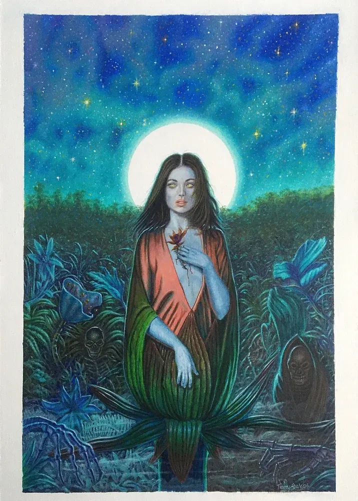
Terry Oakes has a whole page of artwork for sale. Here are three other works from the page that jumped out at me, including some of the previously mentioned black and white art, along with some background info on each from Frank.
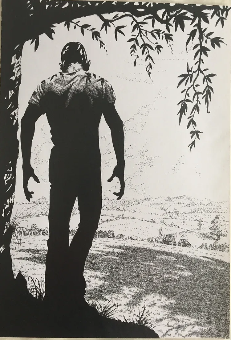
"Passage Home Blocked!" is one of four finished concept drawings for a planned off-the-beaten-track "indie" film about zombies, titled "The Seventh Day", created 2008/2009. Produced and directed by Terry's son, Andrew Oakes, founder of "Intercept Studios" (he also co-wrote the screenplay) these pen-and-ink artworks directly relate to scenes in the movie: this one carries the notation "scene 12" on the back. -Jane Frank
Terry has returned to painting in color - here delivering a clear response to global climate change, something which Terry feels strongly about. This is a painting full of symbolism - with the skeleton of a Minke whale, which in this work represents all whales, having been killed for the benefit of the 'first sea monster': humans, in the form of a beautiful girl, who holds a harpoon. Whales are not only being killed for beauty products, but also pet food (thus, the images of a dog and a cat set among the skulls of all the humans whose lives have, over the centuries, been taken by drowning on sunken whaler ships, or simply lost at sea) All this is backgrounded by a violent ocean, which, in the painting, almost becomes an evil, sentient being, ie: the threatening horns of surf. It's a major message, packed into a beautiful painting. -Jane Frank
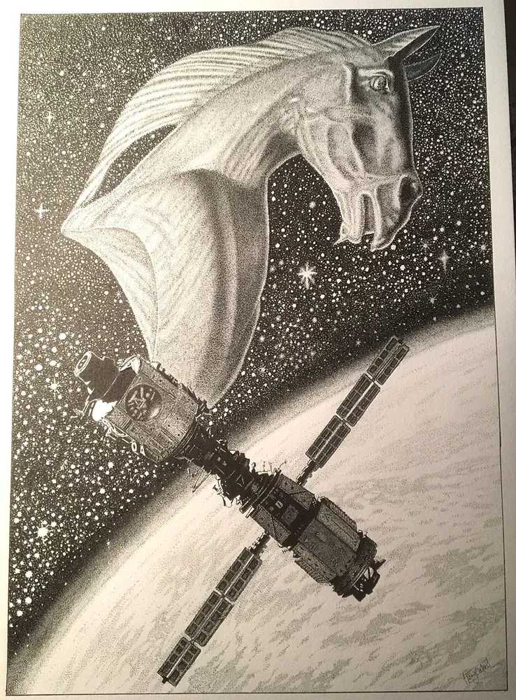
The juxtoposition of images here creates a powerful visual effect, with the giant horse's head representing the discovery and subsequent awareness that an alien civilzation might exist somewhere "out there" - more advanced than our own in ways beyond technology.
I've now wrapped up my "Extended Edition" series exploring the fully-written two-page spreads that I wound up cutting from my art book Worlds Beyond Time for a variety of reasons. Here's the full syllabus:
Henri Lievens
Wojtek Siudmak
Horacio Salinas Blanch
Roger Dean
Alien Nightfall
Future Sports
Floating Cities
Kirby Meets Kubrick
Sea Life out of Water
I think I'll eventually put these behind a paywall when I get around to restarting my paid newsletter, so, uh, read them while you can.
A fun Slate article about how Lester del Rey whipped up the fantasy book genre in the 1970s by riding the wave of The Lord of the Rings mania: The Man Who Invented Fantasy.
The whole story has a lot of fascinating details about how odd Lester was and what the publishing industry was like in the 70s. Here's just one off-the-beaten-path excerpt from it, but you should check out the whole thing:
A books columnist at the New York Times wrote in December that 1977 had been the year Americans went nuts for fantasy. “They’re making hardcover best sellers of books about gnomes, pixies, hobbits and other Middle‐earth creatures. They’re grabbing up large quantities of albums by such fantasy illustrators as Frank Frazetta. They’re buying 600,000 copies of the 1978 Tolkien Calendar.”
If you like retro sci-fi art, you might be interested in this Kickstarter for a more recent artist, Ian McQue, who's coming out with an art book centering on flying ships.
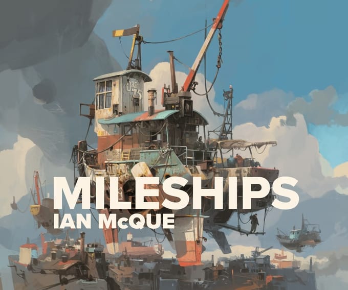
Flying ships have a rich history in science fiction art, as anyone who flips to page 190 of my art book can confirm for themselves.
Ufology: An American Folklore, Jack's Weblog
Aliens are the gods of the conquerors. We cannot imagine anything on Earth more powerful than ourselves. But to suppose that we sit atop a pyramid of all creation brings liability, loneliness, confusion. So we imagine something greater than us off Earth. And at the same time, this framework excuses us from guilt: If humans, otherwise just a bunch of apes, inherited our intelligence—our capacity to inflict horror and violence—from extraterrestrial visitors, then none of this is really our fault.
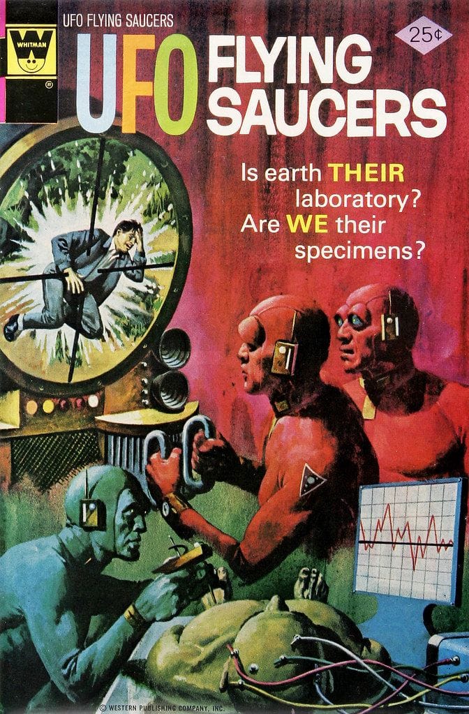
Speaking of UFOs, here's a follow-up to my newsletter about Gold Key's "UFO Flying Saucers," the premier UFO-focused comic book series of its day.
In that issue, I raised some doubts over who did the painting for the cover of issue #5, Luis Domínguez or George Wilson. Now, comic book blogger Richard Gagnon has set the record straight in the comment section:
Hi Adam! RG from Who's Out There? here – I assure you that your fave UFOFS cover is indeed the work of señor Domínguez. Number nine, however, is a definite Wilson job. Both men have quite different techniques and palettes, even while working for the same art director. For instance, Domínguez works from dark to light, stipples highlight details – lots of small brush strokes and dry brush textures. Wilson, on the other hand, is more 'liquid', less textural, favouring wet-on-wet techniques for his backgrounds.
As to whether the insides are worth reading, I can recommend the tongue-in-cheek and bracingly skeptical 'Hoaxmaster' feature by writer Pat Fortunato and illustrator Frank Bolle. Here's a bunch of them.
So, to reiterate: This issue #5 cover is Luis Domínguez...
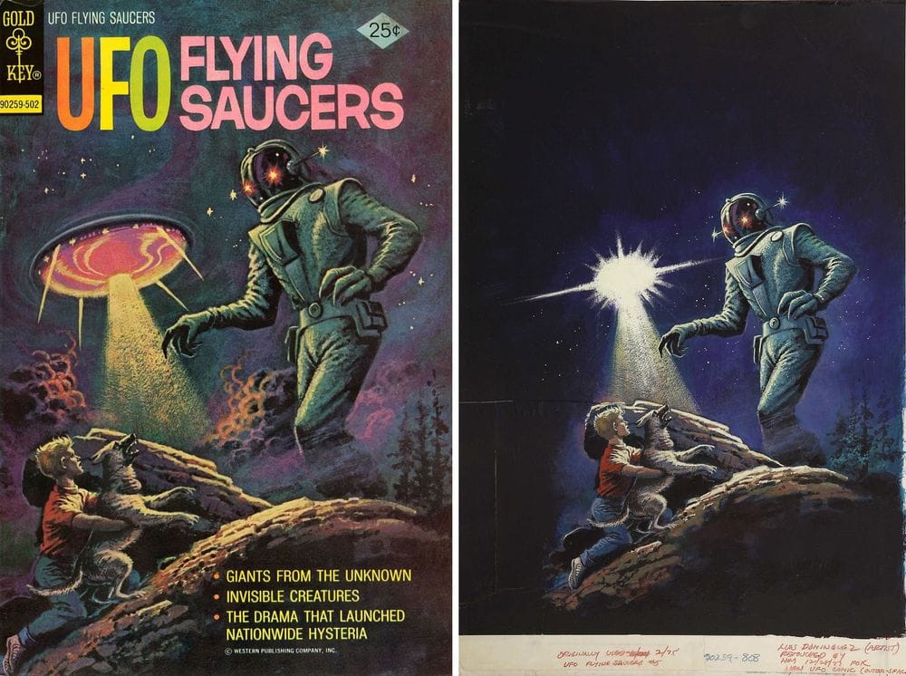
...and this issue #9 cover is George Wilson.
Book promotion corner:
This is from last November, but the Globe and Mail recommended my art book! It's behind a paywall, but you can use this link to check it out. Or just read this bit:
Worlds Beyond Time, Adam Rowe (Abrams Books) And you thought rock posters of the 1970s were trippy! Settle in for a memorable, well-researched selection of the obscure, bizarre and surreal psychedelic cover art (and artists) of mass-market science-fiction novels, at peak weirdness in that decade.
Non-sci-fi corner:
The real death of print - a good longread about the state of magazines. Interesting both because my one friend keeps trying to convince me to do a 70s sci-fi art zine and because I never knew the word "magazine" was literally just invented to reference the military term. The pen vs. the sword battle of referring to media in violent terms rages on.
When Art Pranksters Invaded Melrose Place - apparently an artist collective smuggled subversive messages onto a popular mainstream TV show by creating weird props?? Incredible story.
Plot Devices: The art of making apps for the small screen - an article exploring a handful of examples of fictional app interfaces, created for TV and film.
Tracer Bullet (Calvin & Hobbes) - a short celebration of an amazing film noir parody. And apparently Bill Watterson doesn't really know much about the genre himself! "I’m not at all familiar with film noir or detective novels, so these are just spoofs on the clichés of the genre," he says. Yet it's a lot more tightly written than most of them.