Extended Edition: Horacio Salinas Blanch


This installment wraps up the three international surrealist cover artists that I cut from my art collection's first chapter.
***
David Pelham, art director at Penguin Books during the ‘70s, had a specific aesthetic: spare, stylized, surreal, centered on a single object, such as his iconic 1972 cover to Anthony Burgess’s A Clockwork Orange, featuring a bowler-hat-clad man, faceless except for a gear as a right eye. He illustrated that one himself, in one night, after he didn’t like the art he’d actually commissioned.

Similar to Pelham in many ways was Horacio Salinas Blanch, a Spanish illustrator who produced the majority of the cover art for Barcelona-based publishing house Martínez Roca’s science-fiction line from the mid-70s to the mid-80s.
Martínez Roca loved Pelham’s style so much that they repurposed his art for their first handful of covers in their Colección Super Ficción series, which published a wide range of translations and original novels.

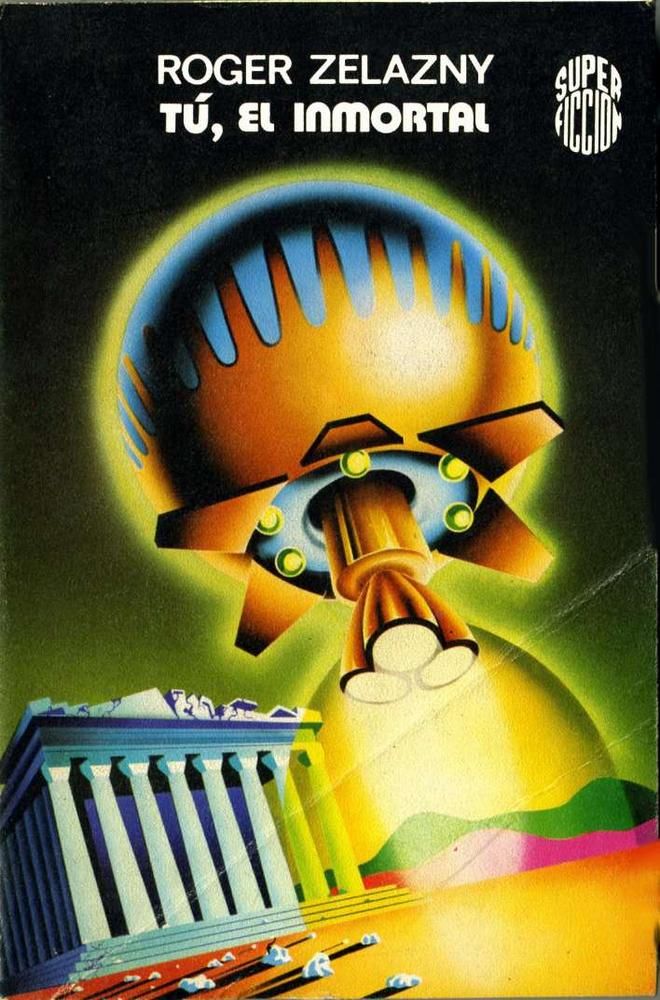
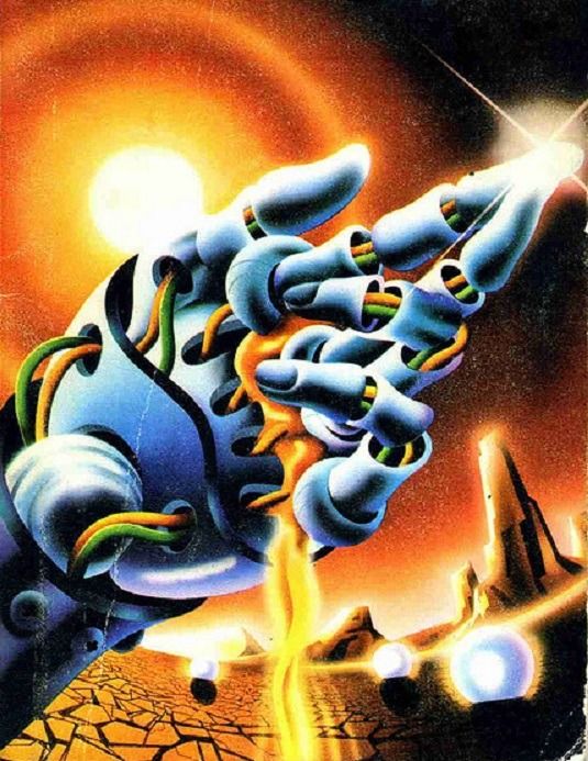
But they couldn’t use Pelham forever, and starting with the ninth book in the collection, they brought in Salinas Blanch, who stuck with them for a decade. Like Pelham, the focal point of Salinas Blanch’s covers was often a single object set against a monochrome background and garnished with surreal elements.
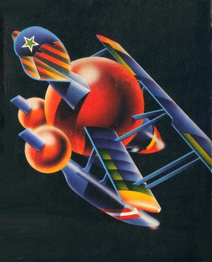
But Salinas Blanch put his own spin on this template with his heavy use of colors, maximalist detail, and airbrushes to create images too arresting to forget.
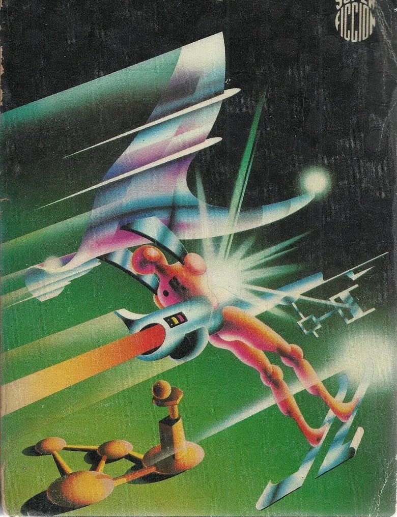
The covers were as varied as the novels they illustrated, moving from classic sci-fi subjects like fiber-optic robot hands and spaceships –
– to classic Surrealist concepts like clocks and faces melting mid-scream.


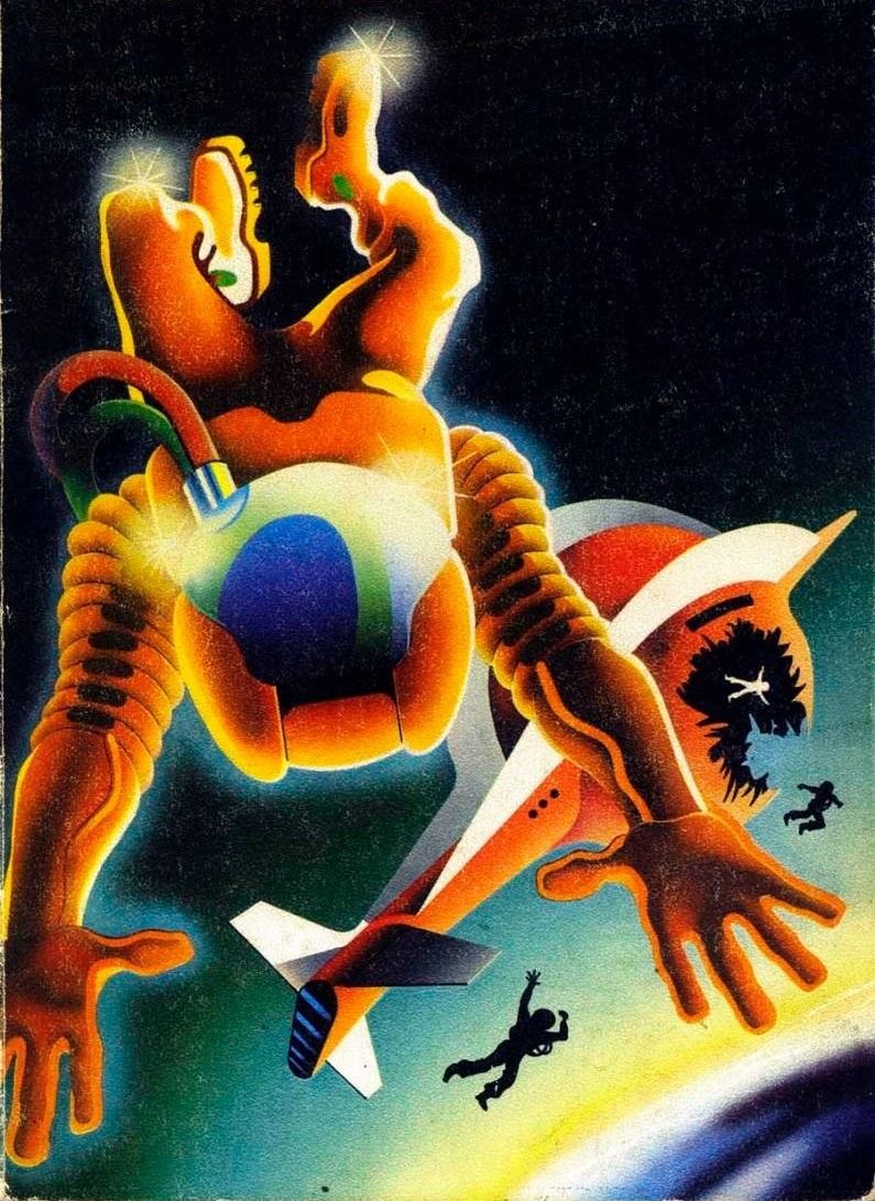
His Pop Art approach also meant a lot of silhouettes, like the spread-eagle astronauts floating out of a space-shipwreck in his 1978 cover to the Spanish translation of Wilson Tucker’s The Time Masters –
– or the Tic Tac-shaped monolith on the 1984 cover to John Varley’s In The Hall of the Martian Kings.

He wasn’t afraid to steal, either, sticking what’s clearly a Stormtrooper helmet in a cover for a translation to Heinlein’s The Number of the Beast.

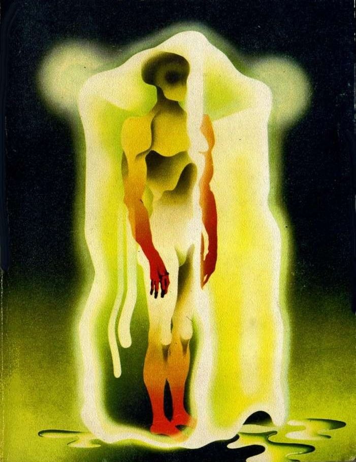
Salinas Blanch’s legacy includes Pelham’s influence but goes beyond it, peppering in a dash of gonzo idiosyncrasy to emerge anew, like the figure trapped in a melting ice block on the 1978 cover to Joan Trigo’s Desierto de niebla y cenizas.
***
If you're looking for more about this artist, check out this great writeup on We Are The Mutants, by Richard McKenna.
It includes one interesting tidbit that I left out of my own writeup: This case of Salinas Blanch borrowing a little too much from Pelham.