Extended Edition: Henri Lievens
The time is upon us! My art book Worlds Beyond Time is officially released this week.
In honor of its release and of the relaunch of this newsletter, I'm starting a new weekly series. And – because the Lord of the Rings was released on DVD during an impressionable stage of my childhood – I'm calling it "Worlds Beyond Time: Extended Edition"
The process for writing this art book involved a first draft in which I covered a broad swath of everything related to 1960s-'80s sci-fi art as long as it was a certain combination of being the most relevant, the most interesting, or my favorite. This draft was then followed by a sprawling series of adjustments as I realized that getting art permissions from every single artist, estate, or publisher is actually really hard.
So, this extended edition is a look at all the two-page spreads that I had to cut out of my first draft, for a variety of reasons. These emails should stand alone, although they may make more sense once you've read my book and know where they would fit in. I'll be including even more art than I would have gotten in my book (most entries are designed for 3-5 illustrations), and these also have the benefit of a once-over by a professional editor, which sure beats all the other email newsletters out there.
But how am I able to put these artists in emails if I couldn't put them in my book, you may ask. The short answer is that fair use exceptions make more sense online, where art images are free, small, and digital rather than print-quality and 35-40 bucks depending on where you buy it.
Anyway, here's the first entry! It's on Henri Lievens, a surrealist cover artist operating in Belgium – he passed away in 2000, and the language barrier made his estate harder to track down. That was the case for a few more surrealists, too, but we'll get to them.
Enjoy my "published author" writing style - it's a little tighter, little more dense, lot fewer comma splices like this one.
***
Belgium’s Henri Lievens stands out as a prominent European sci-fi and fantasy illustrator, most active in the ‘60s and ‘70s at Belgian publishing house Marabout.
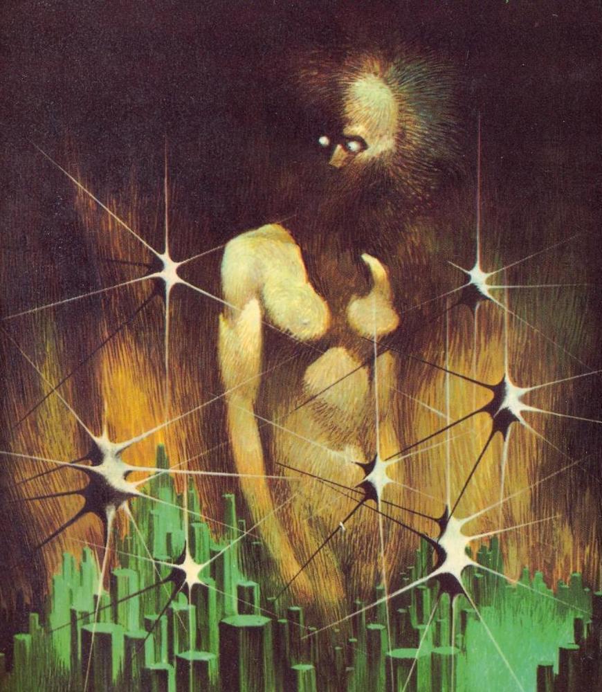
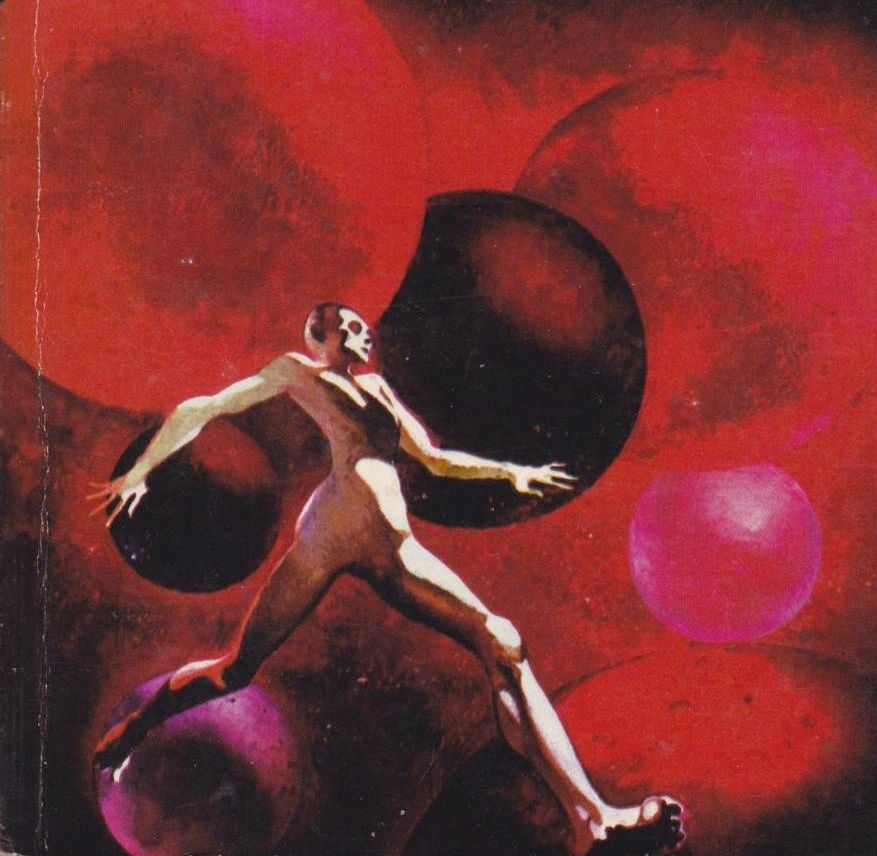
Like Richard Powers, Lievens’s style pulls on the abstract and surreal whenever possible, and often includes the classic surrealist trope of the shadowy, warped figure, a "mannequin" symbolizing the merging of the human and inhuman.
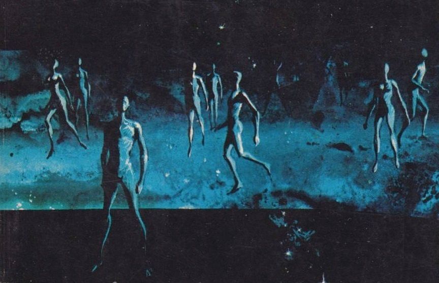
Lievens’s figures tend to be a little more active than Powers’, cavorting and striding around like they’re trapped in a bouncy-house dimension.
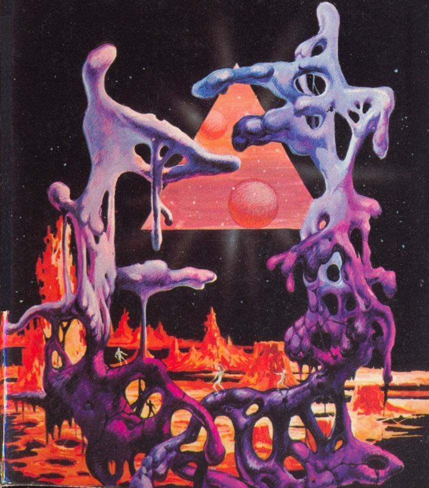
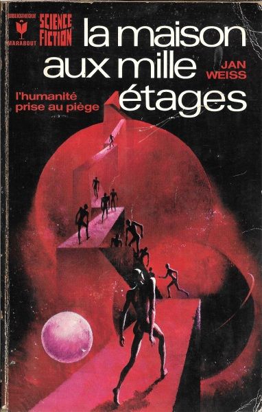
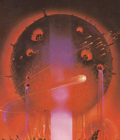
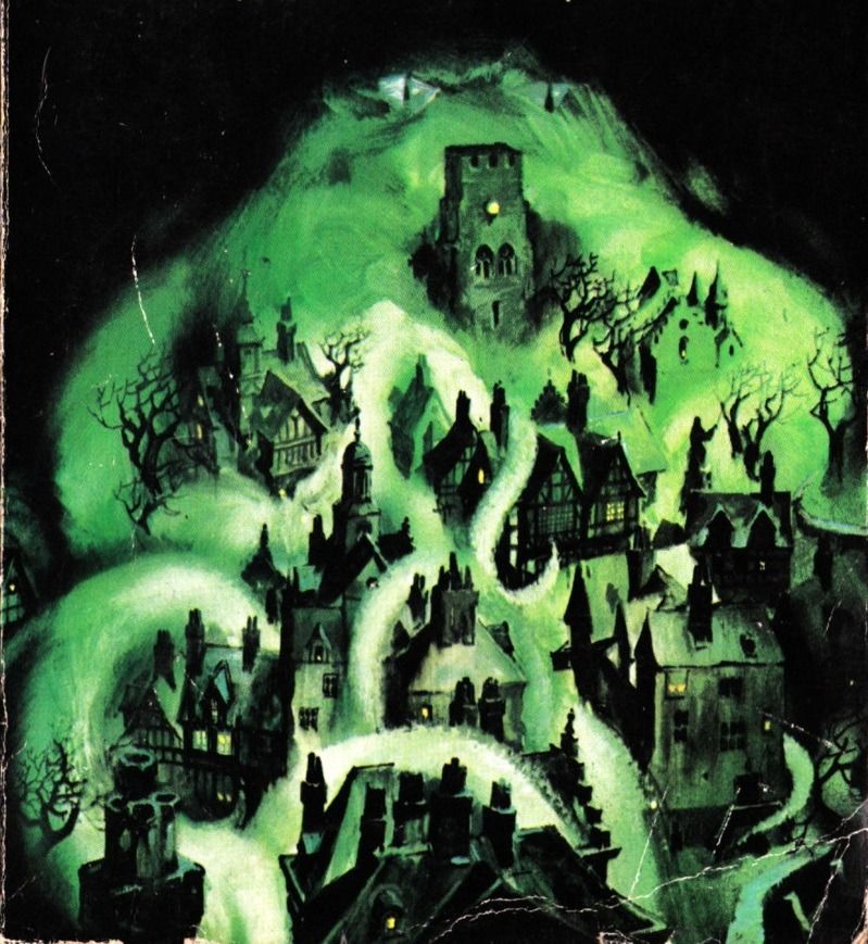
He enjoyed monochromatic scenes, where a single shade of light green or dark red dominates a creepy town or bubbling landscape –
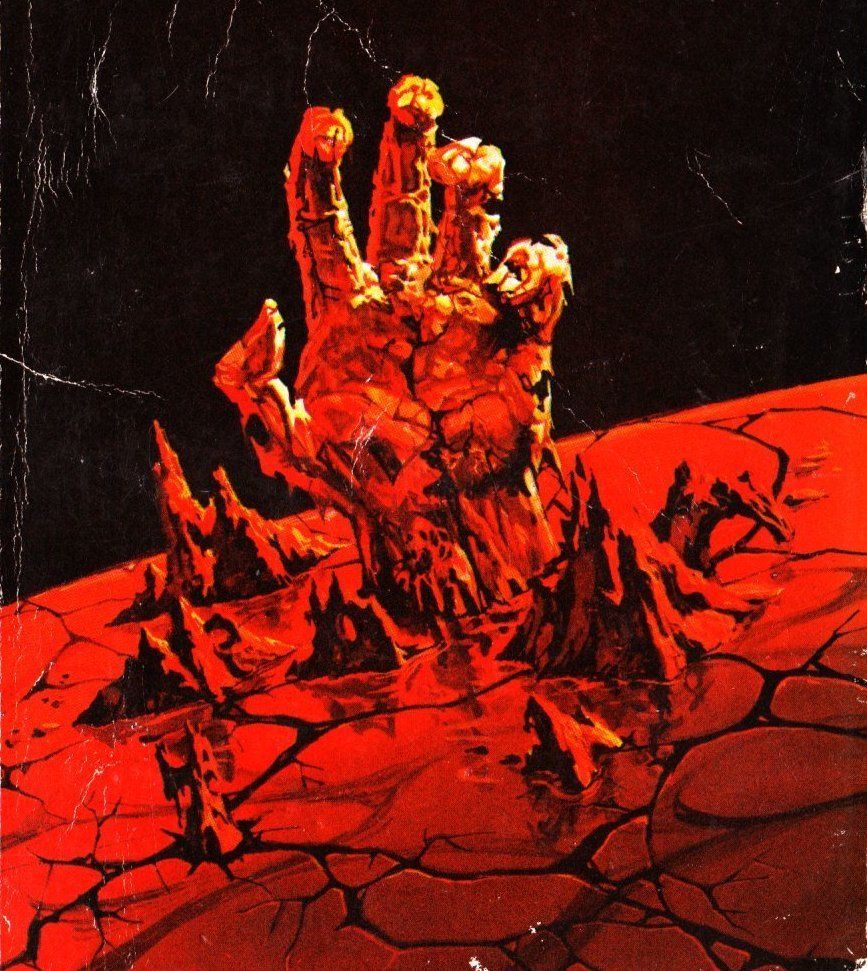
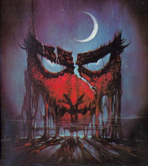
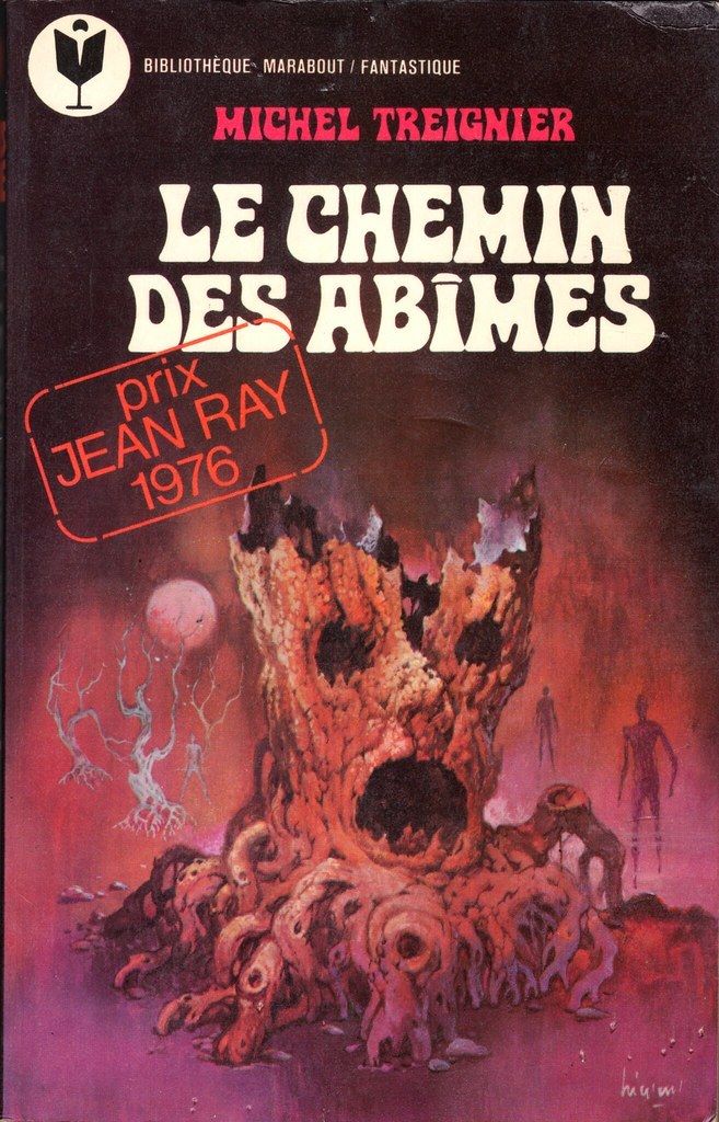
– and he often ties together his covers with a face frozen into a scream, whether it was on a cracked mask, a tree stump, or a hooded skull.
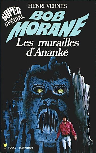
Lievens’s work wasn’t always surreal. He illustrated a variety of adventure and sci-fi novel series, for which he typically centered the requisite square-jawed hero—the French Bob Morane, the American Doc Savage, or the German Perry Rhodan.
He’ll be remembered for the covers he clearly loved the most, however: Quasi-abstract scenes just unsettling enough to stick in readers’ memories.