The Adventures of Starbeem and Re-Koil
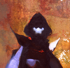
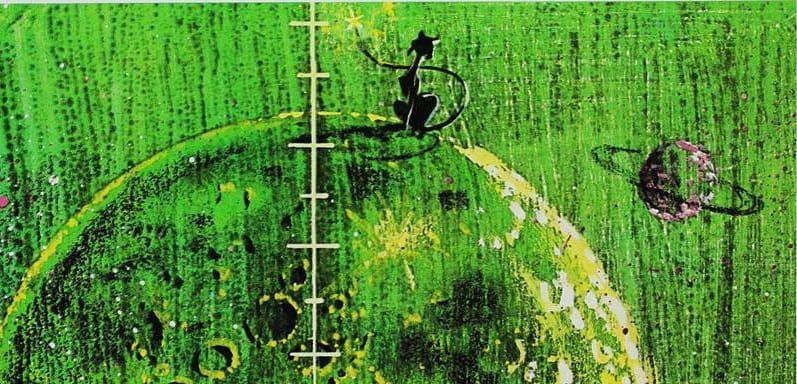
Here's one of the rare "semi-exclusive-by-virtue-of-obscurity" artworks that I can occasionally reveal in this newsletter. It's one of Edward A. Skrocki's 1967 illustrations for "The Adventures of Starbeem and Re-Koil," written by D. J. Donovan. Full image here:
Someone I know on Tumblr scanned their personal copy several years back and submitted it to me to put online for the first time. If not for them, I don't think this image would exist anywhere on the internet – another example of how archival work is never guaranteed and misses a lot more data than most people realize.
The plot of the book: "Starbeem, the moon cat, starts a family when her planet kingdom is invaded by Re-Koil, the space dog, Webby, the space bird, and Wilfred, the space serpent."
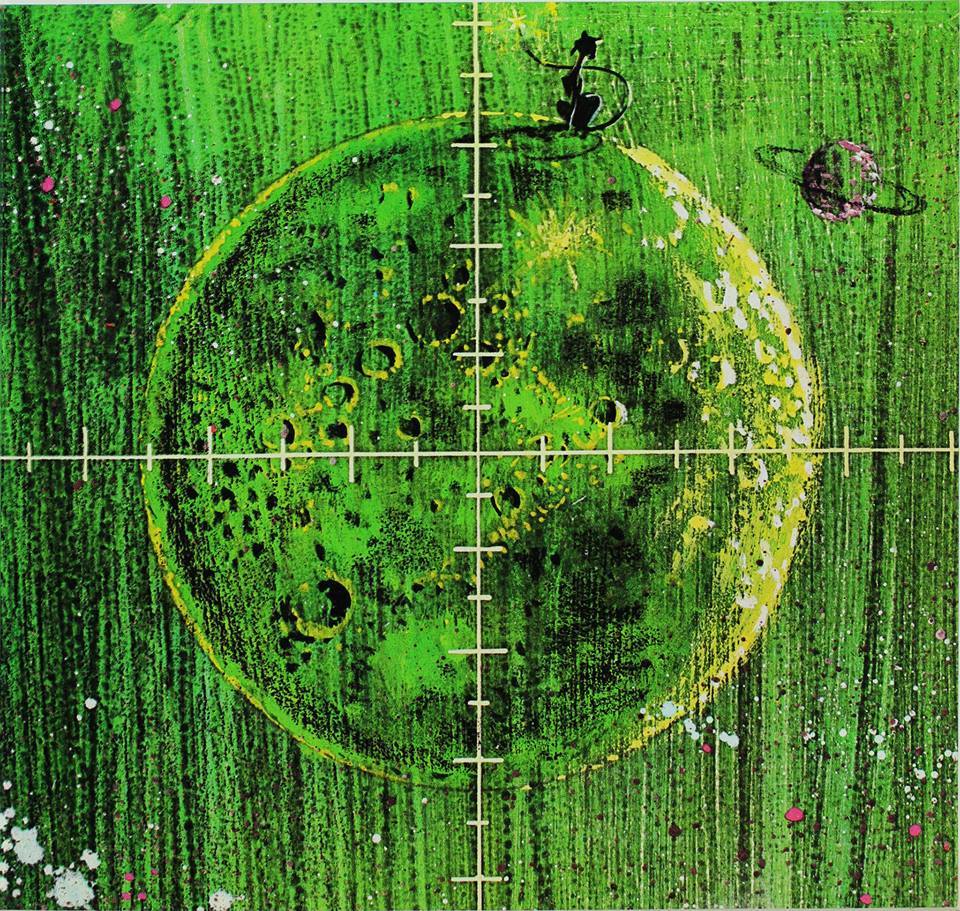
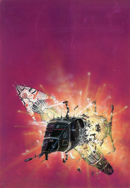
Here's a fun (now solved) cover artist mystery that I found myself tangentally involved with, back in July. This fascinating artwork is by James Talbot, done in 1982. The mystery? What it was used for.
The only thing any internet research turned up is that Talbot did a handful of board game cover artworks for the company Avalon Hill, but this wasn't among them.
I only found out about this mystery second-hand: Joachim Boaz – the pseudonymous blogger at Science Fiction and Other Suspect Ruminations who you might remember from our interview back when my art book came out – reached out to ask me if I knew any publications that might have used that artwork.
The actual owner of the above canvas had picked it up at an antique mall and had asked Boaz for more info, but in the end, that buyer was able to track down contact info for Talbot himself, and got the definitive answer: It's a portfolio piece, created by Talbot to showcase his work, and to the best of Talbot's knowledge, it was never used commercially.
There is a connection to Avalon Hill, however: Apparently, Avalon Hill's A. Eric Dott bought all of Talbot's portfolio, including that one, after Talbot sent him some slides. Talbot landed a job at Avalon Hill with it, even if the artwork itself was never used.
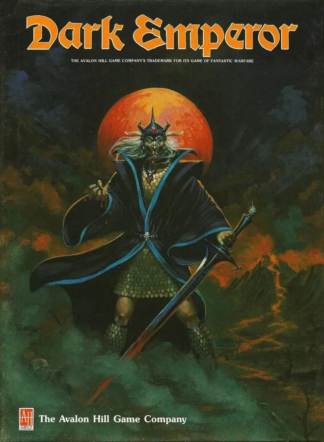
As for James Talbot's published works? Here's Dark Emperor, 1985. The style is reminicent of Peter Andrew Jones.
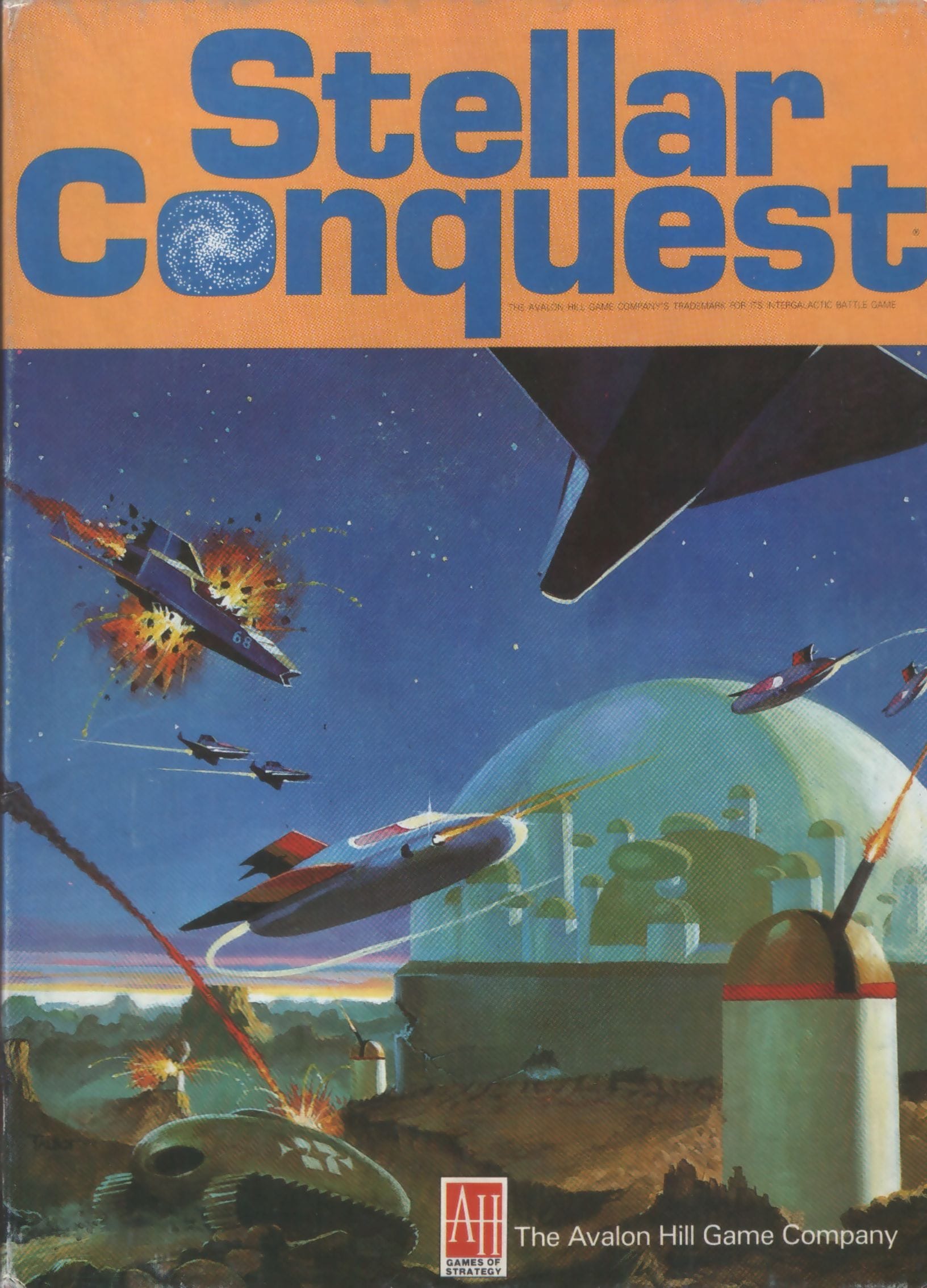
Another standout is his cover for Stellar Conquest. The game is listed as coming out in 1975, but I'm not sure how that timeline aligns with Talbot's 1982 artwork pre-dating his job at Avalon Hill. This might be a later edition of Stellar Conquest.
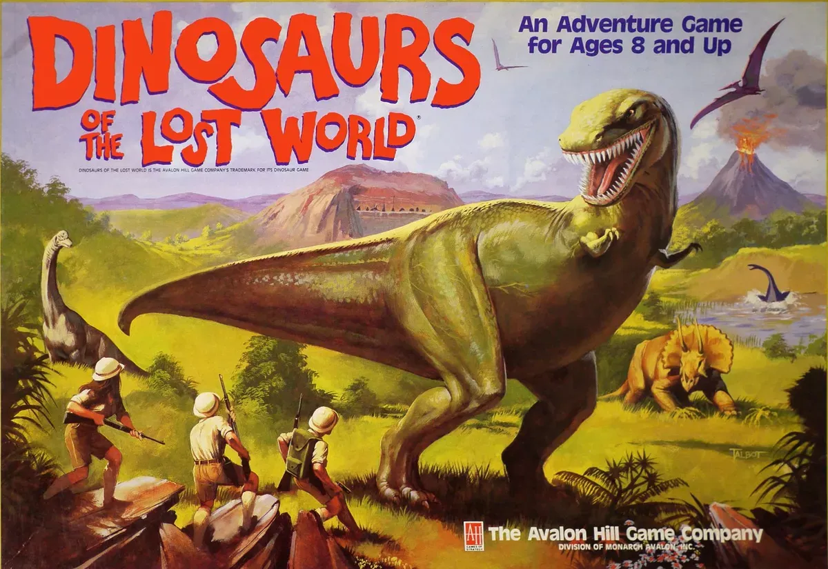
That's about it for Talbot's speculative fiction art, although he did do this sick 1987 cover for Dinosaurs of the Lost World, too. You can check out more of his covers over here.
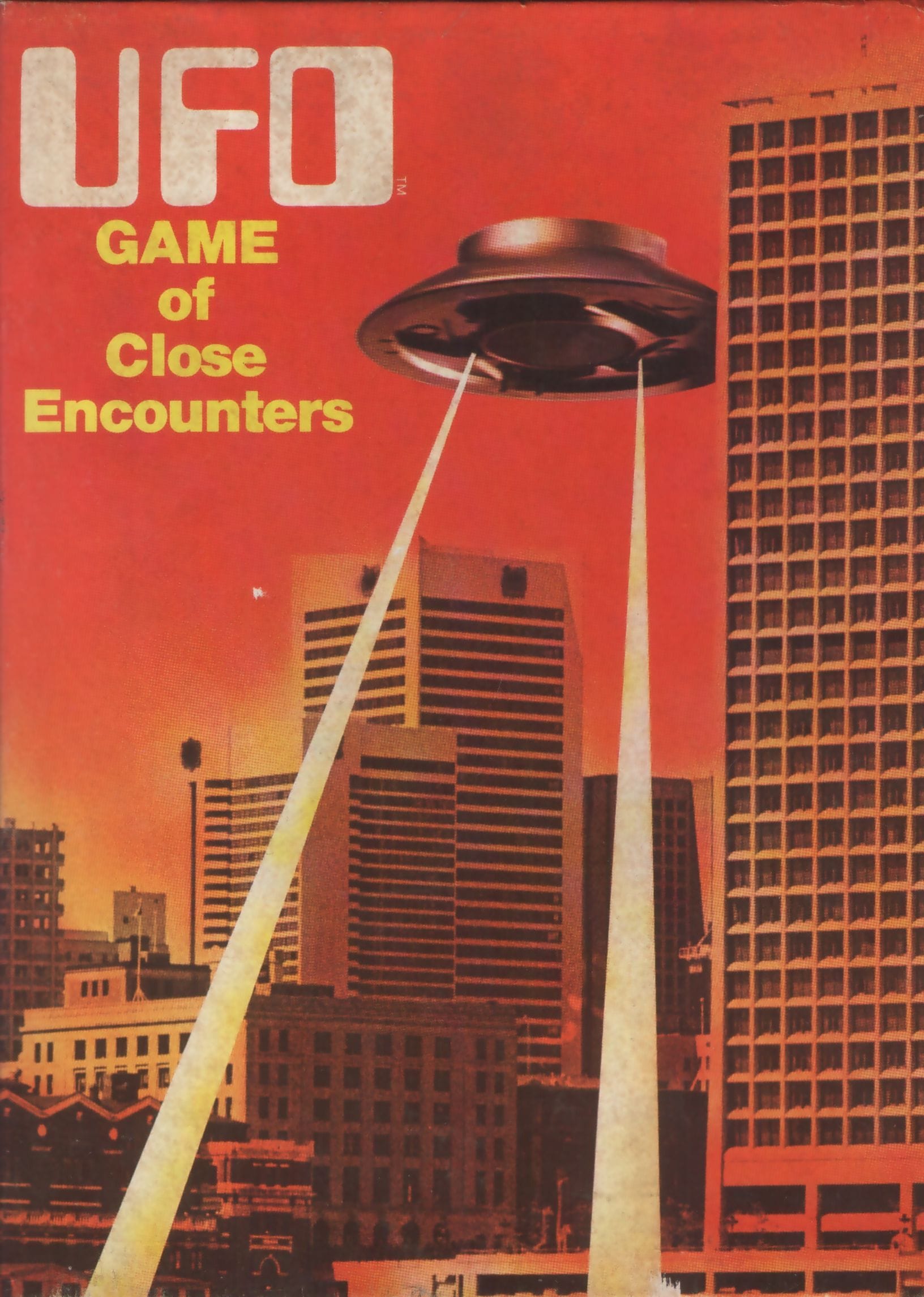
Here's a cool non-Talbot Avalon Hill cover, for UFO: Game of Close Encounters, 1976. Design by Tom Dalgliesh.
Okay, the rest of this issue is just a hodgepodge of articles I thought were interesting.
First, here's a blog post about Peter Elson, a great British sci-fi artist best known for his Chris Foss-like functional spaceships and vehicles, complete with colorful patterns. Elson’s range went beyond hardware, though, and he could do great jungle scenes just as well as futuristic parking lots.
I have a fair bit of his work scattered across my book, although I don’t have a dedicated section just for showcasing him. There’s relatively little research about his life and career online compared to many sci-fi artists on his level, but this post is a nice summary of his style and the impressive variety of mediums and brands that he worked with:
Featured Illustrator: Peter Elson
Julian Schlottmann, Fists of Heaven
The way he designed his spacecraft with a very regal and bright colorful pallet with contrasting paint-jobs was very retro yet striking look and came together in a really nice looking composition. Scattered across the hull of these ships were bright or contrasting colored decals, stripes and curved lines that introduced some really strange looking camo pattern ideas, and little numbers that fleshed out the style of the ships even further. His ships were always unique and alien but were always seeming to keep in the realm of realism and believability.
David Pelham’s airbrushed sci-fi
Penguin Series Design
Pelham used the air brush for the Ballard covers, the technique of air brushing was making a comeback in the 70s, often in sci-fi illustrations. Its heyday was in the Art Deco era of the 1930s – think of the stylish travel posters of A.M. Cassandre. Pelham was a master of the difficult process where a noisy air compressor pushes the air through the metal stylus where it mixes with ink to produce a narrow mist of ink particles. Airbrush art is distinctive for the characteristic smooth tonal gradients made of tiny dots of colour.
Gothic Whispers and Cosmic Dreams: Jerome Podwil’s Captivating Cover Art
Unquiet Things
But Podwil’s artistic prowess isn’t confined to the realm of the gothic. His science fiction covers reveal an equally deft touch, transporting viewers to cosmic vistas that feel at once alien and oddly familiar. Where other artists might assault the senses with harsh lines and chromium gleam, Podwil opts for a more nuanced approach. His extraterrestrial landscapes are rendered in muted jewel tones, creating worlds that feel less like cold, distant planets and more like half-remembered dreams.
The Hidden Racism of Book Cover Design
Tajja Isen, The Walrus
A cover is likely a reader’s front door to a book. The art needs to entice, convey the subject—books on nature will probably have an image from the natural world; a science fiction novel might depict the cosmos. Friction comes when that reach for recognizability gets tangled up in trying to represent minoritized identity. The problem of stereotypical covers may emerge, in part, from the idea of whom they are meant to be legible to. The industry, So and Sinykin attest, has a narrow concept of its target market.
Next Time: Giant Bees