Lookcaitlin Is The Coolest Resource of 70s-90s Tech Magazine Illustrations on the Internet

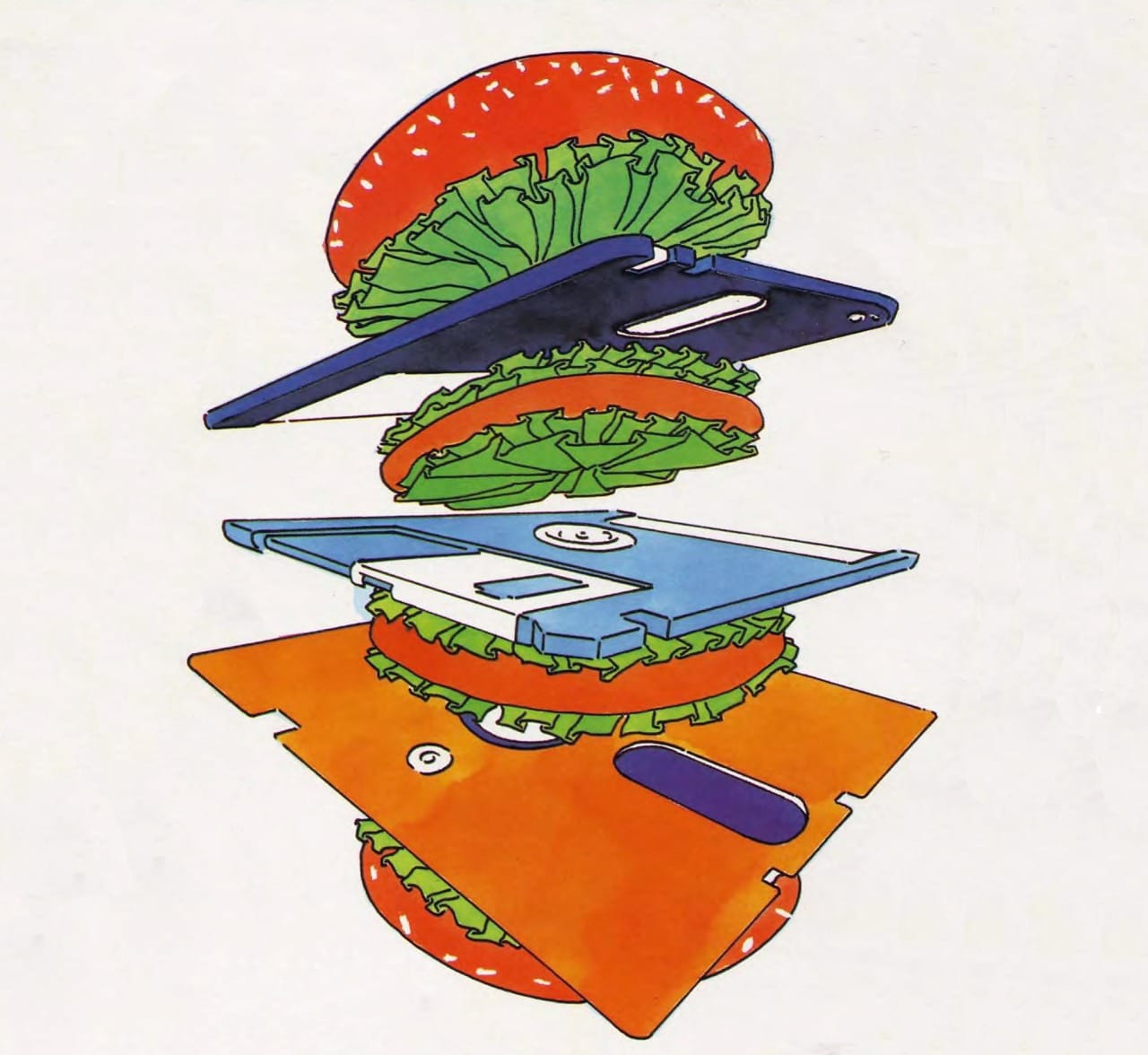
Two firefighters resuscitating a giant cartoon keyboard. A photograph of a burger containing two giant floppy disks. A beautifully garish abstracted illustration of a TV and clock beside a bed. A cow on a computer.
What do these striking images have in common? I found them all after five minutes of scrolling through the Lookcaitlin Tumblr, the biggest and best curated collection of '70s-'90s retro tech illustrations.
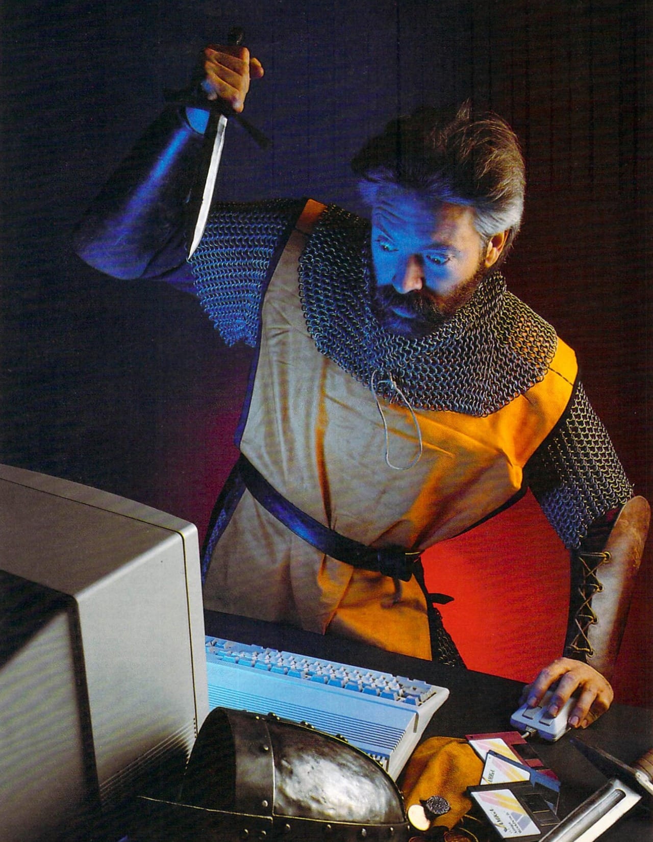
I've mentioned the Tumblr before on this art blog, but you might remember them best from my Medieval Computers post, which featured nothing but illustrations I found on Lookcaitlin.
It's an incredible resource. Where else would anyone see this long-forgotten photo once used as an ad for TIP, Inc, in the July 1993 issue of CD-ROM Today? We can't let images like this languish in obscurity!
You can and should waste your entire day scrolling through Lookcaitlin's Tumblr archive or Bluesky account.
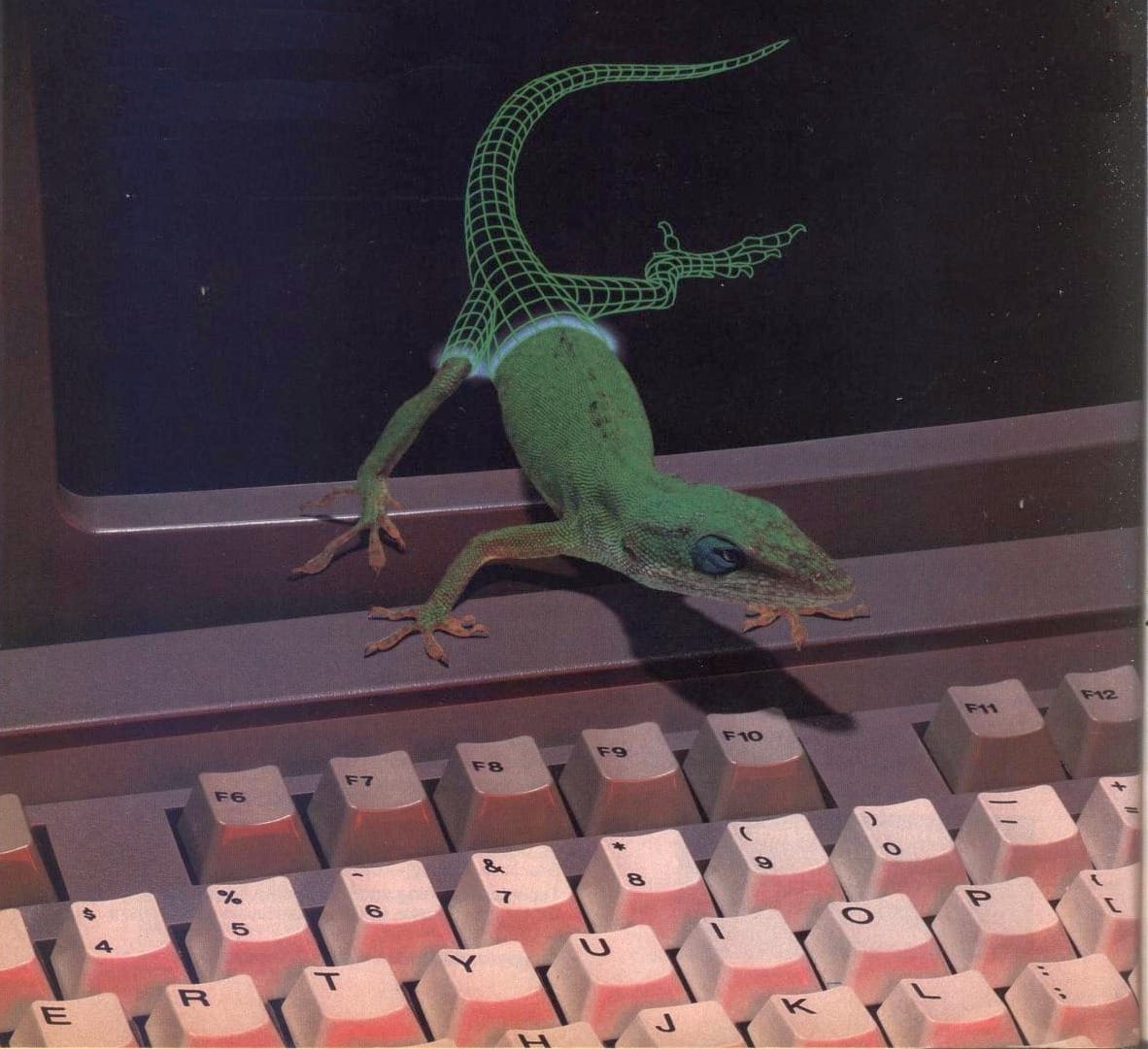
However, as a huge art blog nerd myself, I wanted to learn a little more about the person behind it all. So, I emerged like a lizard from a computer screen to ask a few questions.
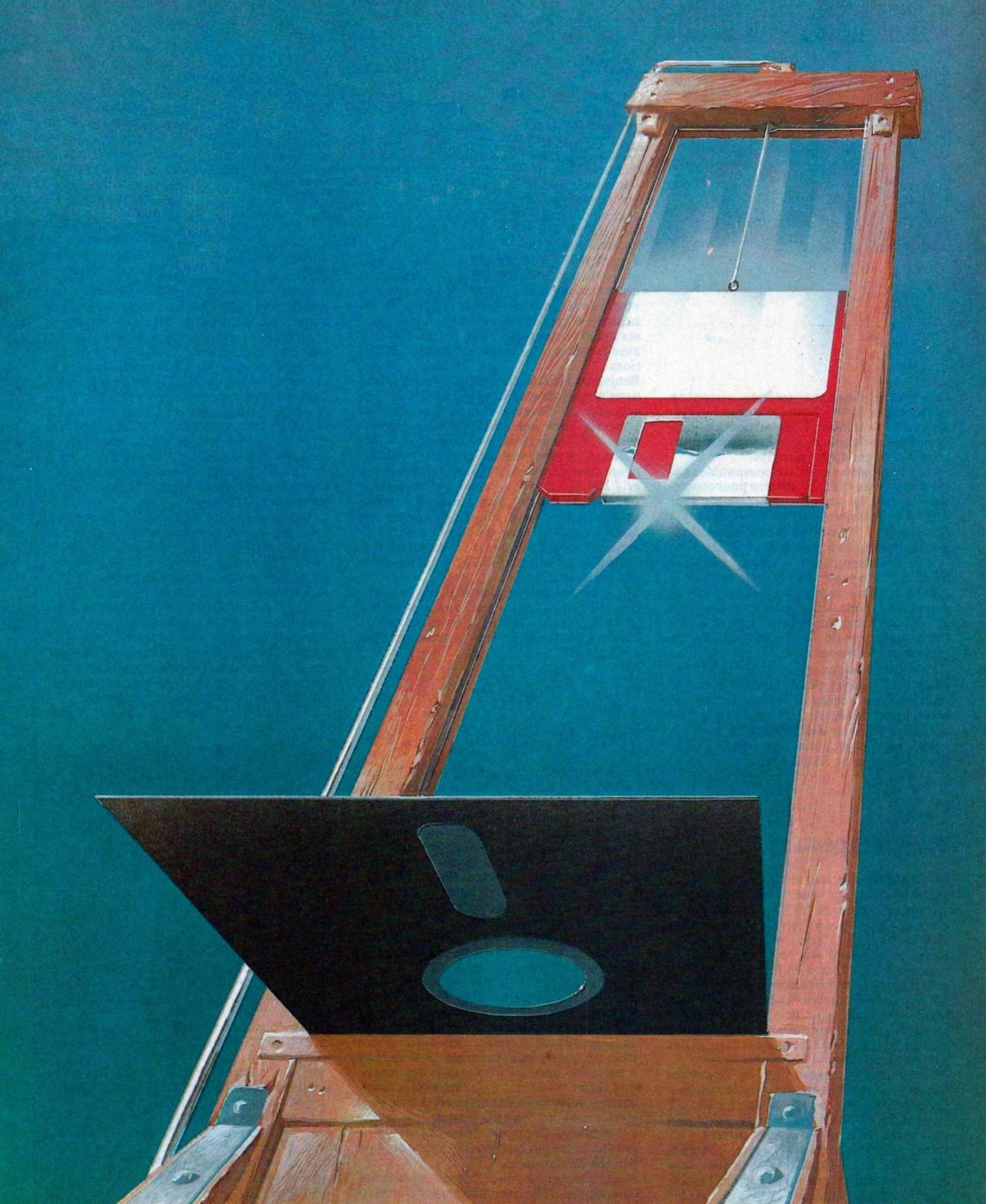
Here's my interview with Lookcaitlin's sole proprietor, featuring some historical context, the process behind the blog, a huge Internet Archive shoutout, and a picture of a floppy disk guillotine.
Do you want to tell me anything about yourself?
I’m just your friendly neighborhood retro art enjoyer! My Tumblr probably makes it seem like I work with computers or art in some way but I’m actually a fitness instructor.
How would you describe the subject matter of the art and images you post on your blog? What do you love about this era of art? I think a big part of what makes retro tech illustration so fun for me is the combination of looking to the future but celebrating innovations that feel old-school these days. Cassette futurism, I think it qualifies as.
I suppose I would describe what I post as “late 20th century pre-Y2K commercial art.” I exclusively post things printed between the years of 1977 and 1997. I don’t exclusively post computer content, but that’s the spine of the blog and the reason for those dates. The “trinity” of personal computers (Commodore PET 2001, Apple II, TRS-80 Model 1) debuted in 1977 and wi-fi became publicly available in 1997. I think those two milestones mark a distinct period in commercial art: when technology was a place or thing you visited or accessed, without yet being omnipresent. There is also an aesthetic shift after 1997 as art and culture began to anticipate the turn of the century.
This particular era of commercial art is also deeply surrealist. You don’t get medieval computers and disk burgers without that influence. I frequently think about the fact that Magritte’s Son of Man was painted in 1964. If you are working at a magazine in 1984, then that painting & that era are just as relevant as if you were making music or art right now and drawing inspiration from the early 2000s.
What I love most about this era of art is similar to your take – I am delighted by the use of organic / old school materials to construct the future. I’ve encountered commercially available computers with wooden components!
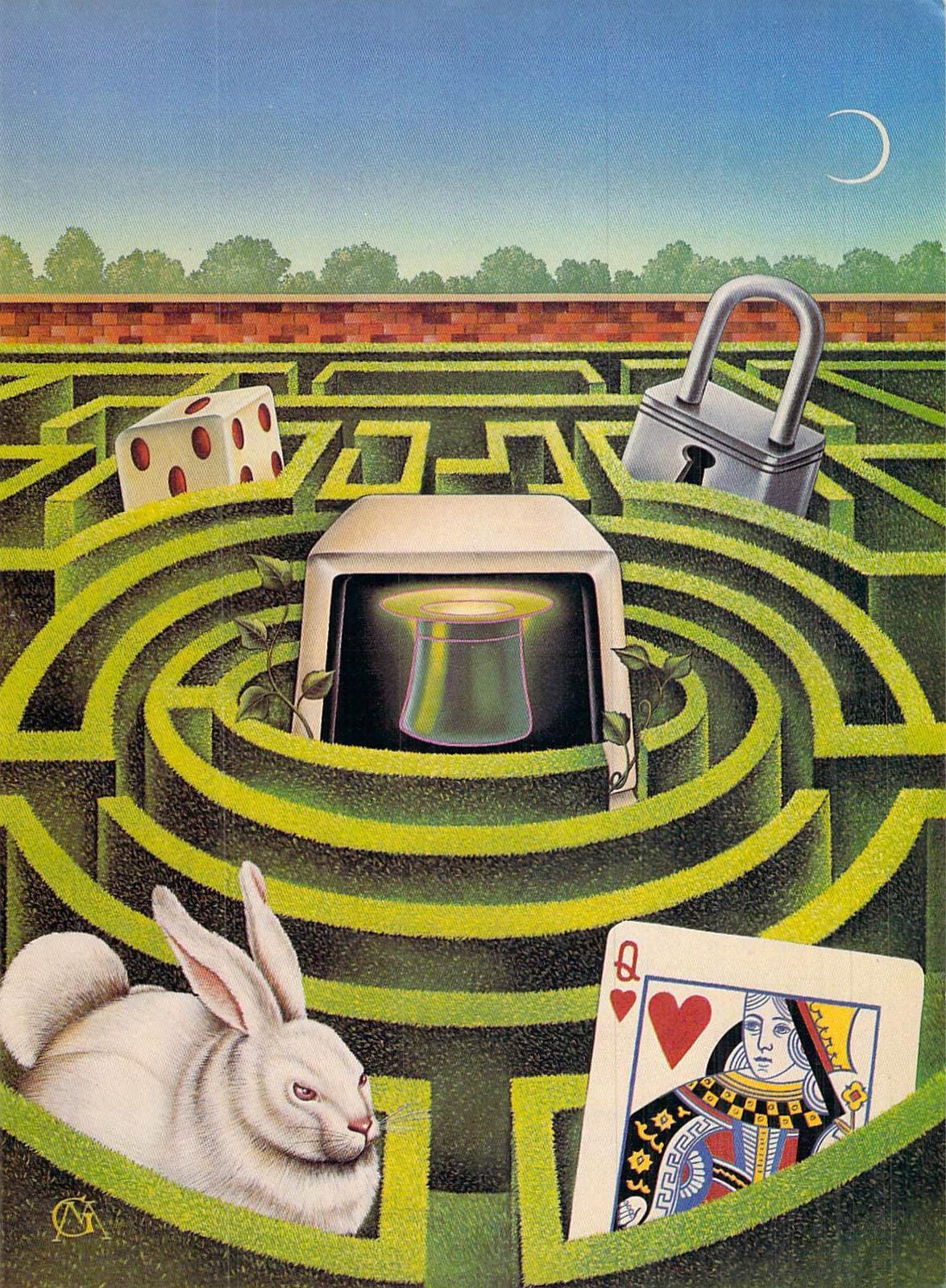
Is there anything you’ve learned about this type of art over the years you’ve been posting? Do you have any favorite artists or magazines? Any interesting trends, like medieval themes? I’ve seen a lot of computers growing in jungles or swamps.
I’ve learned a little bit about the lighting and photography techniques of the period. There’s a great book on special effects in commercial photography that details the methods of a few 80s photographers. It’s fascinating to hear how much work goes into something seemingly simple like showing a cassette encased in a bubble or a computer floating over a glowing grid. I definitely have a favorite photographer of the period though. The only word for Michel Tcherevkoff’s 80s-early 90s is an overused one, but accurate in this case: iconic. If you think you haven’t seen a Michel Tcherevkoff photo, you absolutely have.
For illustrators, I love too many to possibly name a favorite. Robert Tinney leaps to mind of course, and BYTE is an obvious contender for favorite source. I also love everything I’ve ever seen by Stanislaw Fernandes, Stanley Martucci & Cheryl Griesbach, Anna Davidian, Franco Tempesta, Rafal Olbinski, Mark Salwowski, Val Lakey Lindahn and James Marsh. The minute I send this in I will probably think of a dozen more.
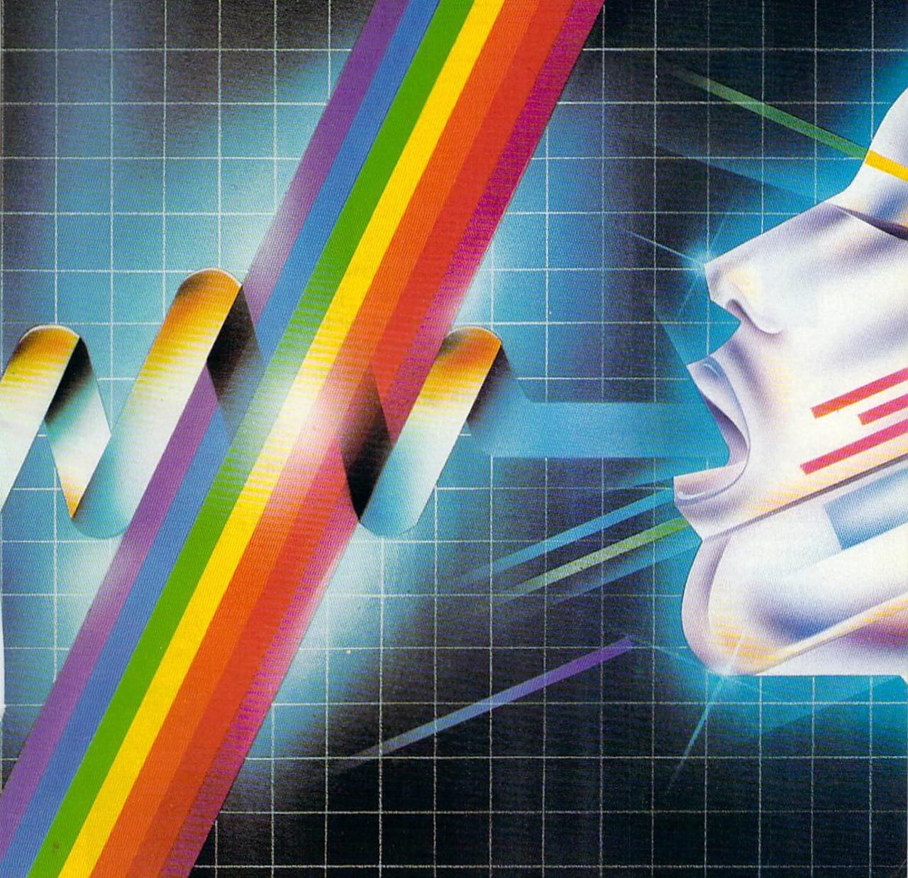
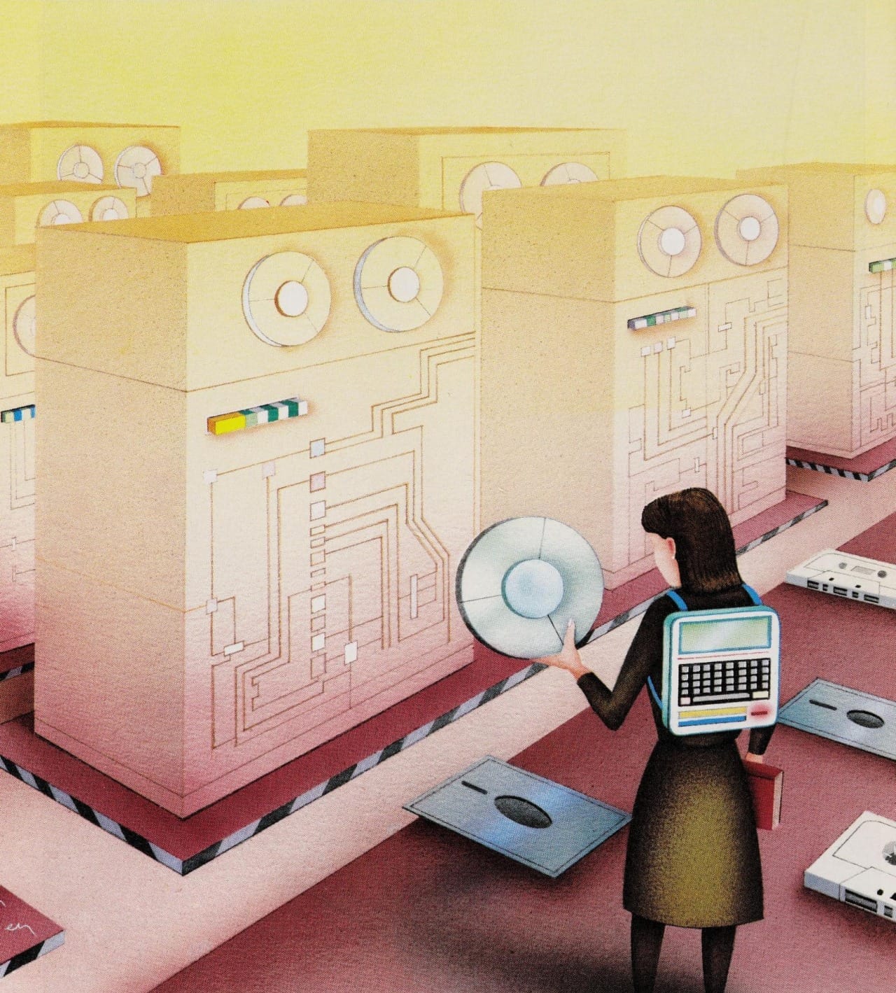
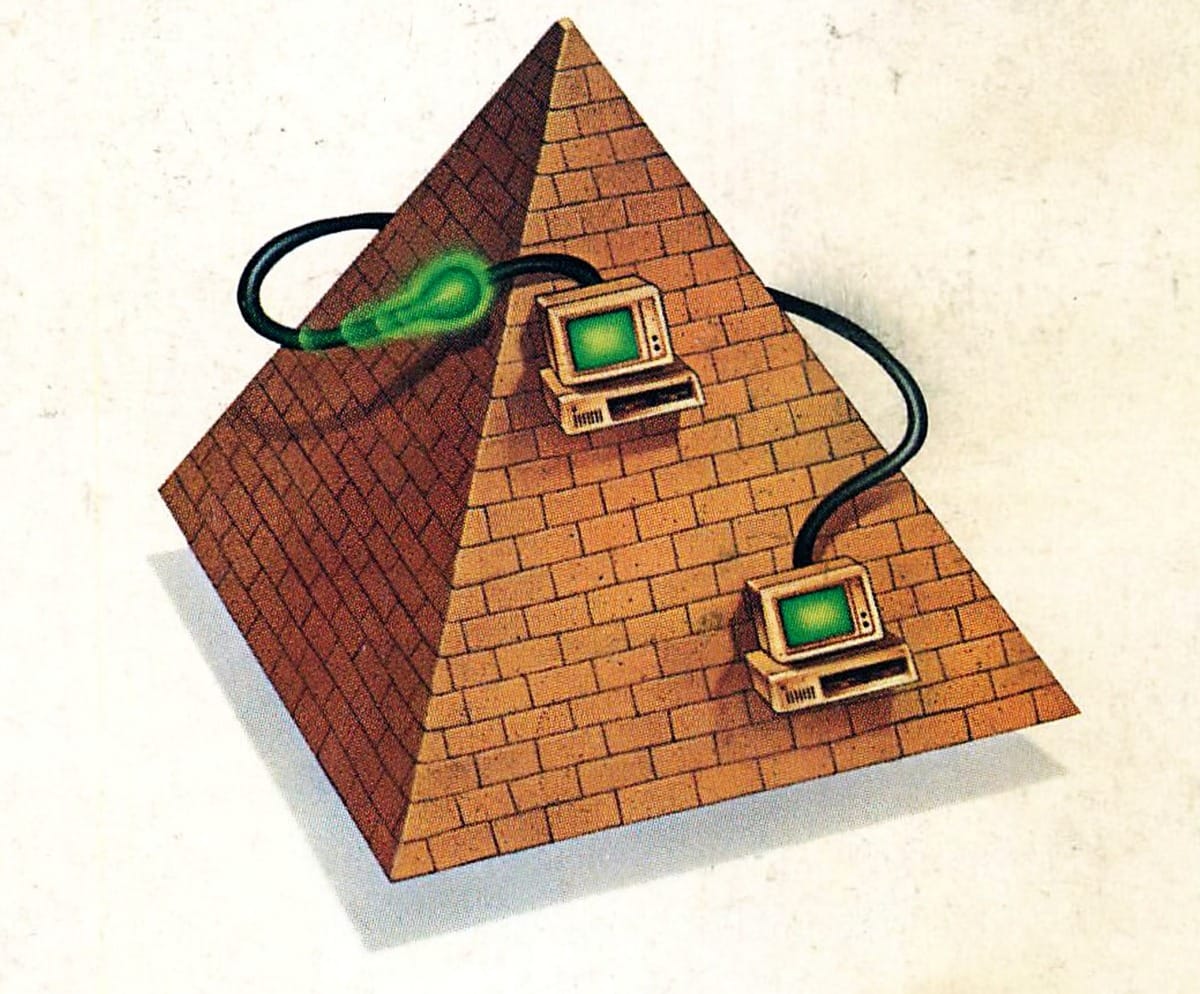
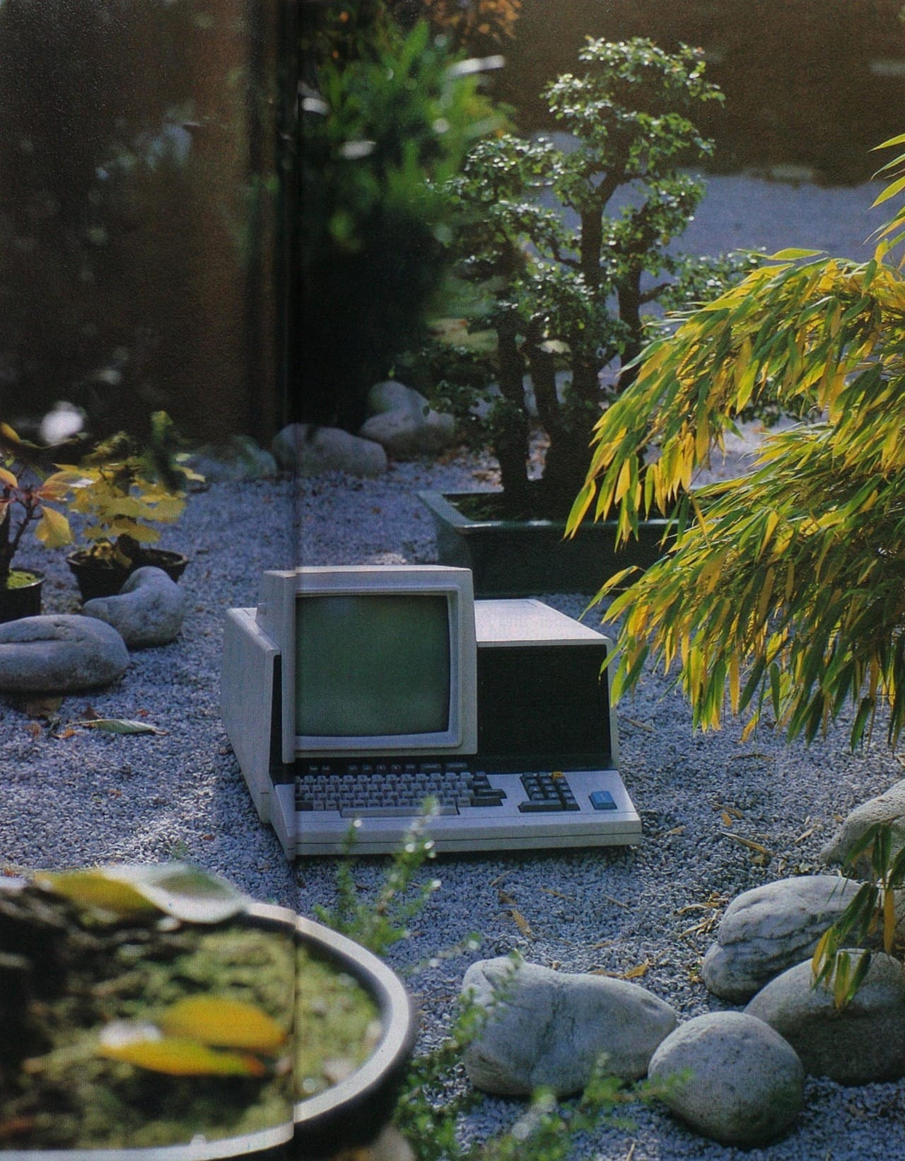
There are so many fun themes and design tropes in the period. I love disk burgers (and sandwiches!) and plates of computer food. I love the abundance of rainbows and hot ladies just standing next to computers. I love the absurdity of computing by (or often in) the pool with these monstrous laptops or having a whole desktop setup on the beach, in the desert or in the middle of the forest. There’s also a surprising amount of ancient Egyptian references.
How and when did you get started with this style of art blog? I see a lot of aesthetic tumblrs over the years, but yours is pretty unique for the specificity of the guiding themes.
The inspiration is from an internet acquaintance who used to post cropped album covers on a message board we both frequented. I loved how it recontextualized the image and cast the viewer in the role of the artist, designer or art director - you may have noticed that I will sometimes strip the text from an image, and that is exactly why. Over time I fell in love with the Internet Archive and wanted to be intentional about directing people there.
What does your typical process for posting look like? How much time do you spend on it, and how do you decide what tech magazine to comb through next?
While I don’t necessarily spend a lot of time on it, I look for things to potentially post almost every day. It’s one of my reflex stops on the internet, like a news site or reddit is for many. If I am waiting for something and I have internet access, I am probably combing through the Internet Archive. I’ll fill up my Tumblr drafts and then drop them when I feel like it, if they’re relevant for a t hemed weekday (e.g. Medieval Computer Monday and Wizard Wednesday!), or for a holiday. When work gets busy, I tend not to post. I could set up an automatic queue but I like to actively pull the trigger on things getting posted.
It looks like you tag the year and artist in your posts whenever you can. How hard is it to find the artist credit? Any tips for where to look in these magazines to find the artist credit? Based off my experience, it looks like the top places to look are the margins of the page for interior illustration, and the first page or two for the cover illustration.
It can be quite difficult. Any language using a non-English alphabet is tricky. In that case I will try to use OCR on the text of the masthead, which doesn’t always help. I’ve learned the word for “cover” in quite a few languages. Then you have publications that credit a list of artists but don’t say who did what. It’s frustrating because you want to give credit and bring attention to their work. You’re correct about margins and first pages being the best places to look. Reverse image lookup is helpful when you hit a dead end. I use Google, Yandex and Tineye.
You link to your source on the Internet Archive in all your posts – seems like you have a pretty big symbiotic connection to them. Did you need to take a break from blogging when they went down from a hack the other month?
I keep a pretty deep Drafts folder so any breaks I take are usually for life / work reasons, but it did worry me when it went down. It’s such an important resource for so many reasons, the least of which is fueling my little obsession. Preserving as much historical media as possible is an absolute necessity. Intentionally sabotaging such a wealth of knowledge is a fascist act and should be treated as such.
Music recommendation: Tangerine Dream Sorcerer score, 2024 mix
Next Time: Alien Landscapes 2