Spot the Difference

Today, we're seeing double, with a big, wide-ranging list of various times that artists did very similar artworks for one reason or another.
We'll start with my favorite example of an artist playing a "spot the difference" game.
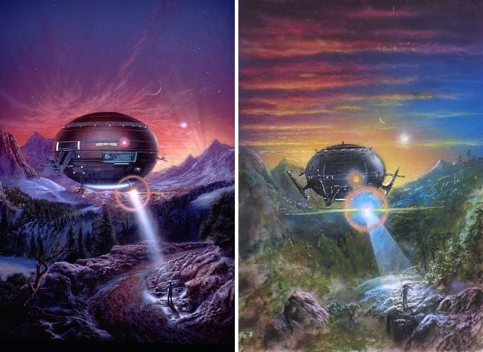
'Mass: Cathedral 1,' and 'Mass: Cathedral 2,' are two works by John Harris that work together to illustrate the "Schrödinger's cat" thought experiment about the uncertainty principle.
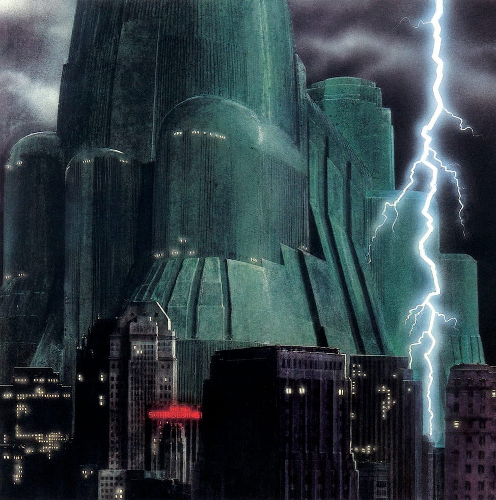
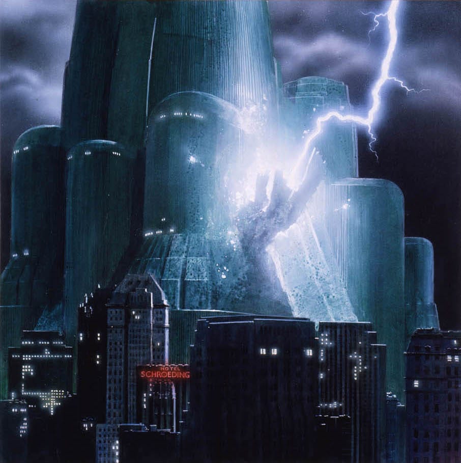
I must have seen each of these images by themselves at different times more than once before I realized they aren't the same image! Harris was even trying to tip me off with that hotel sign.
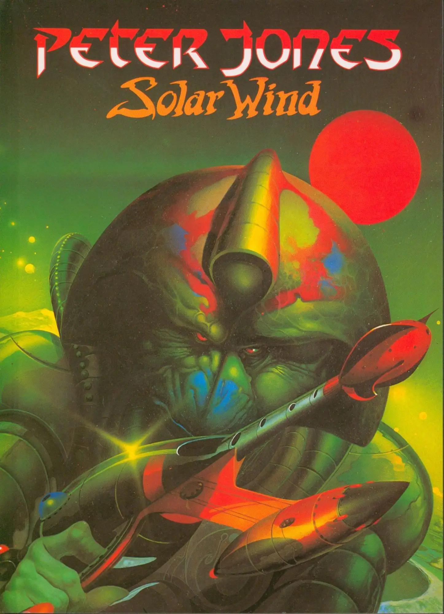
Most artists aren't trying to make a point with their very similar artworks. Here's Peter Andrew Jones' 1979 cover to Larry Niven's Protector:
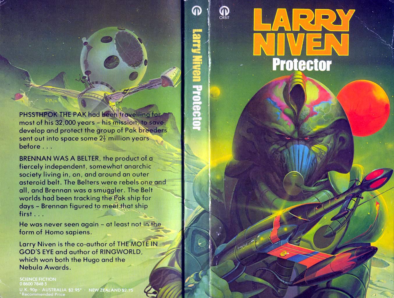
And here's the cover to Peter Andrew Jones' own 1980 art portfolio, Solar Wind. That's the same guy! Right down to the forehead coloring.
Here's Frank Frazetta's original 1970 cover art for A Princess Of Mars (left) alongside the remake that he immediately painted to replace the first one after he was convinced to sell it off. You can read the story, along with an analysis of the changes, over on the Frazetta website.
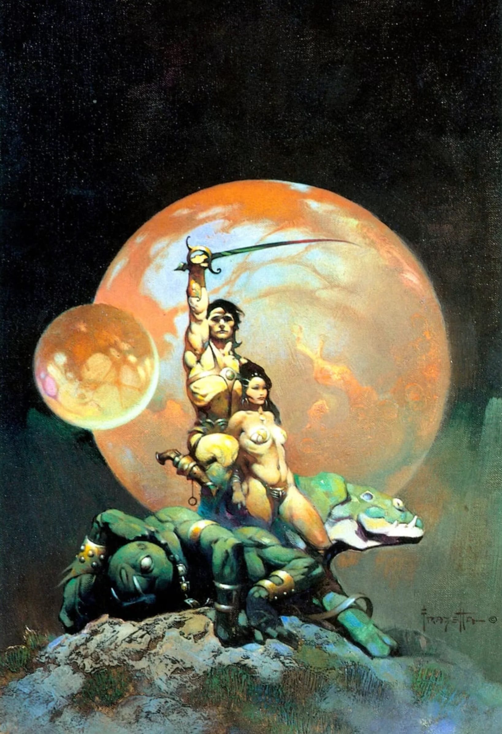
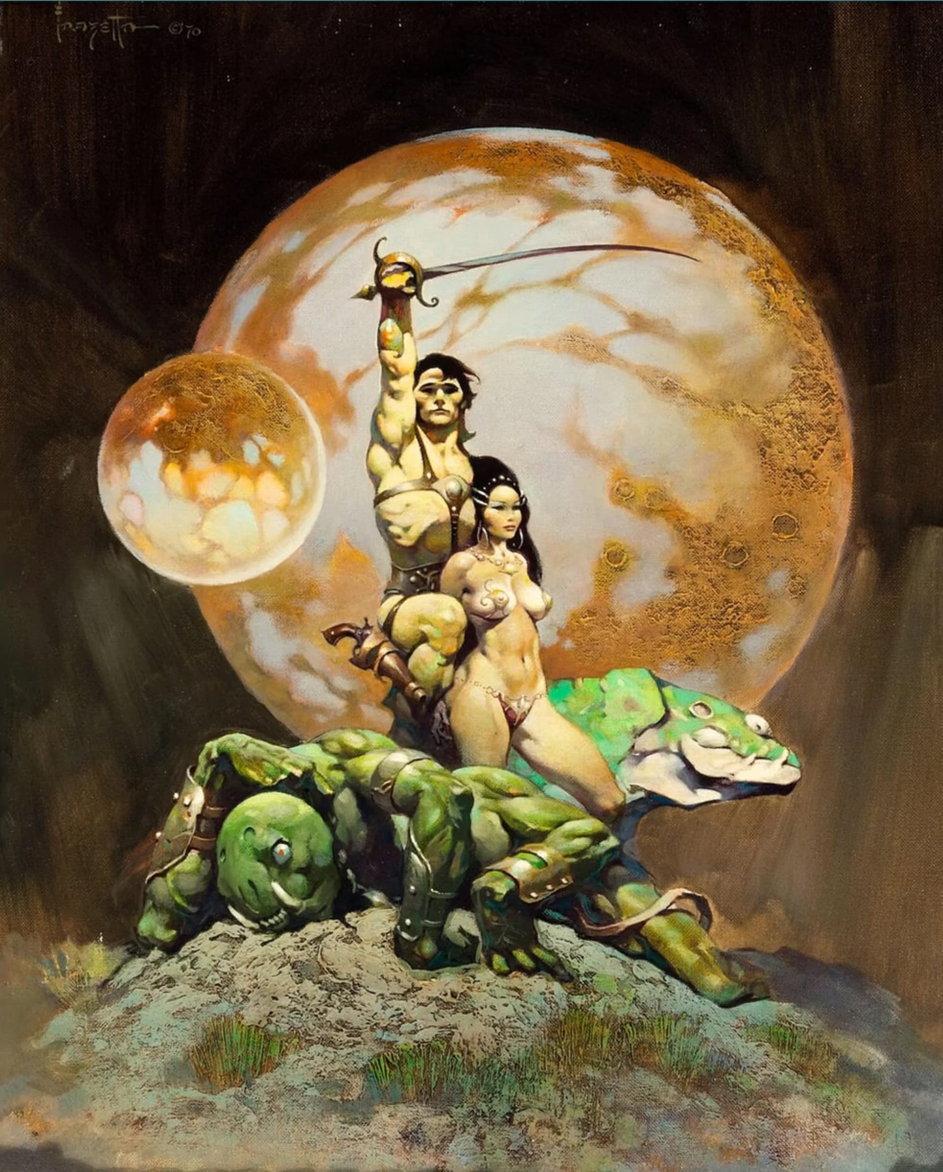
Frazetta would even paint over portions of his original canvas if he felt like it:
“Every so often people ask me why I don’t just do a new painting and leave the original versions alone. And my answer is: they’re mine. I have the right. If I see something I don’t like, I see a way to make something better, then I’m going to do it and to hell with it anybody who says I can’t!” ~Frazetta, in Frank Frazetta ICON, pg 138
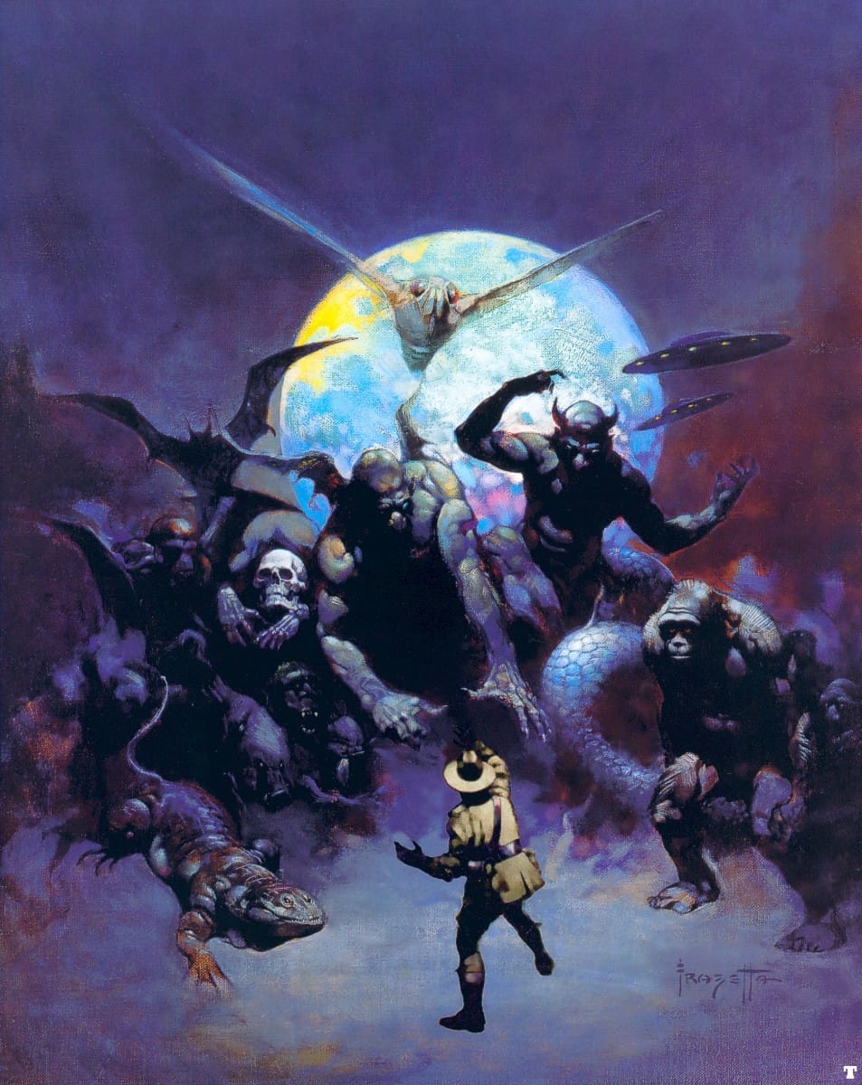
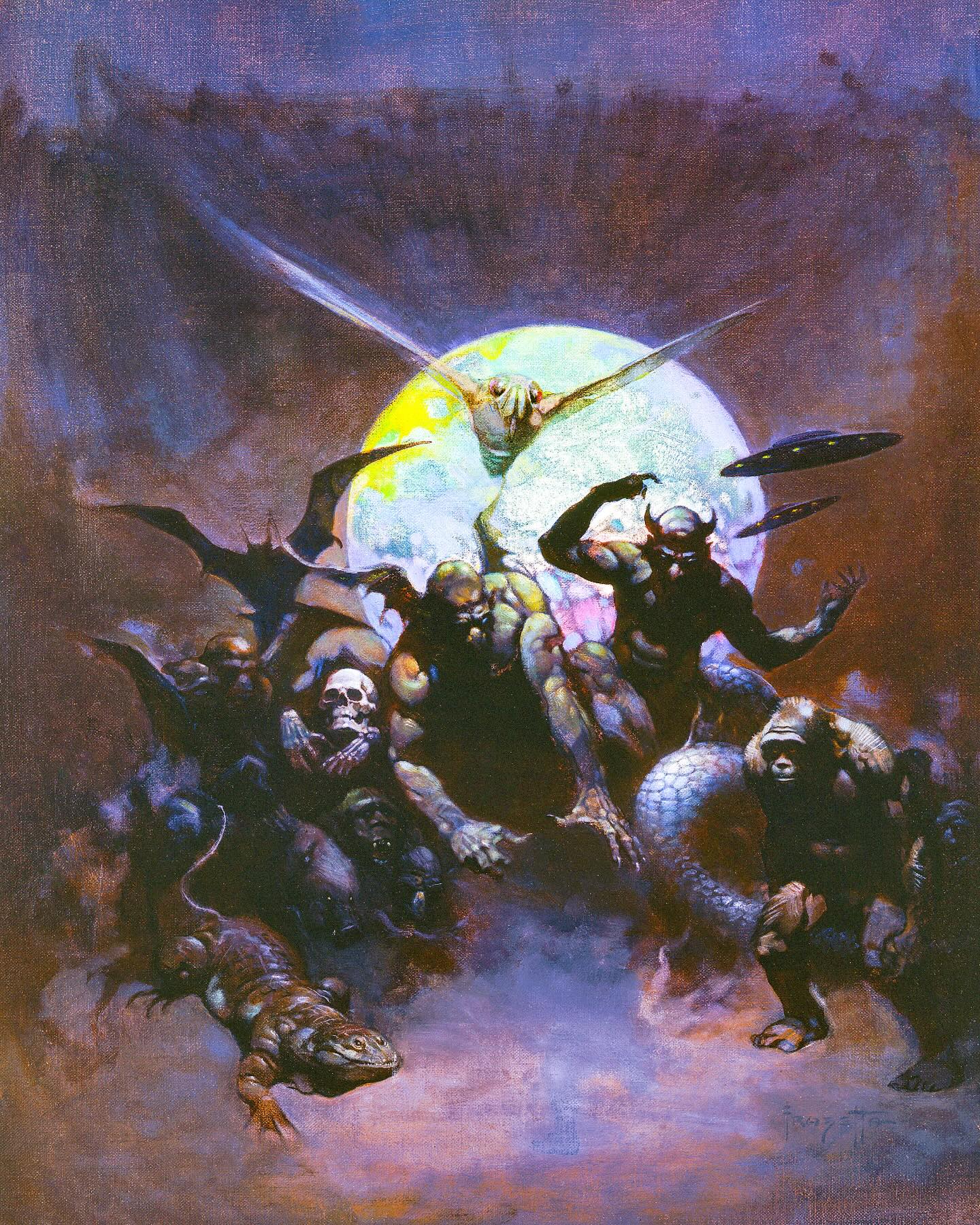
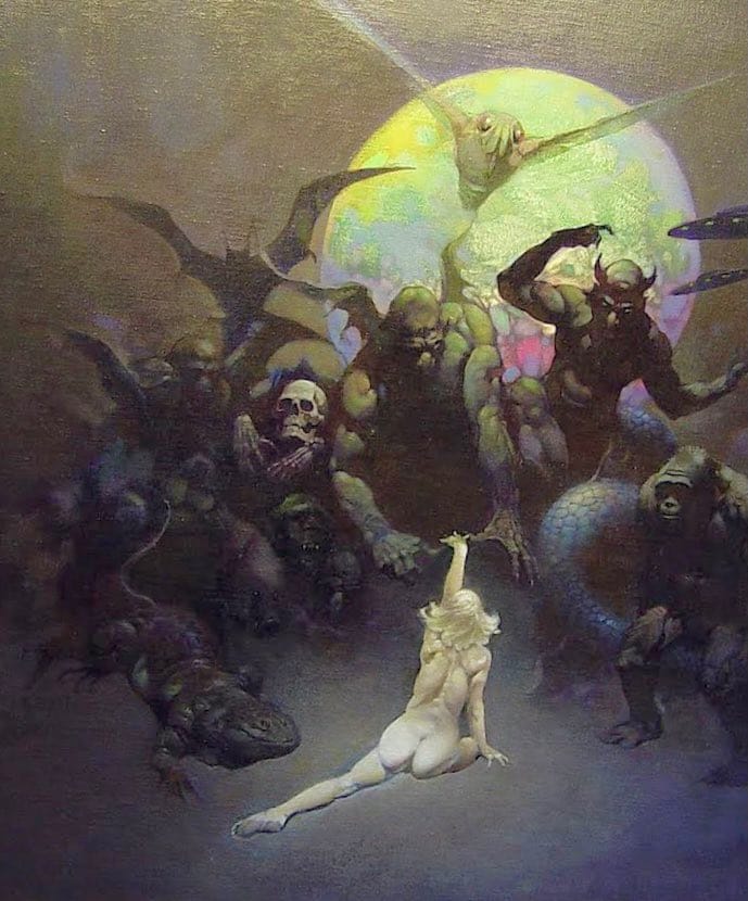
Here's Frazetta's 1970 cover to Strange Creatures From Time & Space, by John A Keel. It features a state trooper facing down a passle of monsters, but Frazetta later painted the trooper out of the scene, so that he could replace him with a nude woman who has seemingly summoned all the monsters to her.
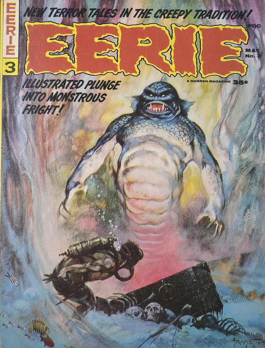
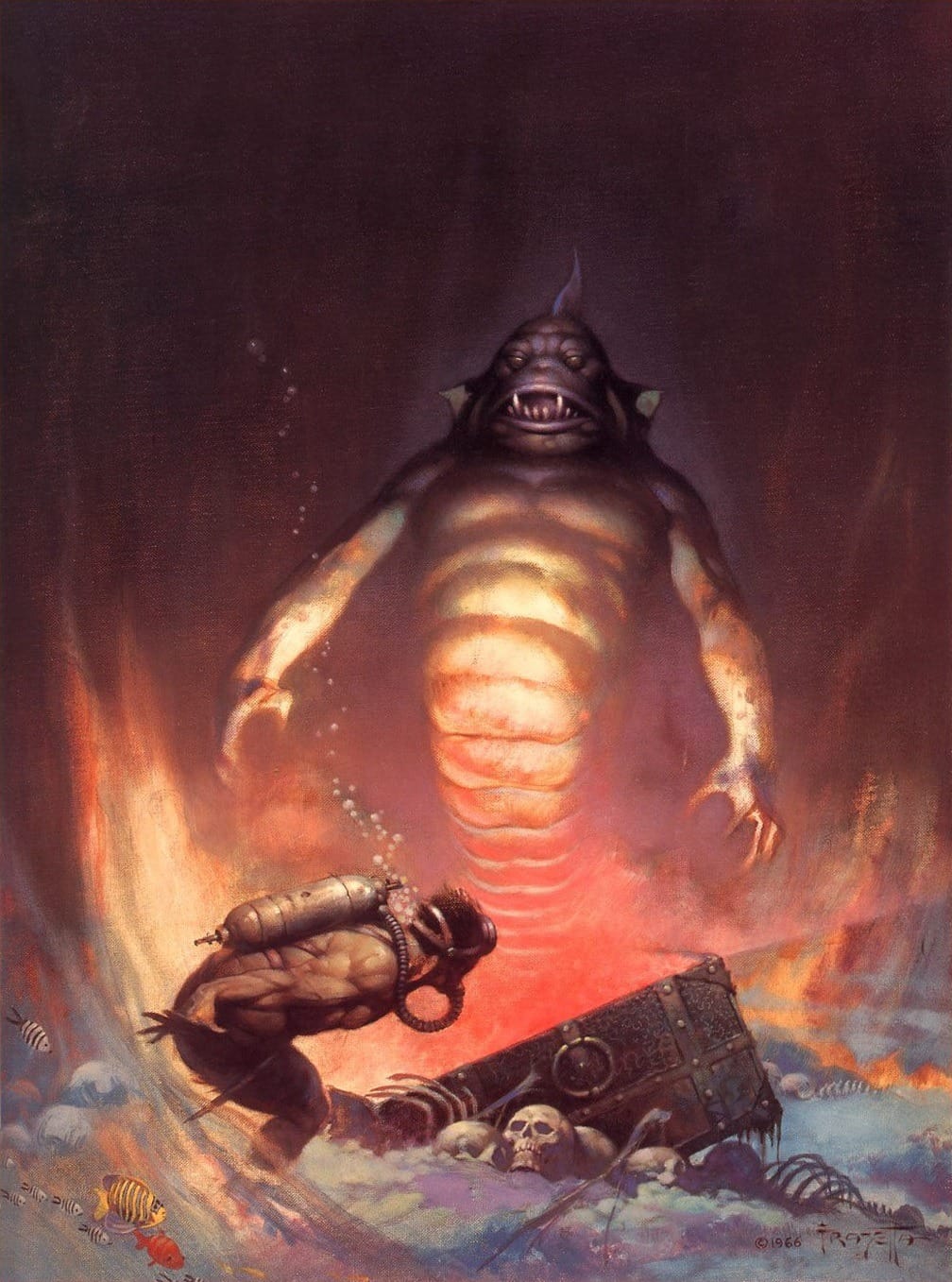
Here's one more Frazetta spot-the-difference: His cover for Eerie #3 in 1966, followed by his revisit for Creepy #97 in 1978.
Clyde Caldwell would revisit his own compositions and heroic poses, even when the entire scene itself had changed significantly.
Here's his 1980 cover for Dragon Magazine #72, followed by a very similar dragon-swordsperson-archer combo on his 1984 cover to the Advanced D&D module Dragons of Despair.
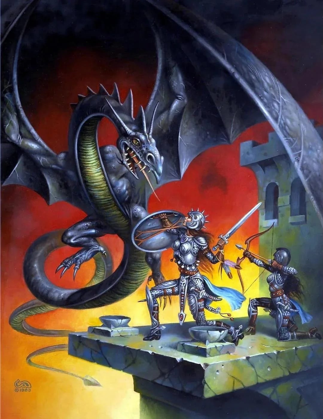
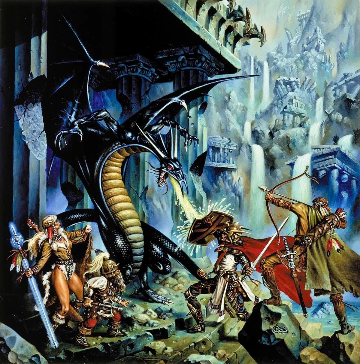
Credit goes to this reddit post for spotting these similarities.
Repeating compositions or color schemes could help illustrators keep up with a barrage of deadlines. That might have been the reasoning behind the similarities with these two illustrations by Jack Gaughan.
He had a good excuse, however: The first illustration here, “Medusa,” was planned to be used as the cover for Cosmo SF magazine's fifth issue in early 1978 (Gaughan was the art director for it), but went unused when the publication folded after four issues.
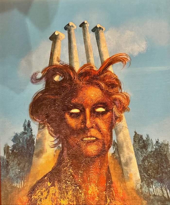
It looks like Gaughan reused the same concept for a new painting when tackling his 1978 cover to Barbara Paul's An Exercise for Madmen, but swapped in a spaceship instead of Roman columns.
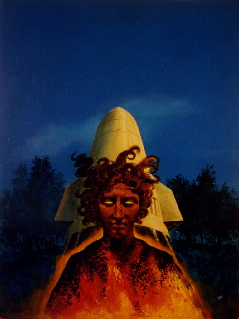
However, I'm not actually sure which one came first – Jack's wife Phoebe posted the second one on Flickr in 2012 with the title "77ExerciseForMadmen," possibly indicating that it was done in 1977.
Sometimes an artist's initial sketch is just as interesting as the final version: The left-hand illustration here is Don Dixon's 1986 cover to Breathing Space Only, by Wynne Whiteford. On the right, his sketch for it.
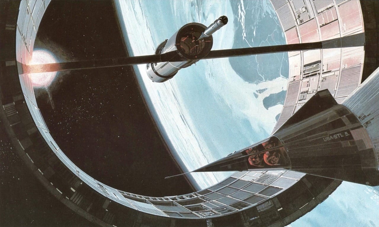
I posted this 1968 sketch by Syd Mead that depicts a space station under construction on my Tumblr last August.
Months later, I stumbled onto Mead's final version of the same piece, with a much cooler color palate.
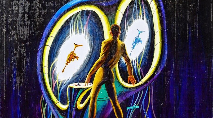
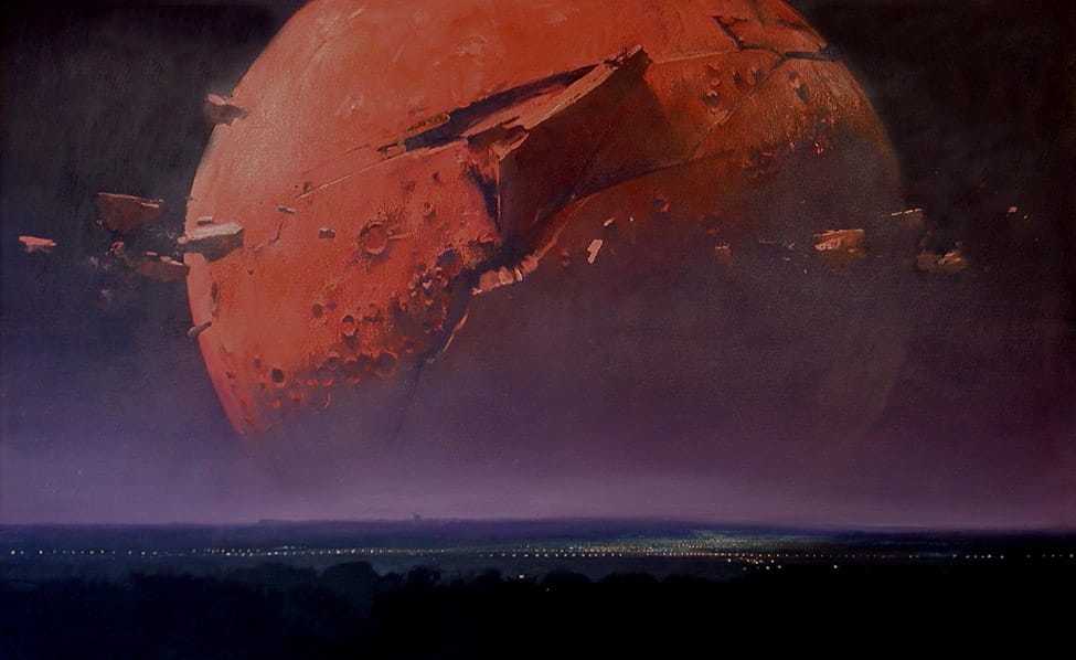
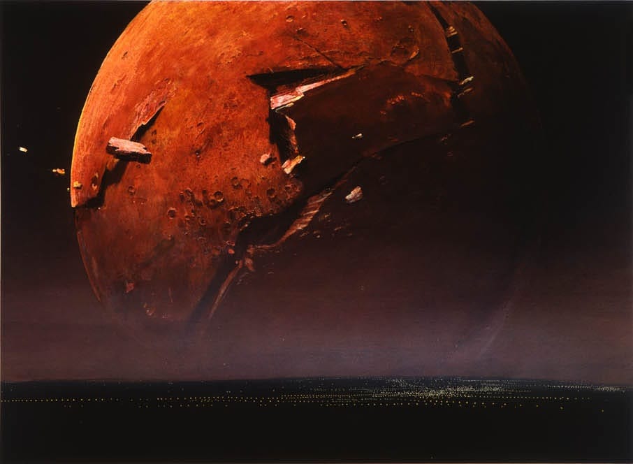
Finally, let's end by circling back to John Harris. One of my favorite artworks from the guy, "Quiet Night," emerged from a dream or vision he had about seeing the moon crashing into the Earth while standing in the playing fields of his old school.
The original was done between 1978 and 1979, according to my notes on Mass, a 2000 collection of his work, but Harris has since re-painted it.
Here's Quiet Night as it appears on his website Beyond the Horizon:
And here's another painting with the same title, taken from his agent's website:
Cool Links:
On Inevitability - Vintage RPG
A cool collection of insights from veteran game designers about whether D&D was a unique catalyst for RPGs or if they were inevitable.
Speaking of RPG legacies, here's an interesting media analysis that argues mass culture is increasingly reacting to a new form of literacy called "world" literacy.
"I date worlds-as-a-medium to the invention of Dungeons & Dragons in the mid-1970s. D&D wasn’t the first fictional 'world,' but it was the first techno-social system to make world-inhabitation mechanical and ongoing. In D&D the unit of play is campaign. Your characters persist between play sessions, unlike a board game, the world doesn’t end when you close the book. It continues right along every Thursday evening when everyone comes back."
Music rec: 🌳 Reclaimed Landscape 🪨 Eco-Brutalism Mallsoft - Junglewave - Frutiger Aero Music Mix 🌳
Next Time: Odds and Ends - April 2026