Spoiler Analysis
Plus, Babylon Berlin is great and you should watch it

I think we need more Spoiler content: Summaries, reviews, and analysis that unpacks and comments on the plot twists found in our media.
In theory, we should have plenty of this, since we’re living in such a hyperaware media environment. In reality, spoiler culture has kept us from really digging into some plot details and what they have to say.
Here’s an example of the type of article I’m talking about: It spoils a story, and depends on those spoilers to craft a thoughtful argument that weaves in fascinating historical details. You can read the story here, but you and I both know you won’t. Who has that kind of time? Instead, you should just read this relatively short article spoiling it.
The Art of Noise
Alec Nevala-Lee, Analog Science Fiction and Fact
On March 31, 1952, Campbell wrote to Robert A. Heinlein, “I’ve got an idea that may appeal to you as a starting point for a yarn. If so—I’d love it. If not—lemme know, and I’ll try it on someone else.” Campbell opened with the contention that the human brain naturally screens out useless or irrelevant information using a set of noise filters, which need to be loosened occasionally to allow for truly innovative thinking. He went on to describe a plot in which the nation’s brightest scientists are tricked into “reconstructing” an antigravity machine built by a dead—and fictitious—inventor, a notion that may have been inspired by a sentence by the cyberneticist Norbert Wiener: “Once a scientist attacks a problem which he knows to have an answer, his entire attitude is changed.”
Was that article worth getting the spoiler? Totally! But you only got to read it because it was written as a preface essay, printed ahead of the story it was discussing, smuggled into an introduction. Why? Because we’re all so well-connected online that we’ve developed austere norms for avoiding spoilers that are depriving us of some great analysis of stories that we’d probably never find the time to read anyway.
Granted, spoiler-centric analysis is still around. Once a decade or so has passed, writers are fairly free to start parsing plot twists, even if they rarely dedicate an entire article to one.
Plus, recent films, books, or TV are often spoiled in articles immediately after their release, by outlets eager to capitalize on everyone’s instinct to start talking about the ending. Vulture has a sporadic series called something like “Let’s Talk About the Ending to X.” Still, these articles don’t tend to go much deeper than just recapping the exact events.
Here’s an article in that spoiler-recap genre, covering the two big plot twists in Amazon’s gonzo Nazi-killing series Hunters. There’s a little analysis at the end, too.
Hunters’ devastating ending and its 2 twists, explained
Alex Abad-Santos, Vox
Suddenly, despite our heroes prevailing, it seems they’re now worse off than when they began. But Hunters’ twists are much more than storytelling devices that set up the foundation for a second season. They reinforce the mordant, core idea of the series: Evil isn’t eradicated easily, and putting your trust in the hands of the “good guys” is a futile prospect.
***
If that article got you excited about WWII-tangental genre TV, you should check out Babylon Berlin instead of Hunters. I’ve raved about it in this newsletter, but that was a few years ago, so for my new followers: It’s a German-language noir show set in late 1920s Berlin, following a couple of detectives trying to solve murder mysteries while the proto-Nazi movement rises to power in the periphery. It’s the perfect prestige TV combo: Detailed historical drama, plus pulpy genre twists, multipled by a great budget.
I mean, I know 1940s America was the original time and place for film noir, but after watching this, I now believe 1920s Berlin has always been the best time and place. And it covers rising fascism organically, in a way that highlights why it’s terrible and where it comes from — as opposed to Hunters’ cartoony version of fascism. Watch it! Season 3 just hit Netflix!
If you need more convincing, here’s a rant about how great is:
Babylon Berlin Is the Best Show You’re Not Watching
Kathryn VanArendonk, Vulture
The series, whose third season just hit Netflix, is so byzantine, so chockablock with plot, so twisty and propulsive — it’s the kind of show you get to the end of, and then desperately need to talk about with every single person you see for the next week. It is the most expensive non-English-language TV production ever, it’s been sold to 100 countries, and it’s epically, outstandingly gripping. But because it’s a German show, and because it’s a hard-to-categorize mix of many genres, and because it’s gone almost entirely unpublicized in the U.S., Babylon Berlin is so unknown here that I feel like I’ve been yelling about a TV show from a different planet.
Also, this isn’t related to anything, but since I’m talking about spoiler-heavy media, how’s this for a crazy one? (heads up: It’s a Knives Out spoiler)
***
All right, spoiler talk’s over, here’s a few articles on retro sci-fi artists I’ve been reading. First, an interview with David Pelham, Art Director for Penguin Books from 1968 to 1979. Some of his most famous covers were for a series of JG Ballard titles, and that’s what this interview focuses on.
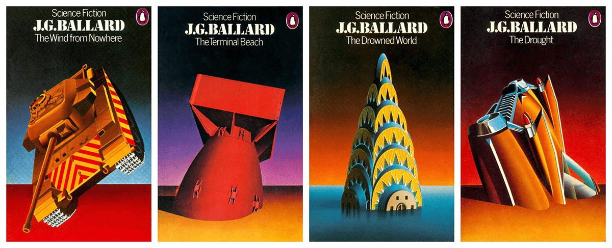
David Pelham: The Art of Inner Space
James Pardey, Ballardian
I quickly airbrushed a thumbnail sketch of a wrecked jukebox half buried in the sand, a reference from The Terminal Beach. I positioned the jukebox at an angle, suggestive of a neglected tombstone. Satisfied with the impact of the image, I then produced a variety of objects half buried in sand, all of which shared a common horizon, a strong yet simple device that related all four covers and clearly signalled that these books belonged together.
That full interview has some crazy details, like Pelham randomly wishing he could have included some audio along with a book cover, his beat-by-beat explanation of his beef with Stanley Kubrick, or his (successful) argument that “there was a lot of automobile-related art happening at that time.”
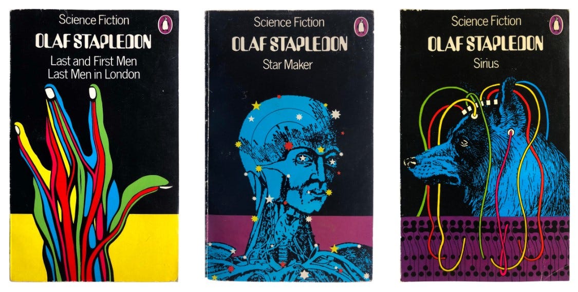
Here’s a longer history of Penguin Books, too, for anyone hoping for a dive into the mid-century publishing industry:
Penguin Science Fiction
Josh MacPhee, Justseeds
An illustrator by training, Aldridge was tuned in to the burgeoning counter-culture, and channeled that into giving Penguin a much hipper look. He took on the science fiction list in 1967, stripping Penguin’s Marber grid down to the bare basics. He placed an enlarged purple penguin in the top left, then the titles in a unique out-of-phase typeface, the author names in purple below that, and colorful, trippy, pop-art illustrations on a field of black. These covers really pushed the boundaries of Penguin design at the time, squarely yanking the aesthetic out of the 1950s and into the “future.” This is really the onset of the peak creative “purple” period, and some really sharp covers came out of this phase.
The article has some great cover analysis as well. It’s worth reading for this description of an “inscrutably terrible” cover: “It basically looks like a space viking come samurai with a butt for a head is wandering through the apocalypse on a furry beast with an extremely long tongue.”
***
Book writing is going okay, although I’m trying to step it up over the next few weeks. I’m putting in a huge amount of library holds now. I’m in the Seattle area, so hopefully they’ll come before we all get quarantined or something!