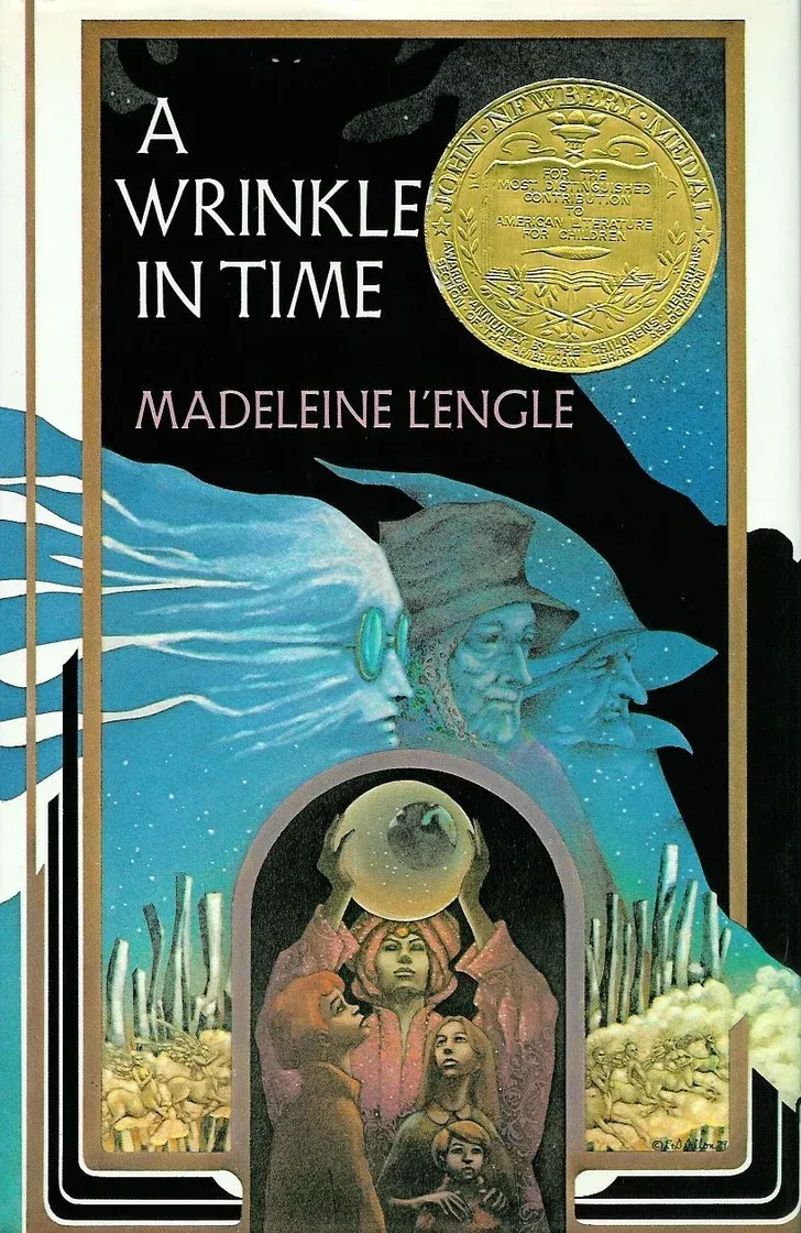
Solving the 1976 'Wrinkle in Time' Cover Artist Mystery

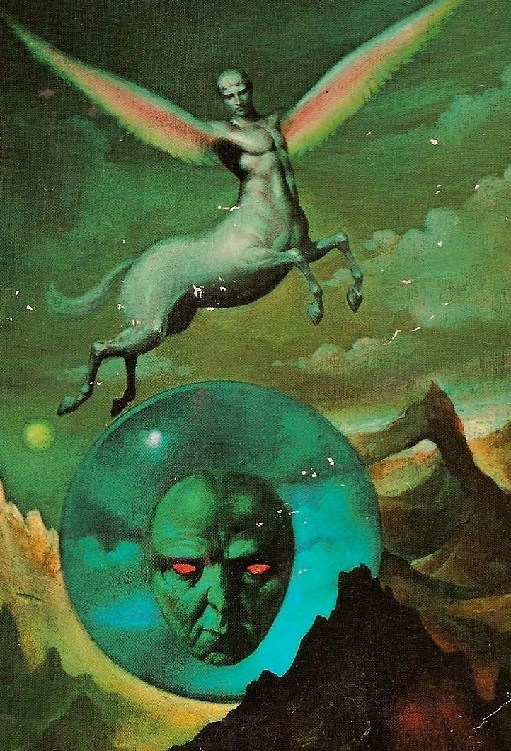
I've been posting the same uncredited cover to a 1976 Dell Laurel-Leaf edition of A Wrinkle in Time, by Madeleine L'Engle, for years and years.
I always get the same response: People recognize it as a beloved image from their childhood – one of those slightly traumatizing ones like Stephen Gammell's Scary Stories to Tell in the Dark art – and they're shocked that the artist is unknown.
Now, the artist has finally been confirmed, after an investigation started with a blog post by writer Sarah Elizabeth but detailed in a new podcast episode from Boston's NPR station. And the big reveal is: They interviewed me for it!
You can listen to the whole thing here (47 mins) along with a transcript (with images) if you'd prefer to read. It's a nice dramatic story, so stop reading here if you don't want me to spoil it!
Like science fiction, cool art, and hidden histories? Sign up for my weekly newsletter here or buy my 2023 art collection Worlds Beyond Time here!
For this email, I thought it would be fun to highlight the art the podcast talks about, along with more illustrations related to the whole internet investigation.
The list of suggested artists is huge, but most of them were always very unlikely. Some people suggested Frank Frazetta, the Brothers Hildebrandt, Rowena Morrill, or Paul Lehr, despite very different styles.
Years ago, I did think that the artists were Leo and Diane Dillon. They had a famously versatile style, and were constantly trying out new techniques and mediums - this makes it hard to rule them out for the Wrinkle in Time cover, even if it doesn't scream Leo and Diane Dillon.
However, they actually did paint a cover for a 1983 edition, which leads me to believe that confusion between editions is why some sources cite them as the artists for the 1976 Dell cover.
There was a big push years back to see if it was Charles Lily that didn't turn up anything conclusive. (Charles Lily has since confirmed it was not him, after a reader of Elizabeth's blog post told someone who knew Lily's son).
Here's a few of the most similar Lily covers from the time for comparison. The loosely defined backgrounds are reminiscent of the Wrinkle in Time background, although the style of the faces looks different.
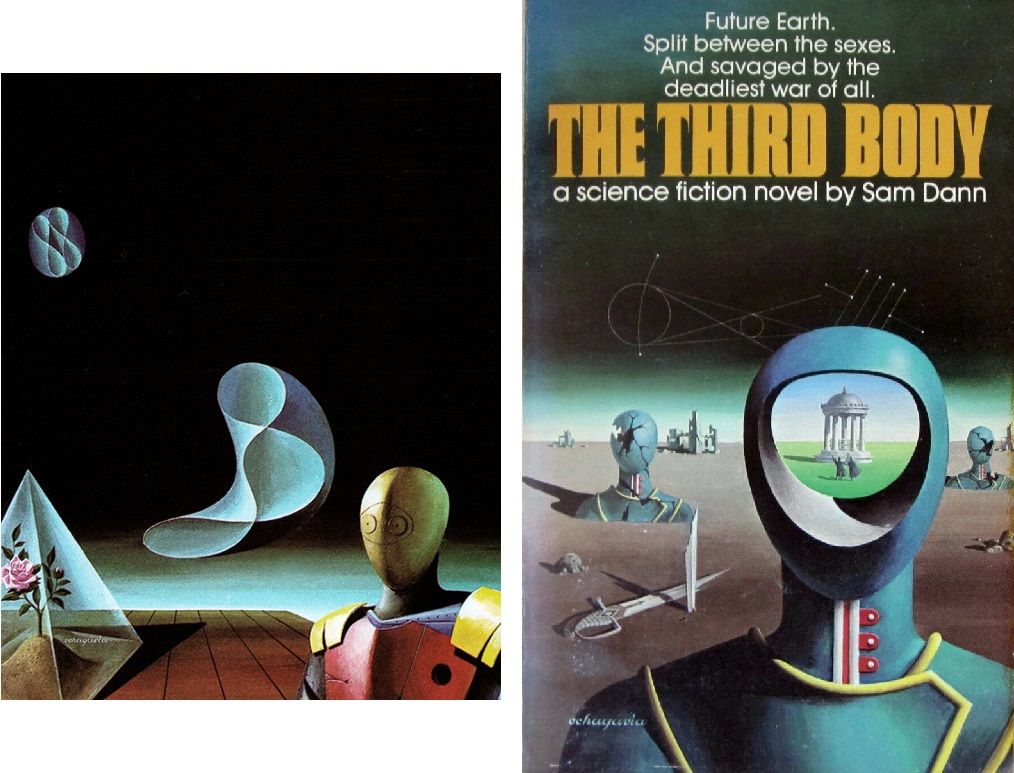
Another contender was Carlos Ochagavia, but his style at the time was very clean, minimalist surrealism like this, which really sets him apart from the Wrinkle in Time artist.
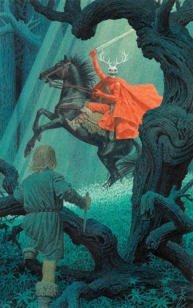
Jean-Leon Huens was one option that the NPR podcast host Amory Sivertson ran past me. As I told her at the time, I can see some similarities, but I'd say this example uses more detail than the Wrinkle cover - those lines that show up in the horse's tail, tree trunks, and that guy's hair aren't replicated in the Wrinkle cover at all.
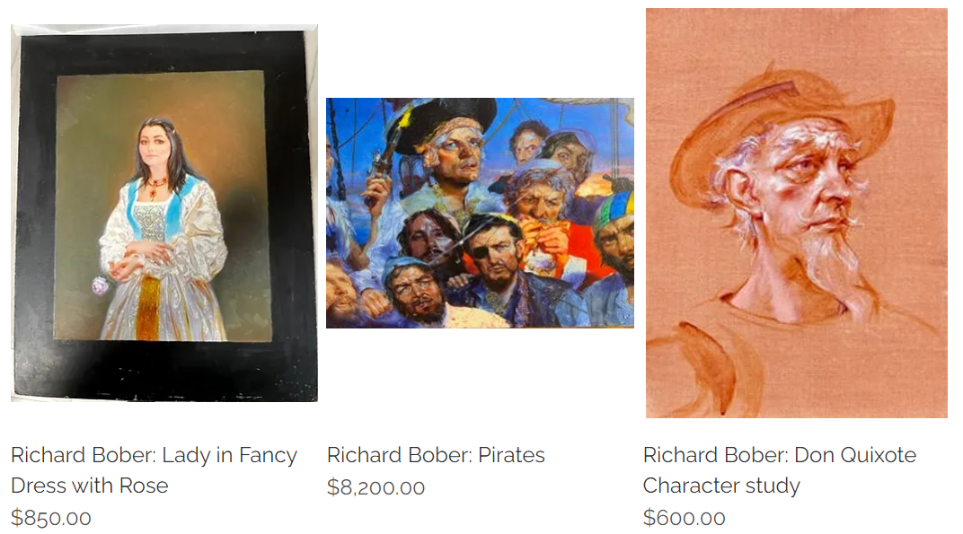
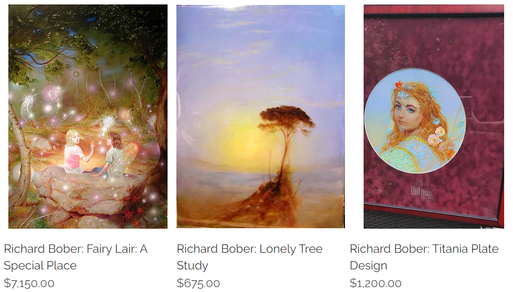
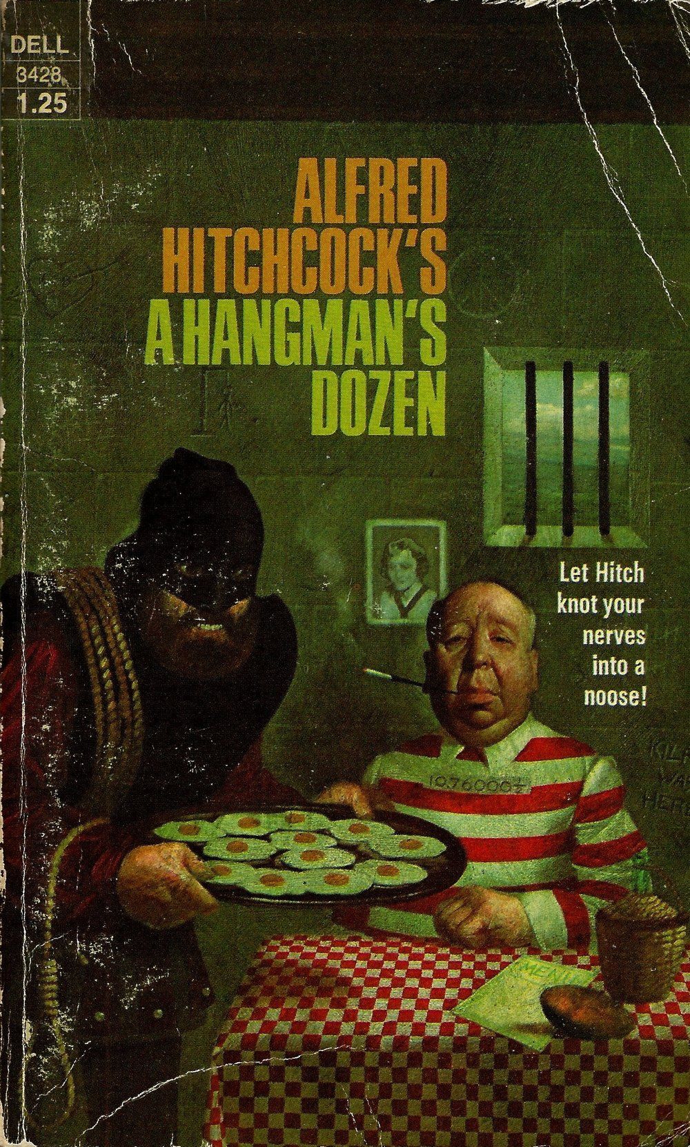
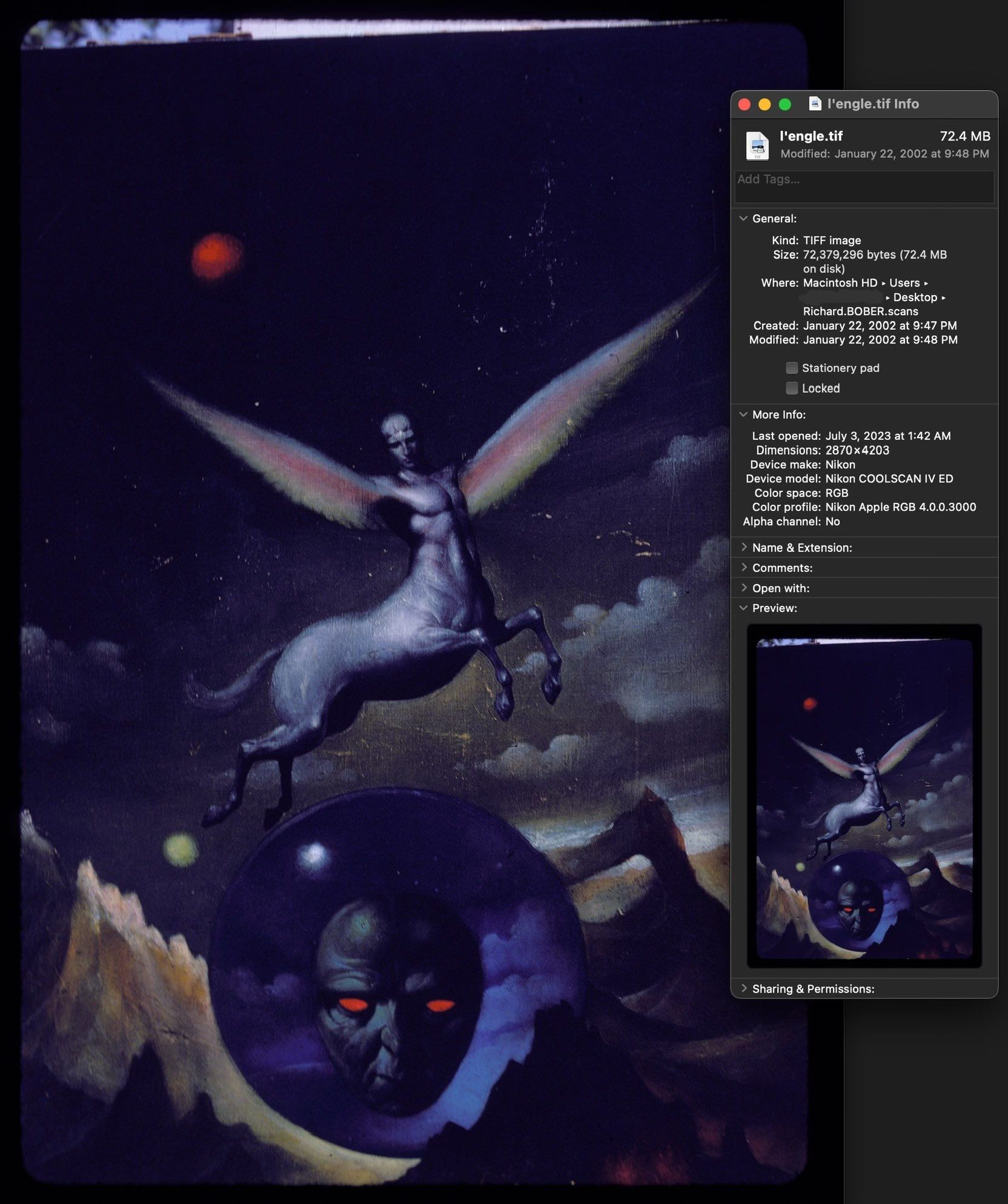
The one artist that I really thought showed promise was Richard Bober, and he did turn out to be the artist. Granted, Bober's later works, from the 90s on, don't resemble the style or subject matter of the Wrinkle cover much at all. Here are a few from his online portfolio.
But Bober did do plenty of Dell horror covers during the mid to late 70s, so he certainly had opportunity. And more importantly, his covers during that time looked much more like the Wrinkle cover. As it turns out, Bober's style has evolved quite a lot over the decades since he first started out.
I was won over by the argument that art blogger Wallace Polsom made on Twitter over here. He posted four horror covers, some of which are dominated by a shade of green very close to the one that dominates the Wrinkle cover.
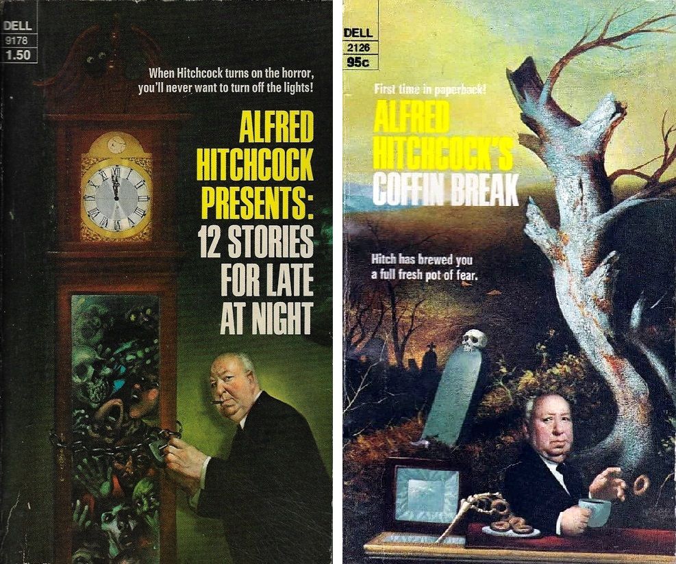
But it's these two covers that feature a lot of imagery choices that cross over with the Wrinkle cover. The green palette is even more similar, and the background seen through the jail bars here is loosely defined, with clouds and land.
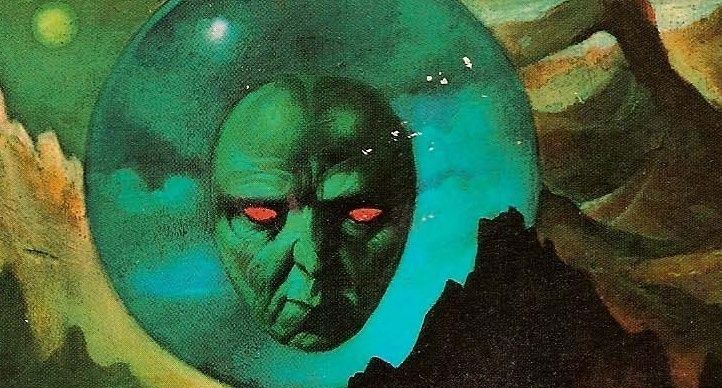
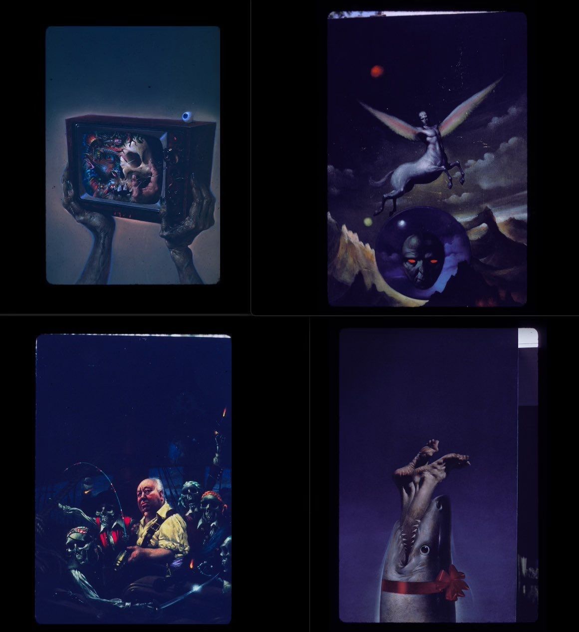
And this one is the most similar, thanks to the multiple green monster faces that share a lot with the green mask-like visage on the Wrinkle cover.
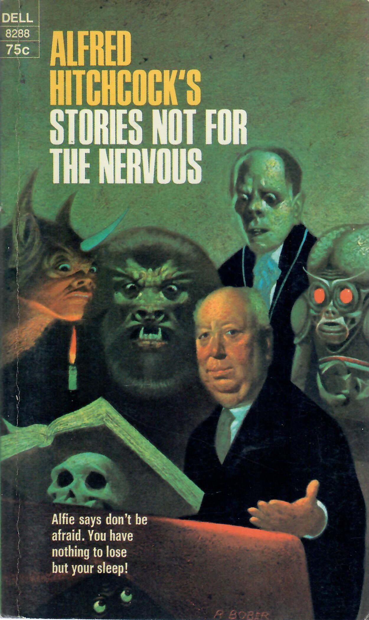
The face on the Wrinkle cover is rounded and facing the audience head-on, like the monster second from the left on the Nervous cover. It has the heavy-browed human face of the third from the left monster, and it has the butt-crack looking forehead and all-red eyes of the monster farthest to the right.
The red eyes in particular are pretty convincing, given that the red and green pairing uses such incredibly similar shades of paint. It's easy to picture Bober reaching for the exact same tubes of paint when looking for a suitably striking complementary color pairing on two different paintings featuring creepy monster eyes.
Side by side... notice that the green-skinned, red-eyed face on the "A Wrinkle in Time" cover is like a combo of three green-skinned lurkers -- one with red eyes! -- on the "Stories Not for the Nervous" cover. Is this the smoking gun? LOL! pic.twitter.com/lY19t4UPtb
— Wallace Polsom (@wallacepolsom) May 30, 2023
And Bober's family was able to confirm that it was indeed by him!
Here it is among the photos he took to document his work, as described during the podcast starting at around 36:20. Those other paintings are pretty sick! Thanks to Leon Bober and Amory for these images, which I don't think you can find in a size this large outside this newsletter:
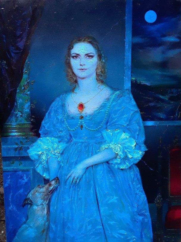
Here's another Bober painting, "Lady Vampire," that Elizabeth had already known and loved before finding out Bober also did the Wrinkle cover.
Finally, there's a coda to the story.
The podcast episode doesn't bring up another uncredited Dell cover for the next book in Madeleine L'Engle's series, A Wind in the Door.
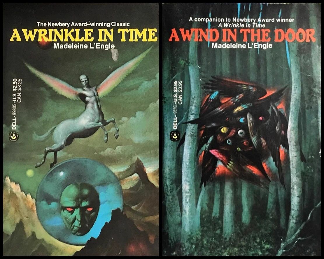
Many others have noted that it also looks like Bober's style, so I mentioned that to Amory and she texted the Bober family about it. They can't immediately confirm it, but they are pretty sure that he painted it as well.
***
To keep the "hunting down the uncredited artist" theme of this newsletter going, here are two more interesting stories:
First up is Geedis. Amory Sivertson mentioned this podcast episode when she was interviewing me for the Wrinkle in Time one, so I gave it a listen and it's great. The setup is about the same: No one knows who created Geedis, or even what the context surrounding it is. But it's immediately so much funnier, because this is the context-less Geedis illustration:
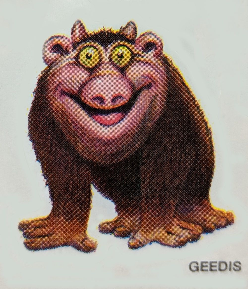
If you don't think that this goofy cartoon manifesting itself into existence like an r/nosleep villian in real life isn't the funniest thing, I don't know what to tell you.
The other story is a little quicker: It's this Metafilter thread focused on tracking down the artist behind this iconic 1991 box art for Sid Meier’s Civilization.
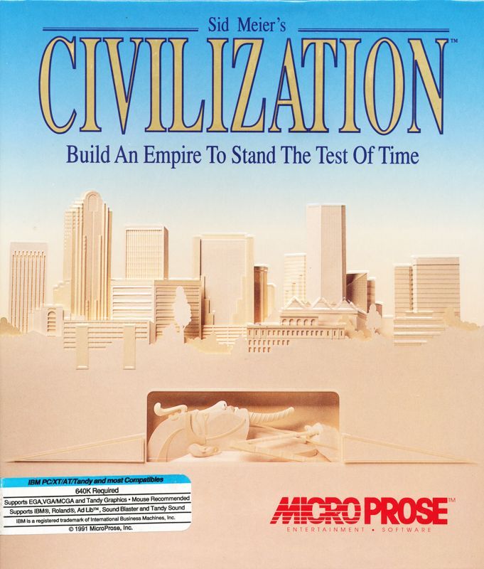
There's no dramatic podcast retelling this time, so I'll just give you the answer: It's by Sally Vitsky. And one of the more interesting details about this piece comes from its Wikipedia page rather than the Metafilter thread:
"The box art itself wasn't made for Civilization. It's a promotional poster for the traveling Ramesses the Great exhibit at the Mint Museum in Charlotte, North Carolina in 1988-1989. The city skyline in the background is that of Charlotte in 1988. Most of the buildings shown are still present."
***
That's all! Check back in next week for another exciting Extended Edition art book excerpt.