Retro Paperback Art in 'Black Mirror'
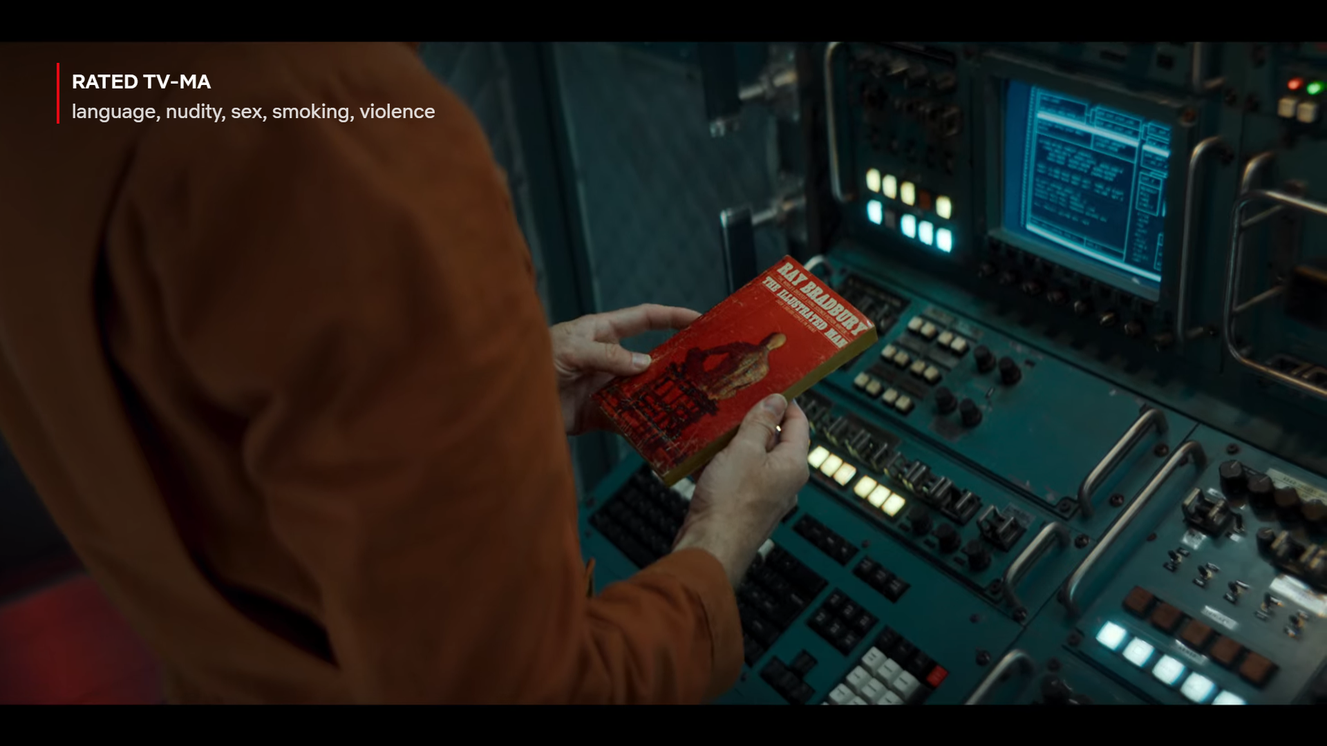
The new season of Black Mirror recently came out on Netflix, and the third episode confirmed something I've suspected for a while: Someone working on that show really knows their retro paperbacks.
Read on for mild spoilers for the third episode of this season, "Beyond the Sea," as well as for the 2018 one-off film "Bandersnatch." (You might want to watch it first, as I thought this whole season was pretty fun. The show really fits that Twilight Zone format of serving up twists that are just predictable enough that the real fun is trying to guess them as you're watching.)
That top image is from a scene set in a spaceship in an alternate reality 1969. The ship is about two years into a six-year mission, and apparently this is a reality in which NASA can afford to ship paperback books up for reading material, because one of the astronauts is reading Ray Bradbury's The Illustrated Man, complete with a barnburner Dean Ellis cover.
Here's a closer look:
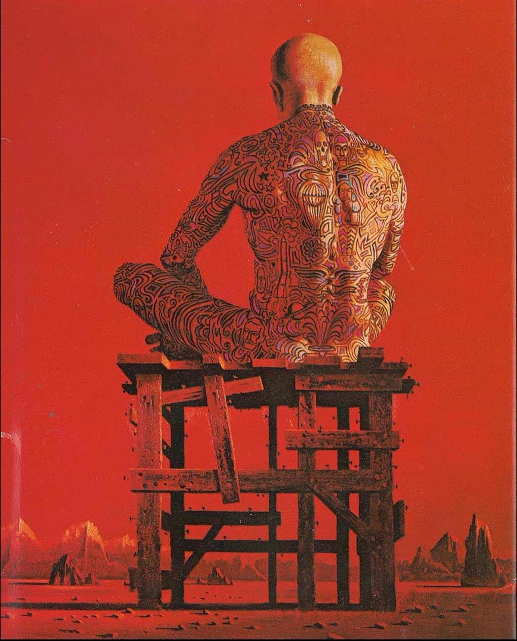
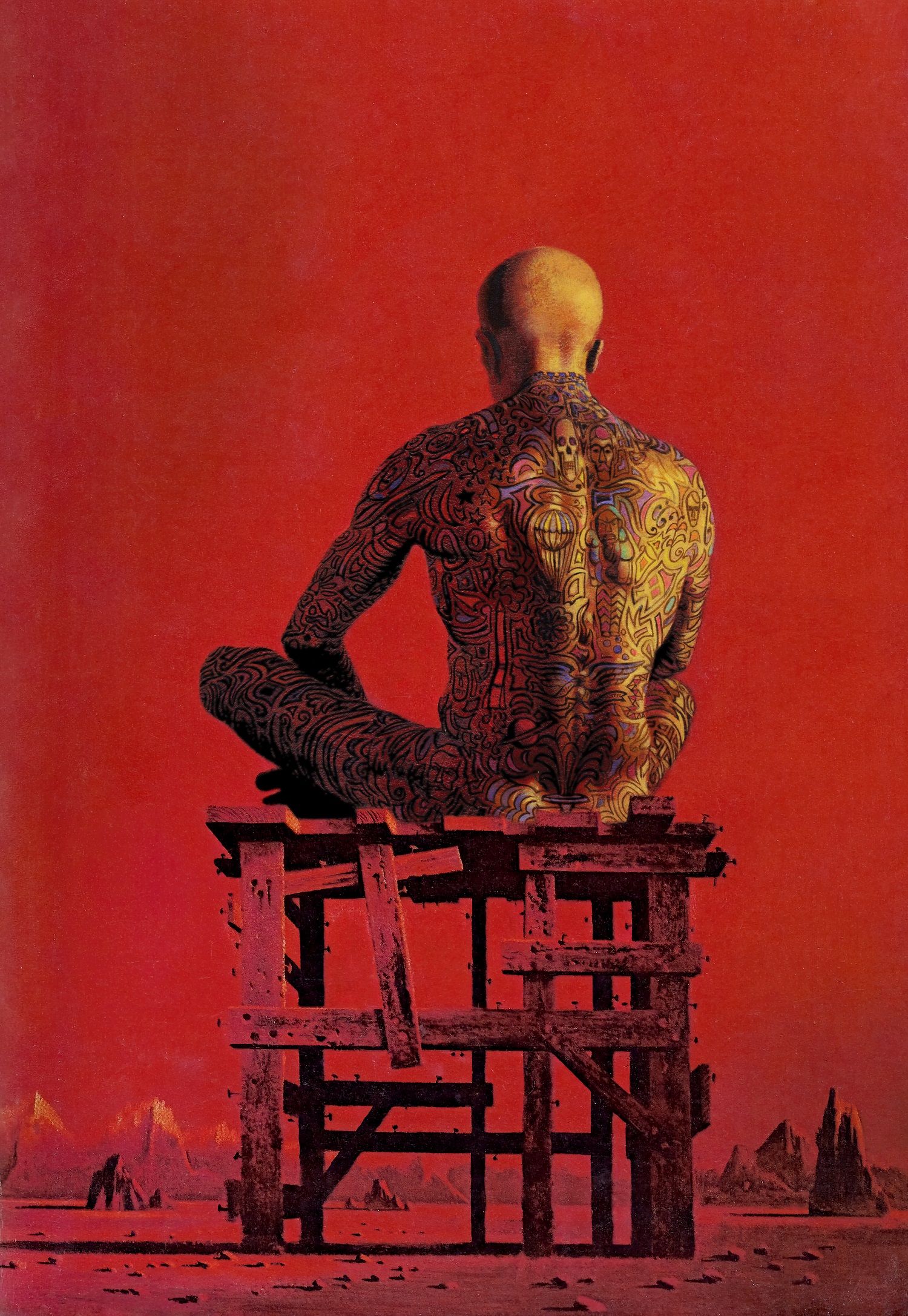
This edition first came out in 1967, so the timeline works (even if it's cutting it a little close). But the real reason this is a great cover to include is that it's one of Dean Ellis's most iconic artworks, as well as a fit for the show.
Ellis was always good at the style of art that paperbacks need: Something with intricate detail but a single central shape that is identifiable from across a grocery store or when you see it for a few seconds on your Netflix show. The Illustrated Man cover has colorful tats and lots of individual crate nails to stare at, but one central image, a cross-legged man. But this cover in particular evokes more ennui than the typical Ellis, too, since the man is isolated, staring into the distance, his thoughts unknown. There's some thematic relevance to the episode here.
Paperback art in the late 60s wasn't always this detailed, and the other paperback book in this episode is an example of the surreal elements that were a little more common in the decade.

It's a 1968 edition of The Moon Is a Harsh Mistress, by Robert A. Heinlein, with a cover by Paul Lehr.
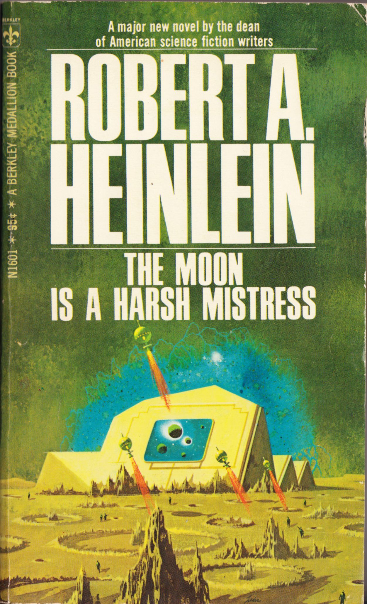
Lehr was a big artist during this period, so he's a clear pick. This particular cover isn't quite the style that I associate with Lehr, although it does use one of his favorite tropes: A crowd of tiny figures gathering around a single object, in this case a moon base.
One of Lehr's big influences was the cover artist Richard Powers, who dominated sci-fi covers during the '50s with his era-definingly surreal approach. In my opinion, the Harsh Mistress Lehr cover is slightly more strongly modelled after Powers than most Lehr covers, even for this time period.
For contrast, here are a few Lehr Heinlein covers that have a clearly Lehr-esque look, with more shadows and monochrome color (both of these were editions from the same year and the same publisher, Berkeley Medallion).

The spine of one Richard Powers paperback is actually visible in that earlier screenshot of the 1969 bookstore: This 1967 edition of Galactic Odyssey, by Keith Laumer.
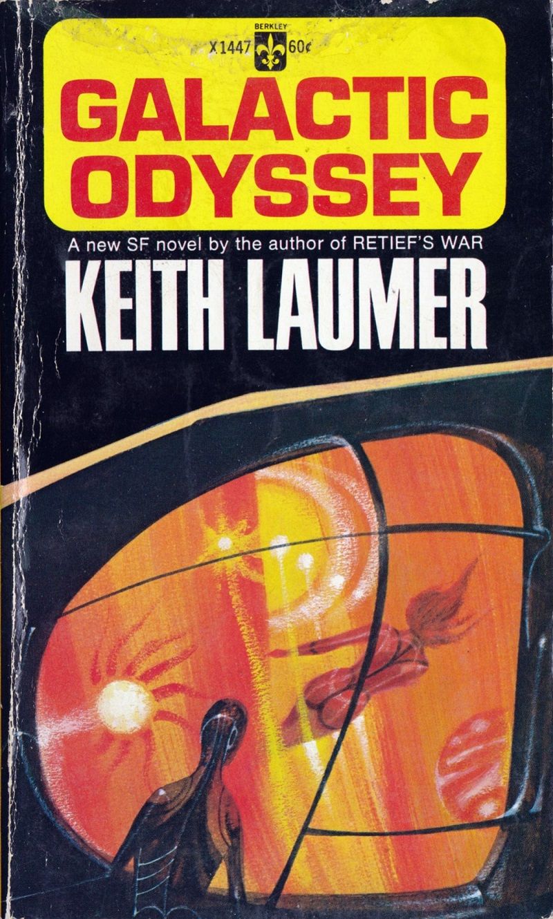
This cover isn't actually shown in the Black Mirror episode at all, but I wonder if there was a plan to include it any some point: The cover appears to feature a man enviously watching a woman from behind a window screen, which would have packed some impressive symbolism in the context of the episode itself.
I didn't see any other covers visible in the episode. I couldn't identify the two paperbacks in the stack here: The bottom spine looks like it says The Martian Chronicles to me, but I couldn't find a cover that looks like it fits out of the options available on ISFDB.

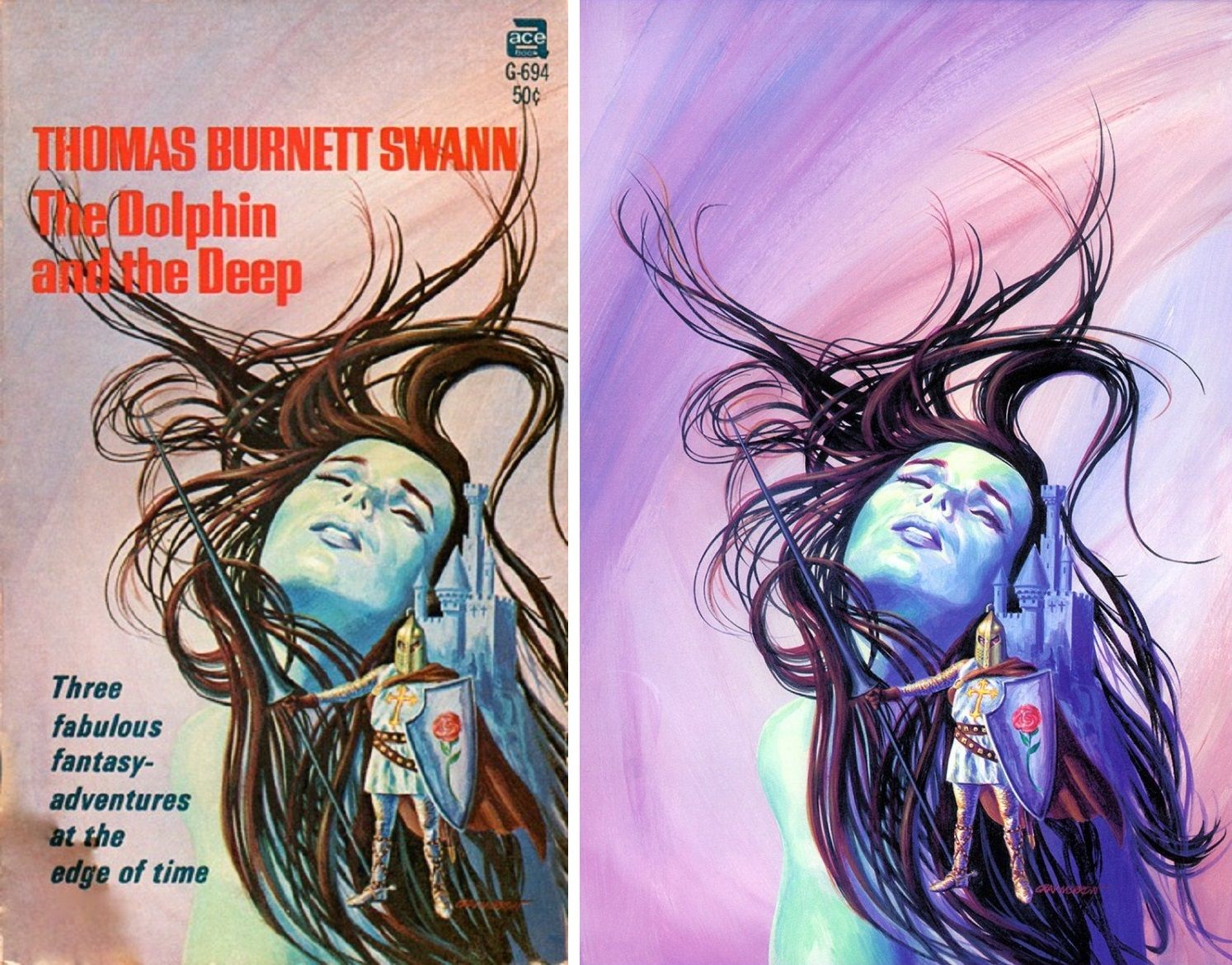
The bookstore shelf had one other spine I could make out: The Dolphin and the Deep, by Thomas Burnett Swann, which only had a single edition: This 1968 one, with cover art by Gray Morrow.
Anyway, that's my take on Black Mirror's use of 1960s paperbacks. A lot of great choices at work here.
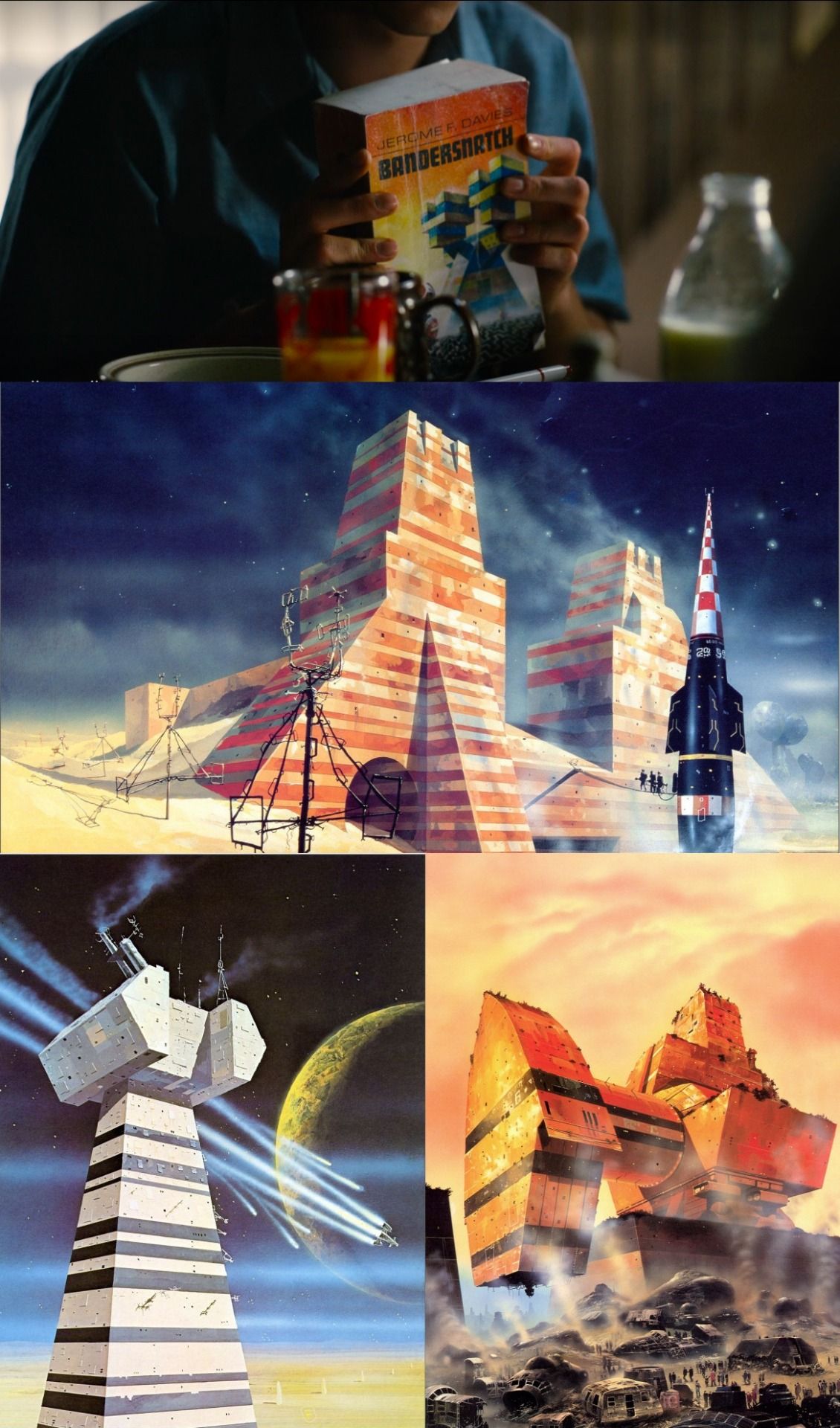
Oh, and the Bandersnatch Black Mirror episode? It heavily features a fictional '80s paperback, and the show commissioned an original Chris Foss illustration for the cover. Here's a screenshot of that cover, along with three older Foss illustrations that most closely resemble the striped building that Foss depicted.
__
One last note: That Dean Ellis Illustrated Man cover is so iconic, in fact, that I've already included it in my art book, which is out next month.
The original artwork is owned by a private party who declined to allow me to use a scan - sadly, the only high-quality scan of the original work available online is this 2014 auction house flyer, and it has text over it. But look at those satisfying brushstrokes!

If any of my readers know a photoshop wiz, I encourage you to dare them to remove the text from that flyer - here's the largest version of it online. But I'd be shocked if it's actually possible.
Instead, I had a textless version restored from several paperback covers using the artwork. I'm including it here – this is its online debut! The brushstrokes aren't there, but I believe this is the biggest and best text-free version of this iconic Dean Ellis artwork available on the internet.
