Orange and Teal


If you were a movie nerd on the internet in the late 2000s/early 2010s, you're familar with orange and teal.
The two colors are opposed to each other on the color contrast wheel, so they look good together. And since orange roughly translates to the fleshy skin tones of the actors that movies always want to call attention to, filmmakers would often dress people and sets in blue.
But when digital film and color grading emerged, we started a little too much orange and teal. It was cool when O Brother, Where Art Thou? did it, but we have to draw the line somewhere, as many Medium articles sternly warned in 2011.
But the "orange vs blue/teal" trend has been around for as long as people have been combining colors, so it's no wonder there are plenty of eye-popping examples in the heavily saturated world of retro science fiction cover art.
(And yes, I'm playing fast and loose with my colors here – some of these oranges might be yellows and some of the teals are definitely blues. Don't worry about it!)
Let's start with Davis Meltzer's 1975 cover to Mack Reynolds' two-in-one title The Five Way Secret Agent and Mercenary from Tomorrow. Here, the color contrast serves to separate the steeples of an old town from the golden curves and orbs of a futuristic city expansion.

Fun fact: That Meltzer art is uncredited and unsigned in the publication and has been misattributed to Jack Gaughan. However, Ragged Claws called it a Meltzer in 2013 and was recently vindicated by a 2024 auction listing that included Meltzer's signed preliminary art.
Meltzer liked that color combination – here are three similar examples to prove it.

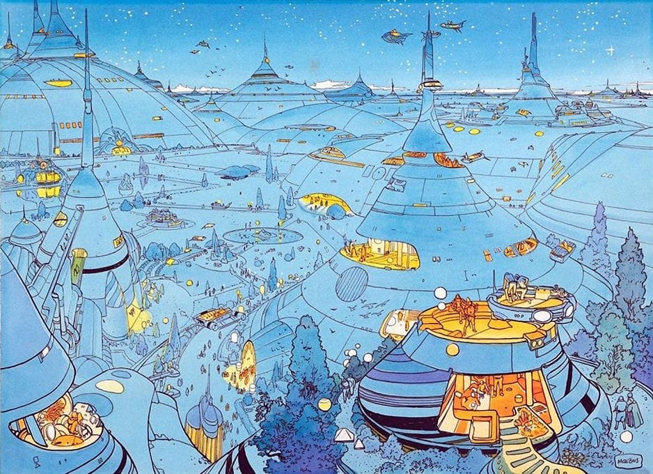
True to his towering reputation, Moebius might have the most motivated color choices out of my picks for this post. Within this friendly and calming cityscape, the night sky casts a blue tint over everything, dotted with pockets of warm orange list from various domociles and flying cars.
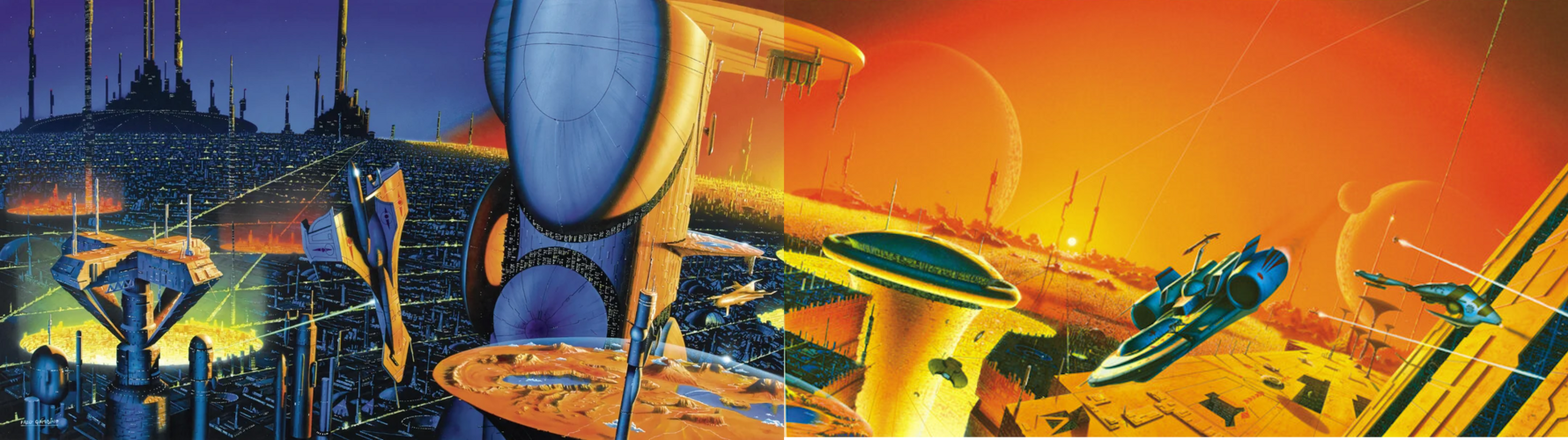
Fred Gambino's series of six covers for the 1994 editions of Asimov's Foundation titles can all be combined into a single sprawling scene, likely depicting the planet Trantor, as a teal night gives way to a blazing orange day.
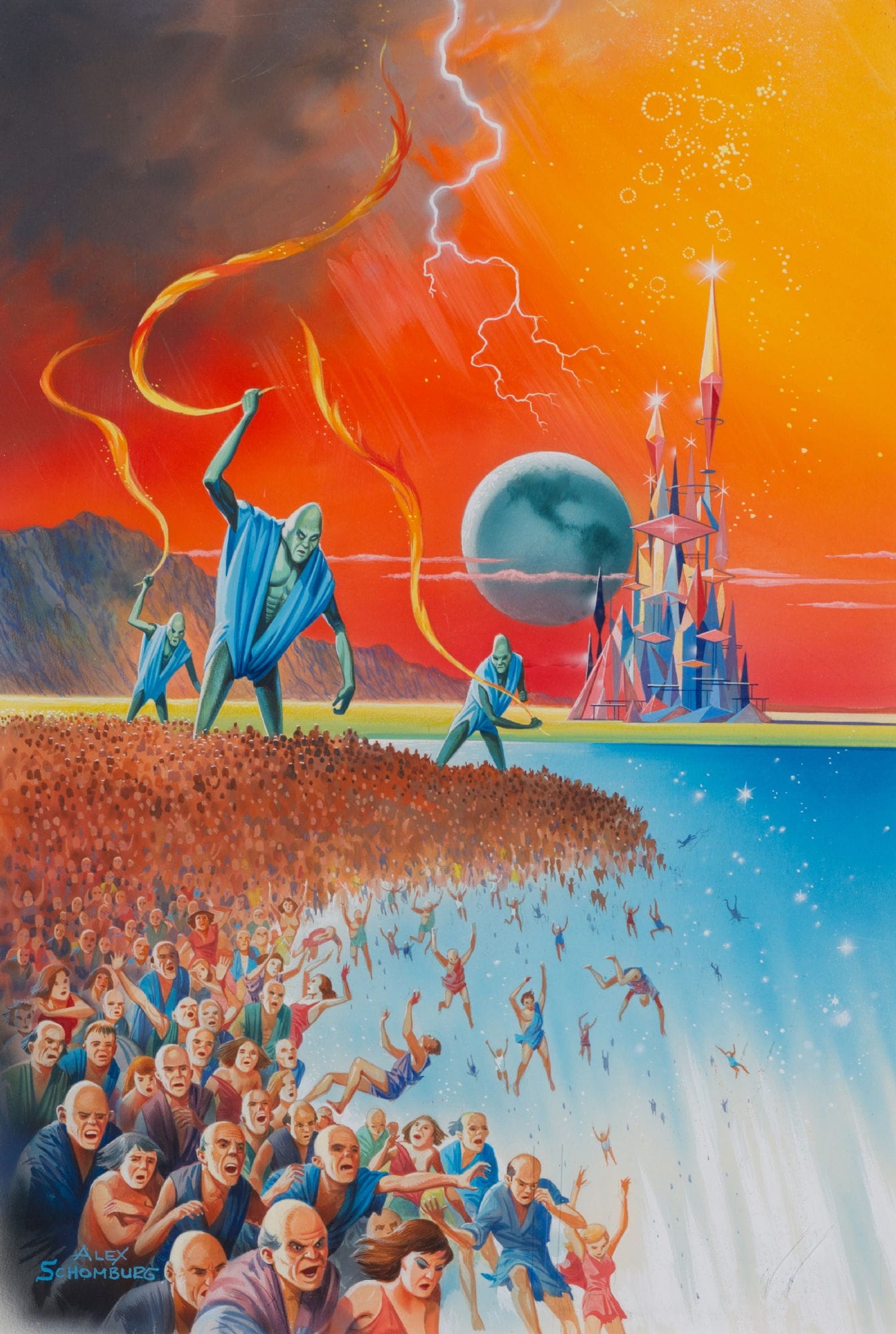
There's also whatever's going on with Alex Schomburg's 1965 cover to The Well of the Worlds by Henry Kuttner, where the color contrast helps the viewer tell the difference between the sky and, uh, I guess that's the lower section of sky?
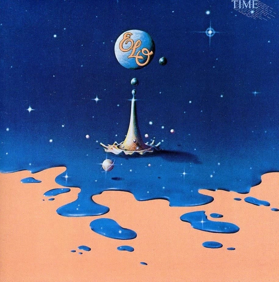
What would the entire universe spill out onto? Probably a tan tabletop of some sort, as posited on Guy Fery's cover for ELO's 1981 album Time.
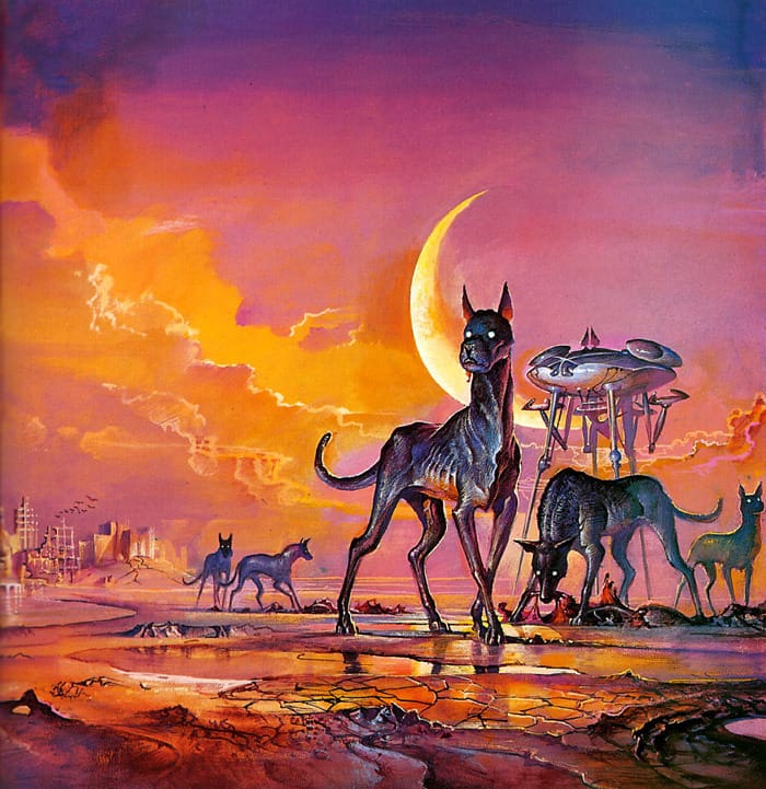
This Bruce Pennington illustration of hounds in an alien apocalypse – his 1984 cover to The Book of Frank Herbert – includes plenty of other colors as well, so it might not be the best example. But it's very pretty!
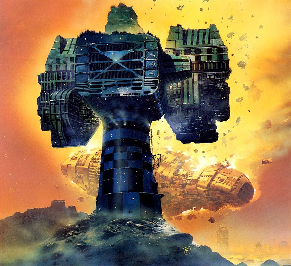
This other Pennington fits the brief better.

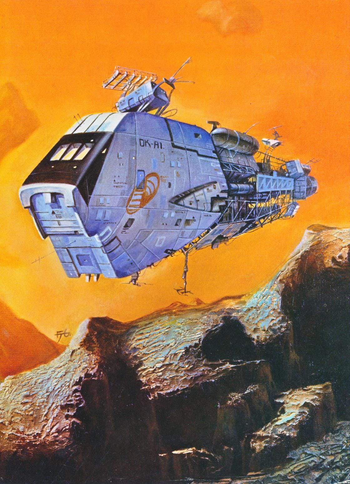
Spaceships and other gadget covers got the orange and blue treatment, too, like this 1984 Chris Foss cover for Eclipsing Binaries, by Stephen Goldin, and E. E. 'Doc' Smith.
Or this Fred Gambino illustration, which popped up in the Steven Caldwell-edited 1980 collection Space Patrol: The Official Guide to the Galactic Security Force.
Or John Schoenherr's 1963 cover to Man of Two Worlds by Raymond F. Jones.
This 1989 Don Lawrence commission for Dutch Railways' 100th anniversary already popped up in my trains of the future post.

Speaking of stuff you've already seen, I included this Frank Kelly Freas Analog cover in my post about sci-fi smoking, but it's perfect here as well.
With this illustration, Freas emerges as the one orange-and-blue artist to take full advantage of alien biology in order to make the skin itself the blue element in a scene. (Well, maybe the second artist, after that Avatar poster designer.)

Not to be outdone, Jack Gaughan has his own stylish orange and blue illustration, too, with his December 1969 cover to Worlds of If magazine, illustrating Gordon R. Dickson's "Ancient, My Enemy."
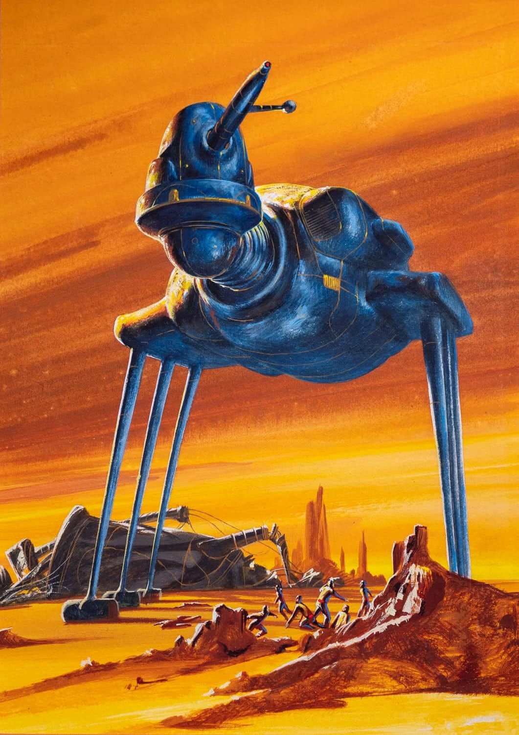
The most beautiful spacesuit depicted with this type of color scheme has to be David Bergen's 1977 cover to Charles Logan's Shipwreck (which also appeared that same year in The Flights of Icarus art collection by Martyn Dean, Roger Dean, Donald Lehmkuhl).
Just check out all the dials and straps on that floppy suit.

That's all the orange-and-teal images I've dug up so far, but I have no doubt there are dozens more – it's a basic, visually pleasing combination of colors during an era that prioritized splashy pops of illustration.
Cool Links
The Rise and Fall of Time-Life Books - Target Marketing
Apparently these mail-order books were the company's most profitable division at one point. They weren't traditionally published, so their impact went under the radar at the time. And, since the internet kinda replaced this type of general information series, they're far more obscure now. This article's from 2001, the year Time-Life Books shuttered.
Once Upon a Time (1976) - Vintage RPG
I'm loving all the fantasy art collections that Stu's been reviewing on his blog lately. This one's about a collection edited by David Larkin right before he edited the more famous Gnomes collection, so it's a bit of a missing link in fantasy art history.
Music rec: Confused bi-Product of a Misinformed Culture's The Rabbit Hole IX - A Deep Bass Mix
Next Time: Ed Emshwiller's Four-Armed Santa Claus