Groovy art

Most 70s sci-fi art doesn't fit the stereotype for the pop art trends of the time. No bell-bottoms, no Peter Max Astrologicalendar inspo, and no yellow submarines that aren't airbrushed into hyperrealism.
But there's an exception to everything. Here's a roundup of the grooviest examples.
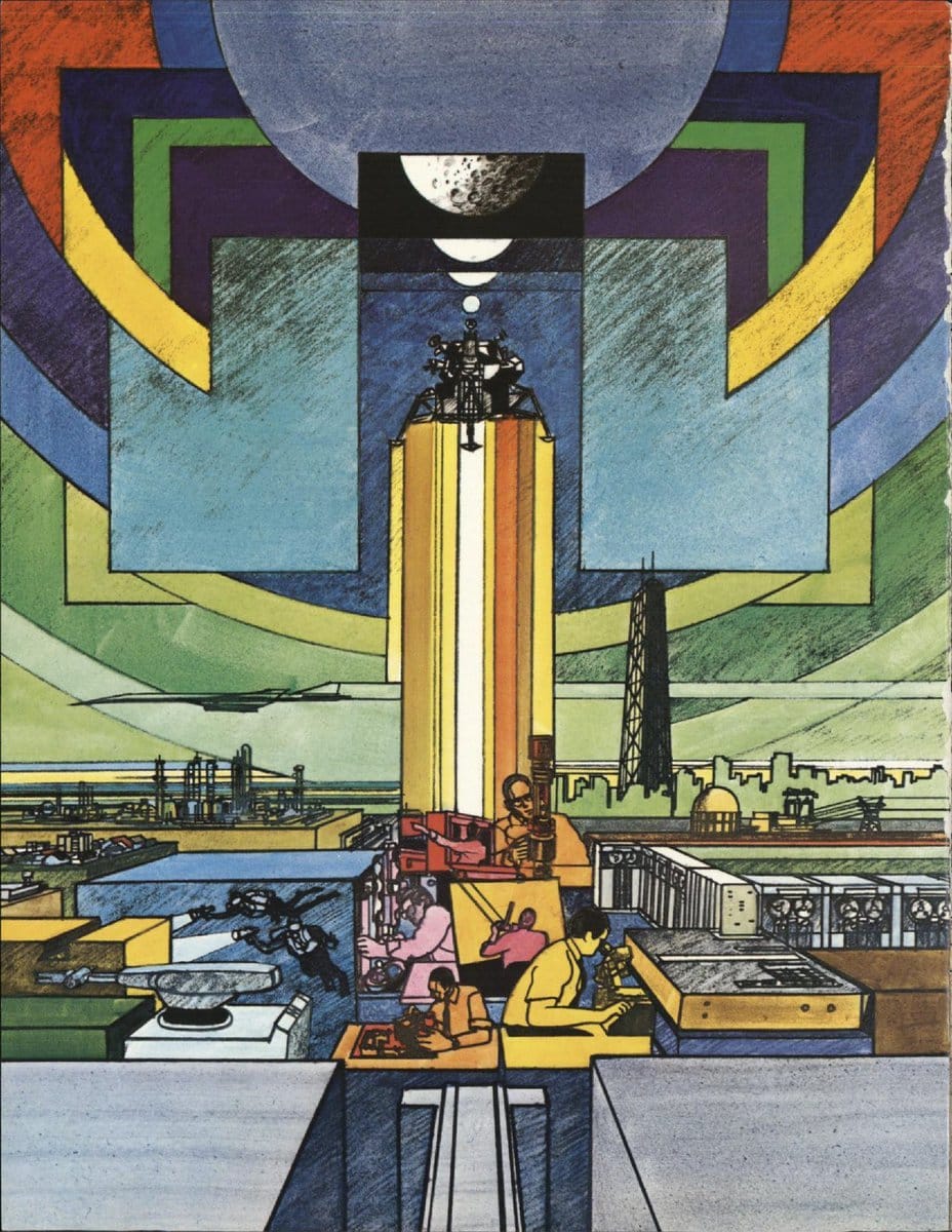
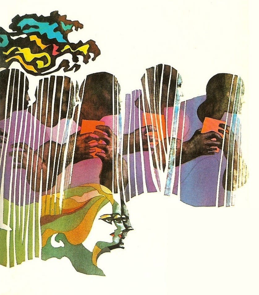
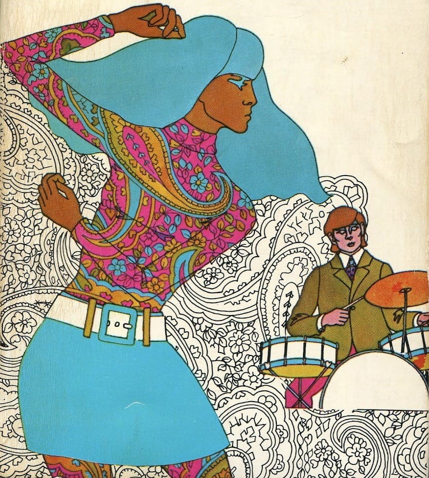
That said, I'll admit this first one isn't actually sci-fi: It's from a July 31, 1969 corporate annual report for CONDEC, the conglomerate owner of Unimation, the world’s first company dedicated to manufacturing industrial robots.
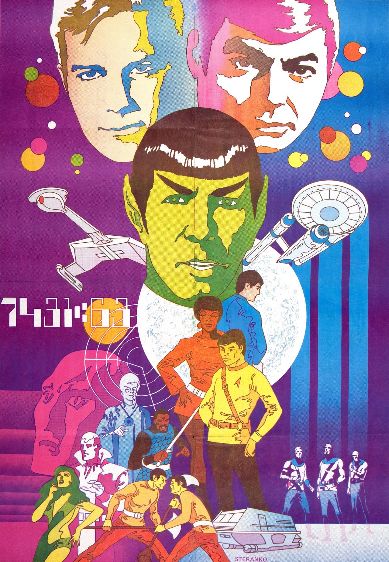
But this 1968 Star Trek poster by Jim Steranko is a great example of a classic science fiction franchise getting particularly groovy.
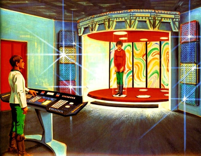
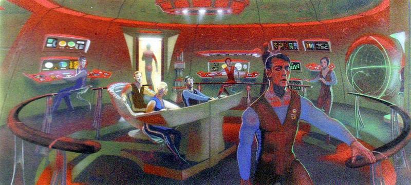
It reminds me of Mike Minor's colorful 1977 concept art for the never-made Phase II Star Trek series.
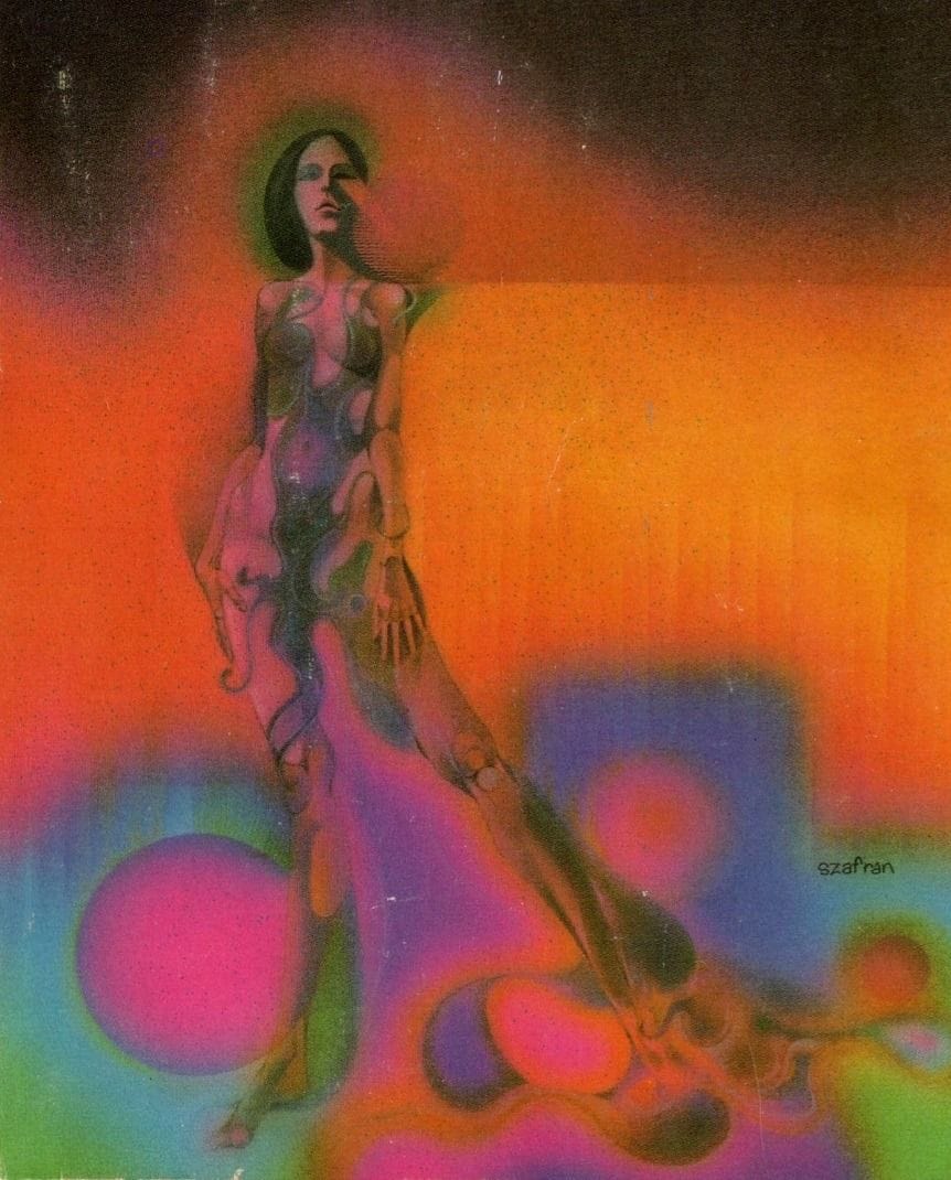
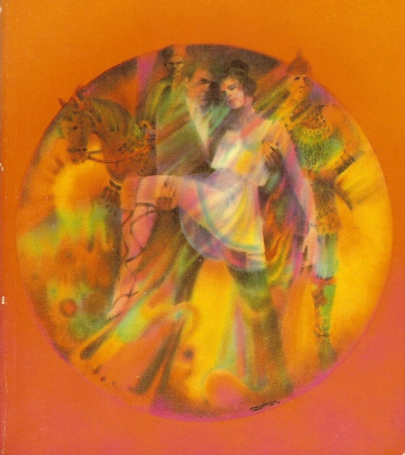
When it comes to science fiction cover art, however, Gene Szafran is the reigning champion for trippy surrealism.
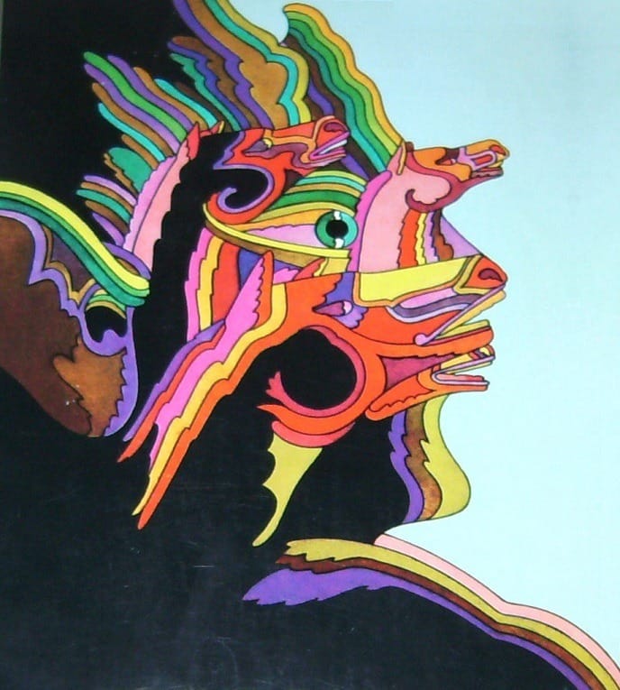
Mike Hinge's typical style incorporates bold color choices with bold line work, but even when he skips the lines, his art brought plenty of groovy pschedelia to his magazine or book covers.
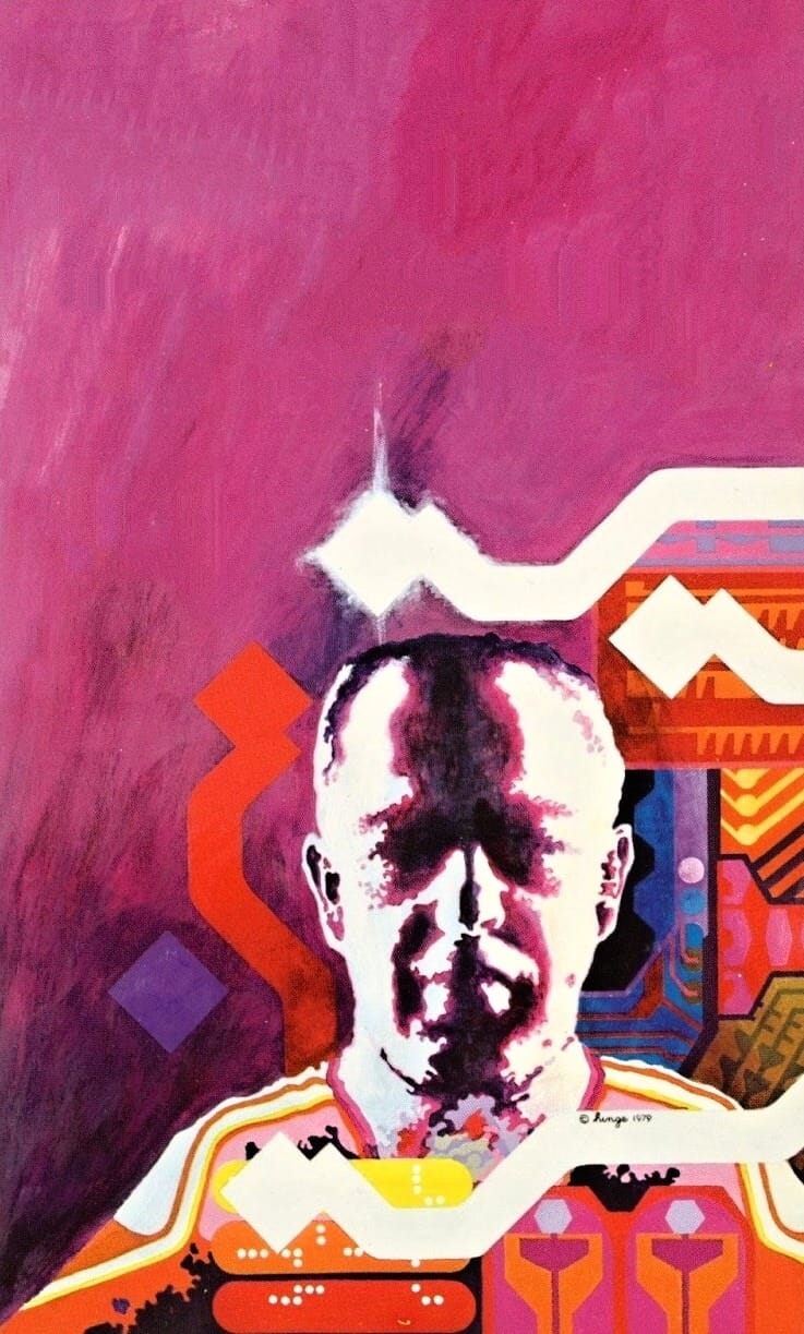
In fact, there's even a groovy Mike Hinge/Jim Steranko connection, as I learned while writing this post: Here's John Coulthart, writing about Hinge's groovy works in a blog post (that I only found after I'd already added both Hinge and Steranko to this roundup, I swear).
...Mike Hinge, a New Zealand-born illustrator whose covers for American SF magazines in the 1970s brought a splash of vivid colour to the groove-deprived world of science fiction. This was a rather belated development for staid titles like Amazing and Analog whose covers in the previous decade wouldn’t have looked out of place in the Gernsback era. Opening the door to someone like Mike Hinge, a graphic designer as well as a general illustrator, was probably a result of both magazines having undergone recent changes of editorship. Hinge approached SF art in the same way that Jim Steranko approached comic-book art in the late 1960s, importing trends that had been flourishing outside the medium. (And Steranko liked Hinge’s art enough to publish a portfolio of black-and-white drawings, The Mike Hinge Experience, in 1973.)
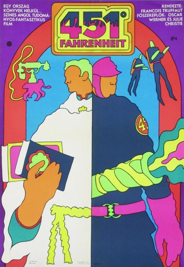
Shifting gears entirely, here's influential Hungarian graphic designer György Kemény's Fahrenheit 451 poster from 1969.
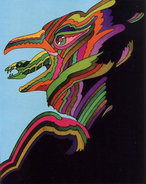
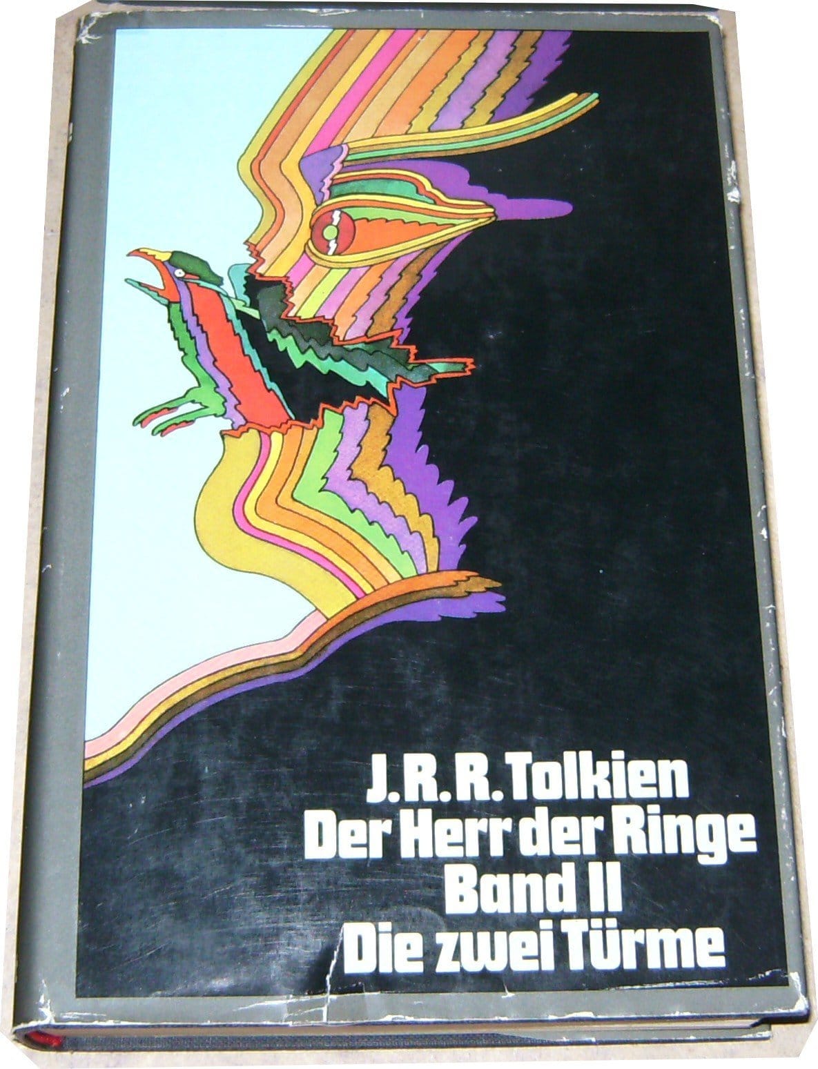
Not to mention Philippe Caza's Feb 1972 cover to Galaxie magazine.
And I can't post that Caza without the 1970 Lord of the Rings trilogy covers by Heinz Edelmann that it always reminds me of:
Leo and Diane Dillon's style isn't exactly the same type of groovy as the above examples, but I'd still include stuff like their 1970 cover art to Chronocules, by D. G. Compton.
Bob Pepper is another big artist to name here, as proven by works like this kaleidoscopic 1971 cover to Austin Tappan Wright's Islandia.
Bob Haberfield's another great artist to mention. Here's his 1970 pop art cover for The Singing Citadel, by Michael Moorcock.
The timeline is relatively tight for these covers, as far as trends go: Practically all of the groovy sci-fi covers listed here have been from between 1968 and 1972.
Here's a slightly early example, an uncredited 1967 cover to The Crying of Lot 49, by Thomas Pynchon.
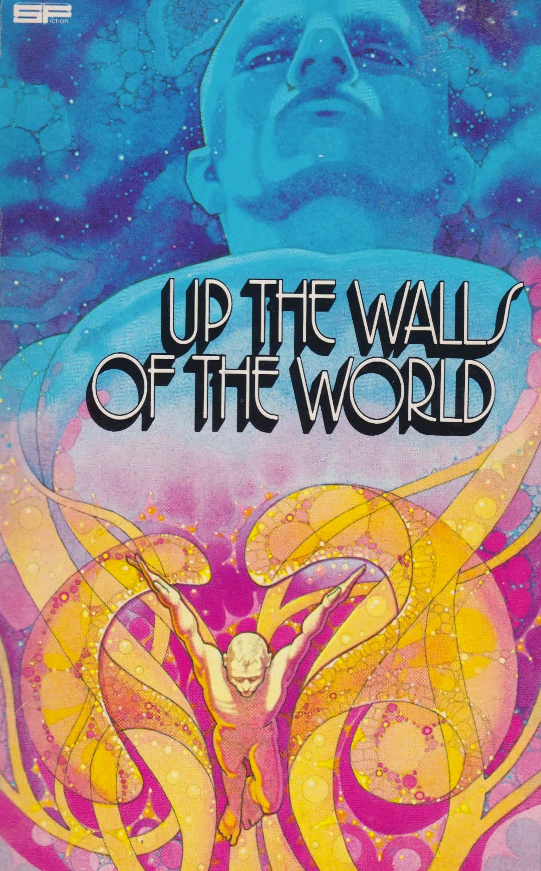
And here's a particularly late example – another uncredited one, used in 1979 for Up the Walls of the World, by James Tiptree, Jr.
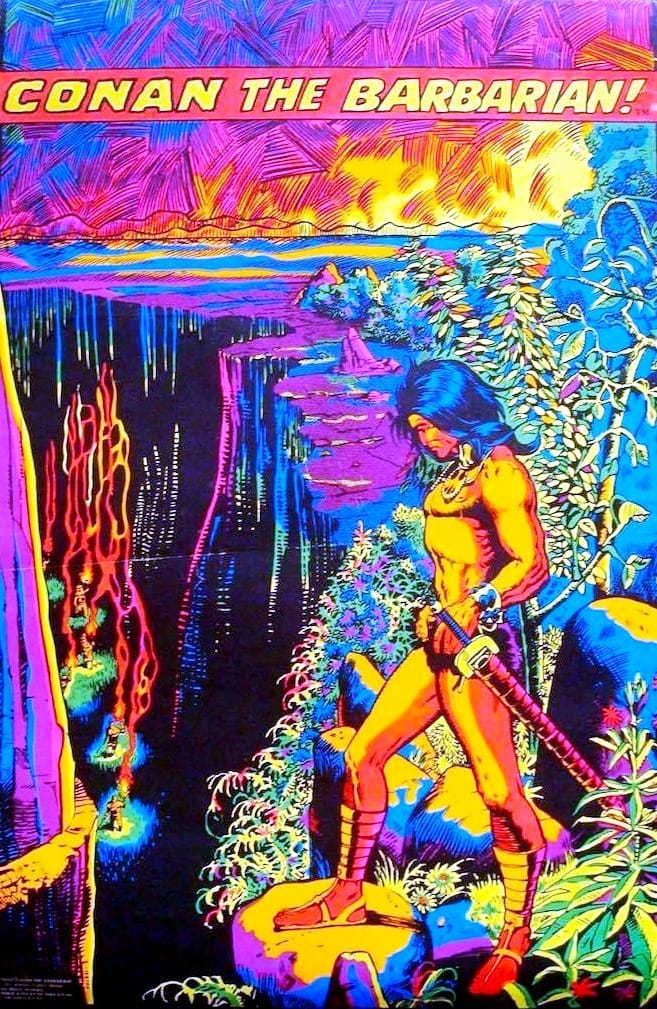
Okay, I was going to end on those two, but then I found this 1971 Conan The Barbarian black light poster. Marvel did a ton of these in 1971, and they rock.
Music rec: Two hours of this vaguely Halloween themed party mix
Next time: I'll actually do that David Schleinkofer tribute I promised last week