Earth From Orbit

We're used to seeing Earth from the ground level, and it's easy to picture the pale blue dot version as well. Today, we're taking a look at the Goldilocks zone between those two extremes of visual interest: The view of Earth from within its orbit, when the entire planet is still so big that it won't entirely fit within the frame.
Airbrushed clouds, sharp yellows against bright blues, and in some cases an invitingly shimmering halo of gleaming atmospheric light – Here are the best slices of a low-orbit Earth that retro sci-fi covers and space illustrations have to offer.
One great example is on Patrick Woodroffe's 1974 cover art for The Green Hills of Earth, by Robert Heinlein. Earth is big and bright – though admittedly not very green.
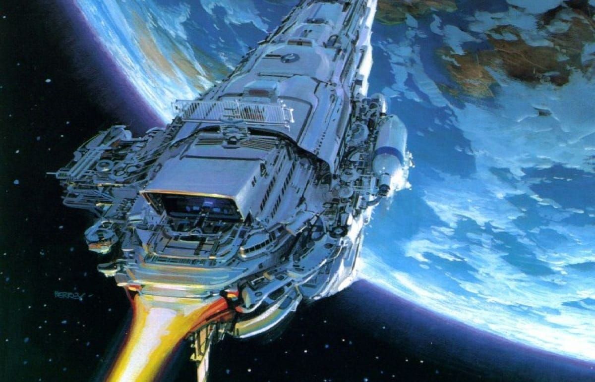
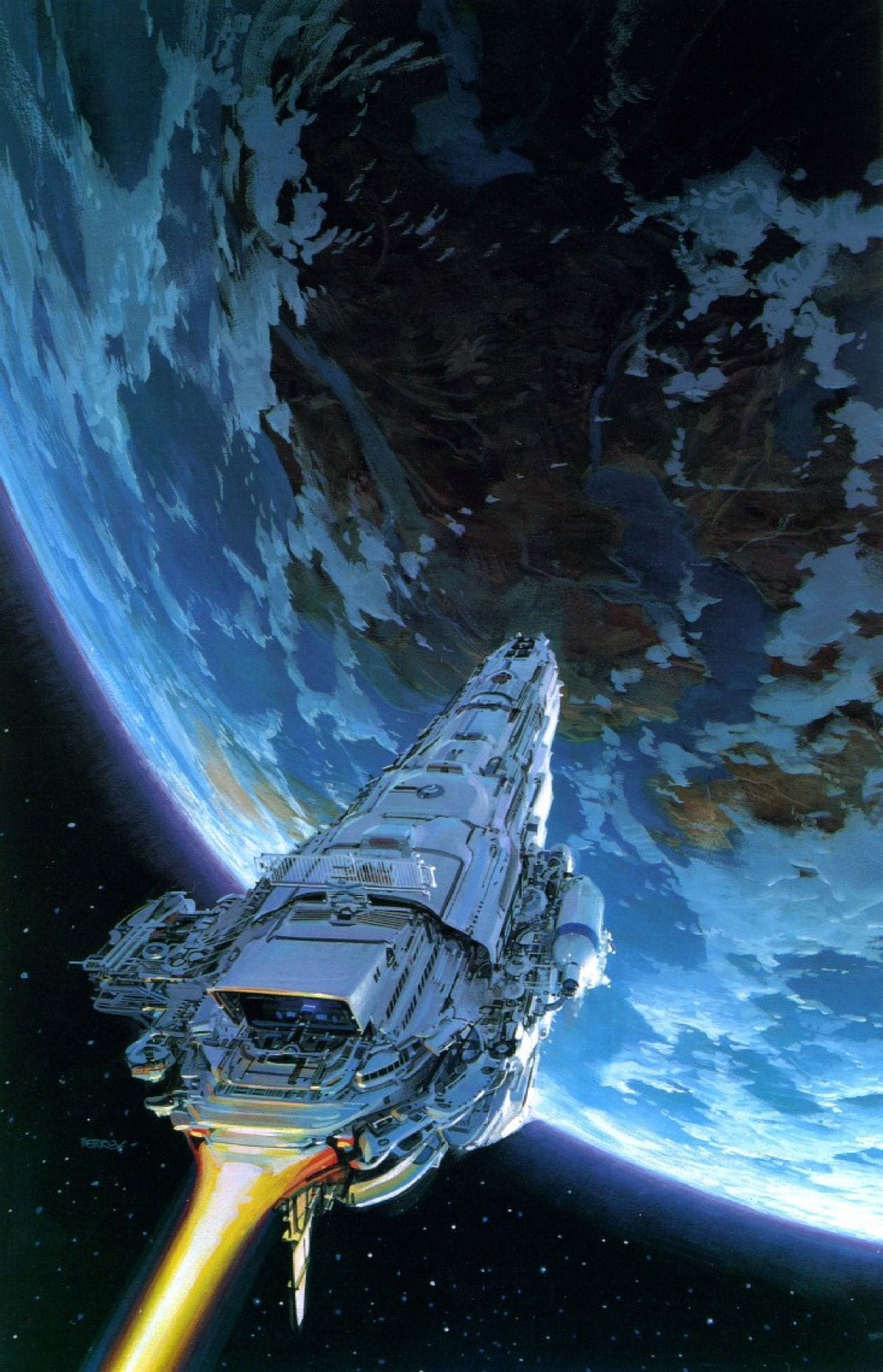
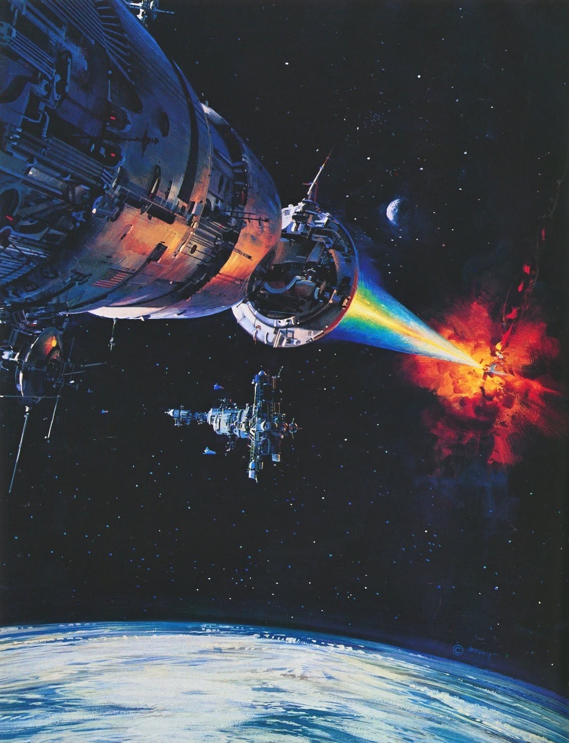
John Berkey often featured a blue semi-circle of Earth in the background of his scenes of spaceships and space stations. Here are three examples.
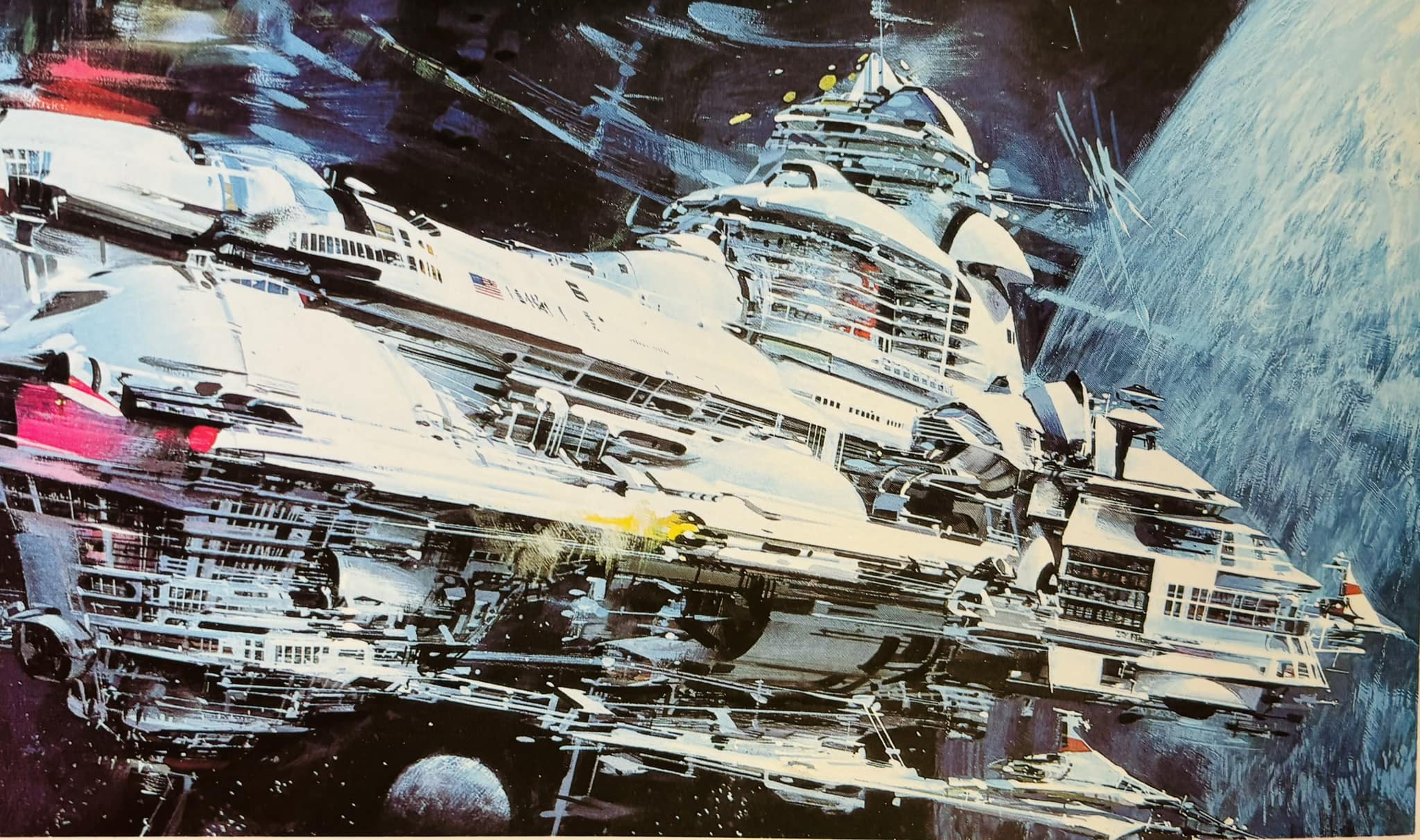
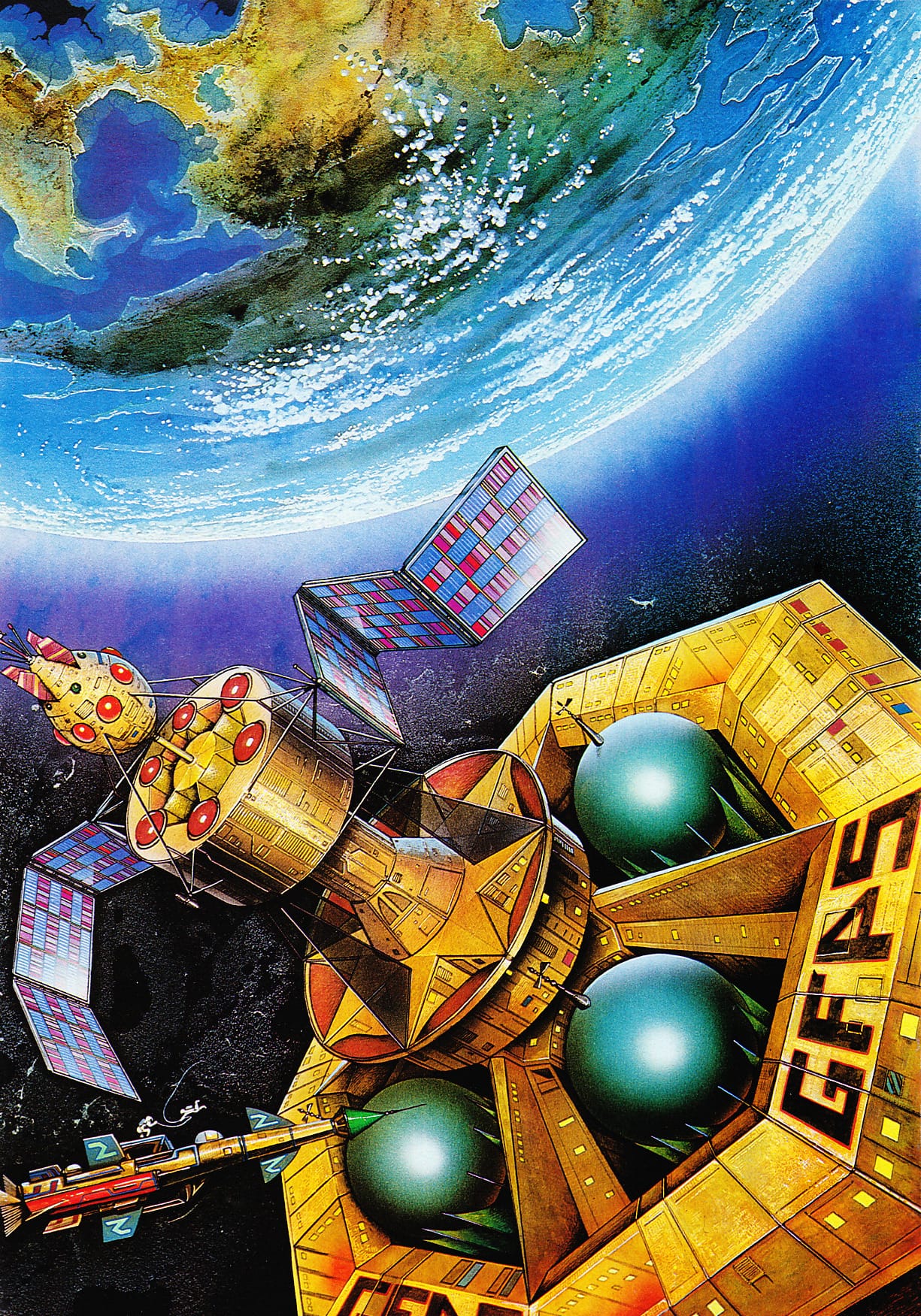
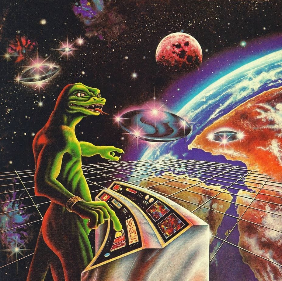
Barclay Shaw might have the weirdest example.
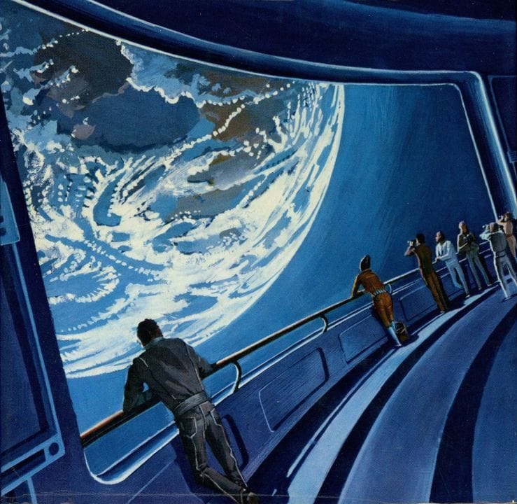
I really love Bruce Pennington's 1975 cover art for Imperial Earth, by Arthur C. Clarke.
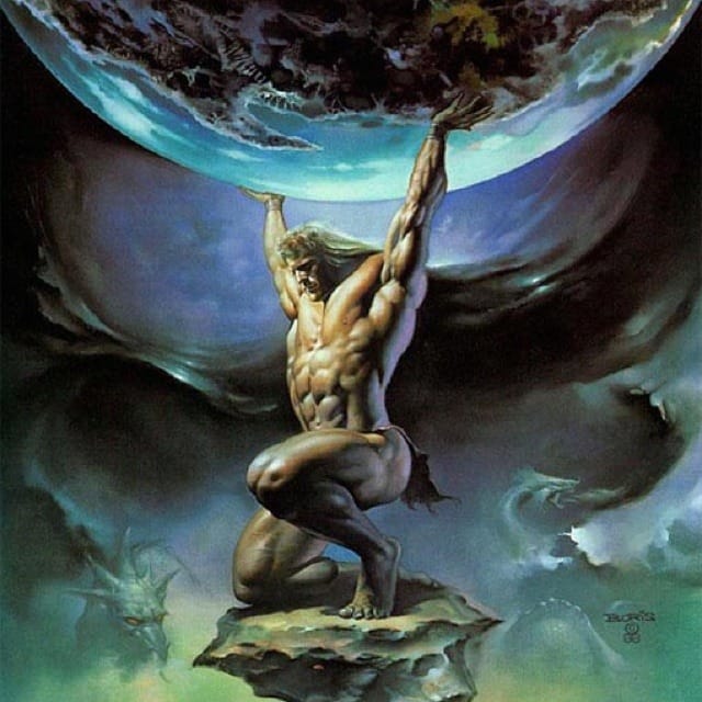
Boris Vallejo takes a unique approach.
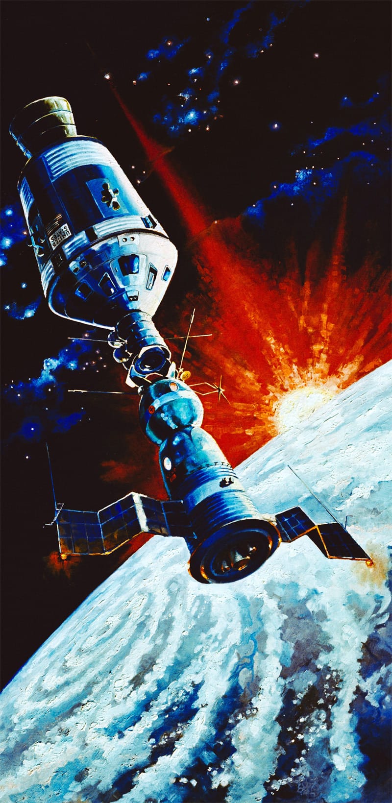
A Soviet Soyuz spacecraft in Earth orbit docks with an American Apollo spacecraft, as painted by cosmonaut Alexei Leonov in 1974.
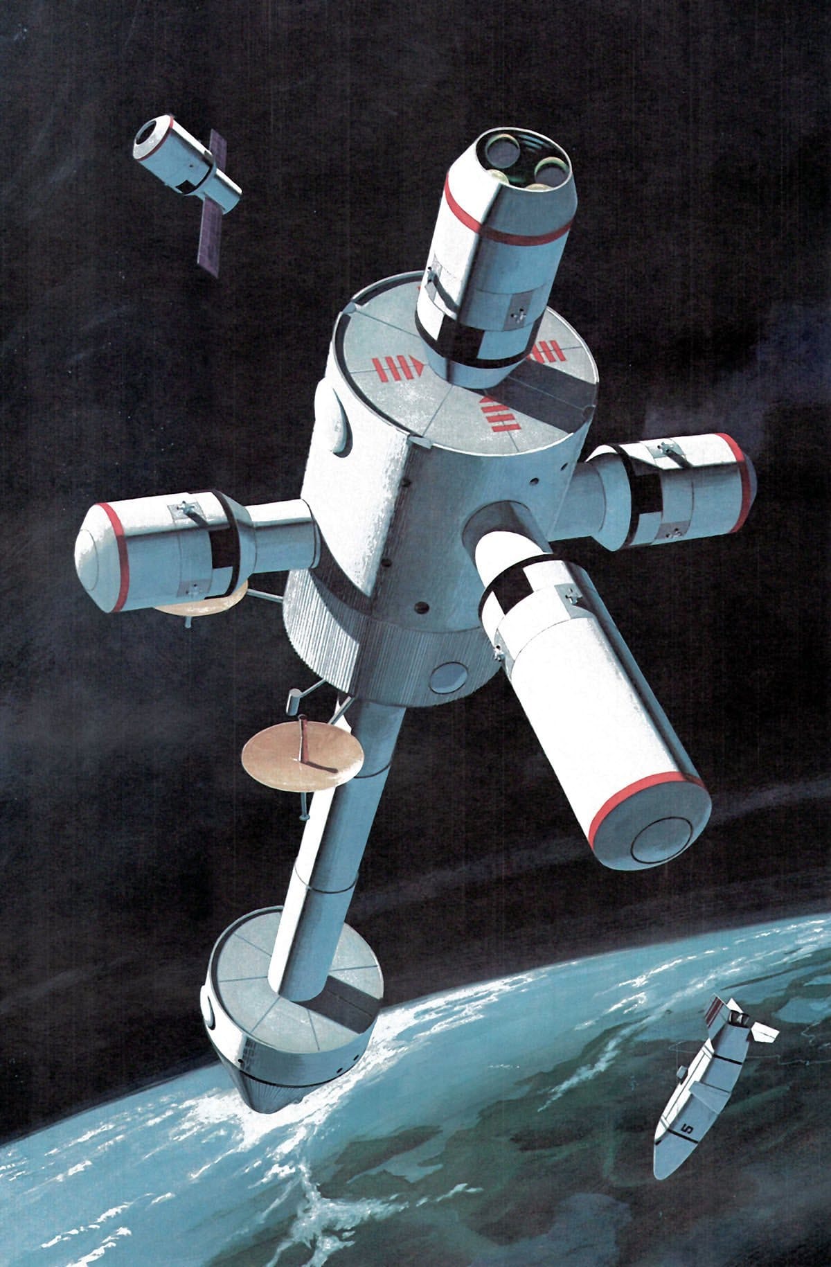
Ron Simpson concept art depicting a NASA Earth Orbital Station.
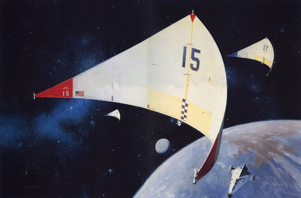
As a big near-future NASA artist, Robert McCall has plenty of scenes orbiting Earth. Here's one with the tiniest possible astronauts in it – all the better to convey an epic scope.
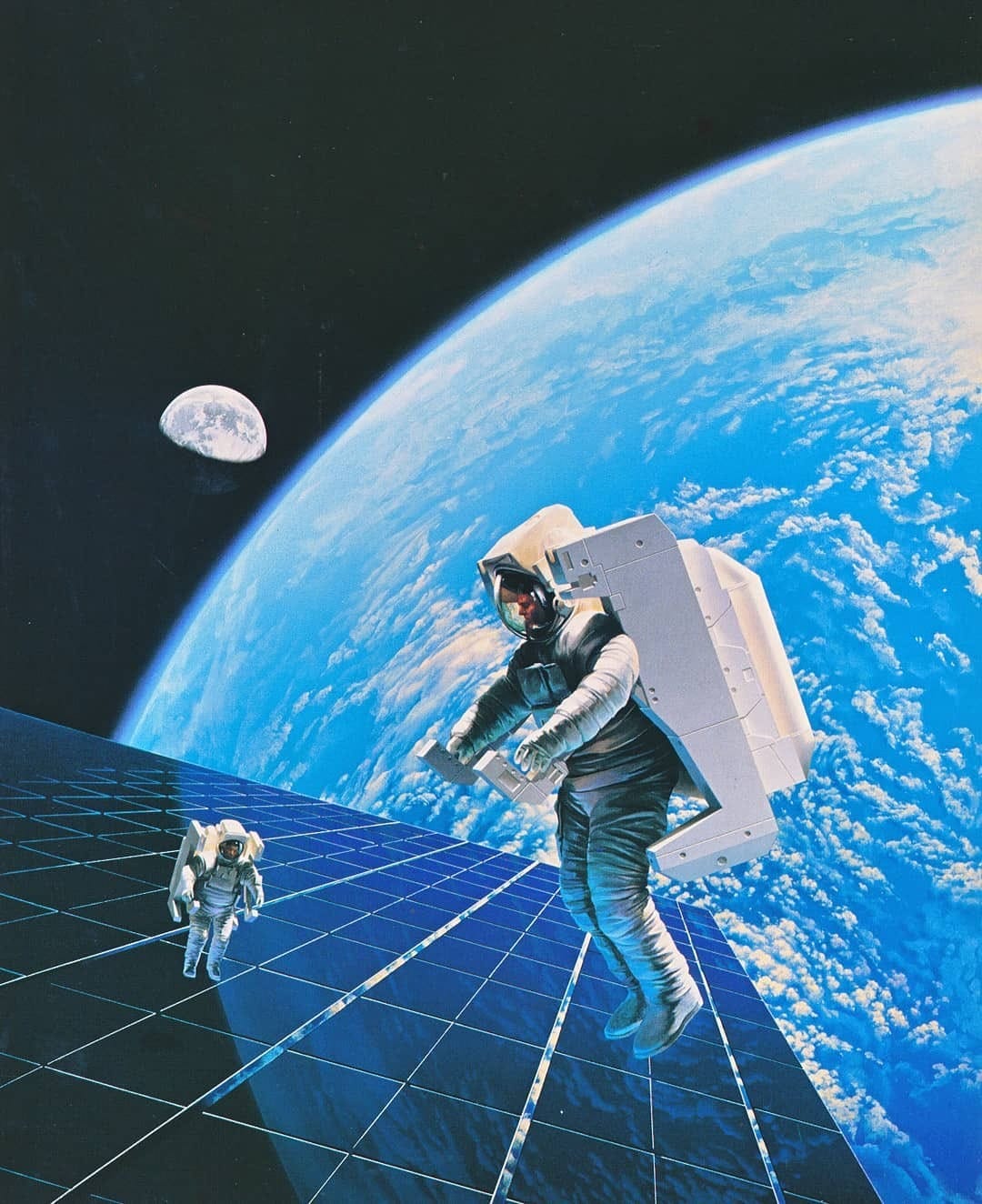
Another NASA artist, Pamela Lee, has some of the brightest blues around.
Günter Radtke also has some great orbital hardware.
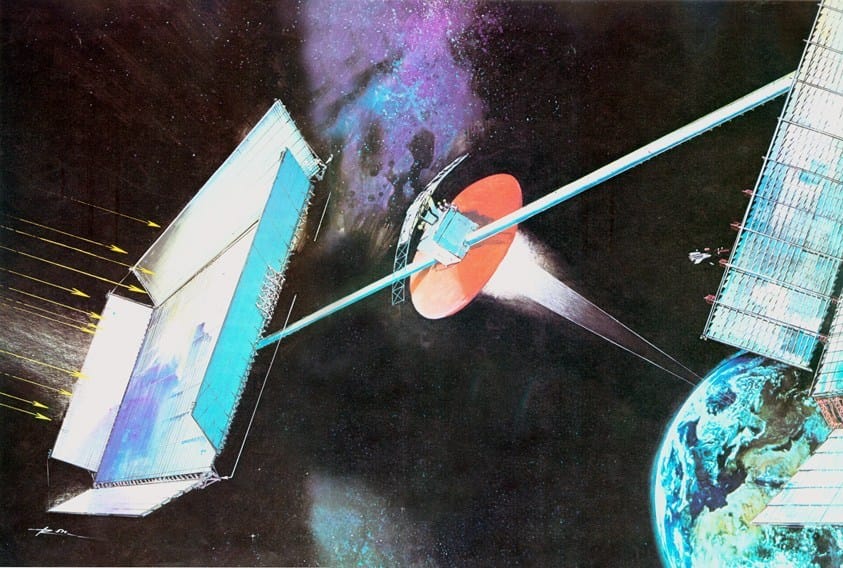
Steven Vincent Johnson.
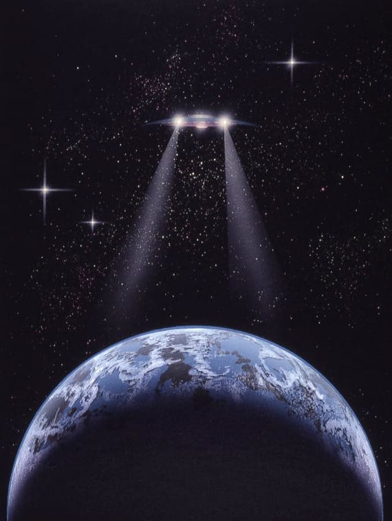
Many big names are represented here, to be honest. Here's Chris Foss...
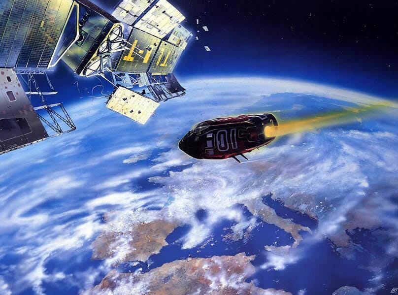
Michael Whelan...
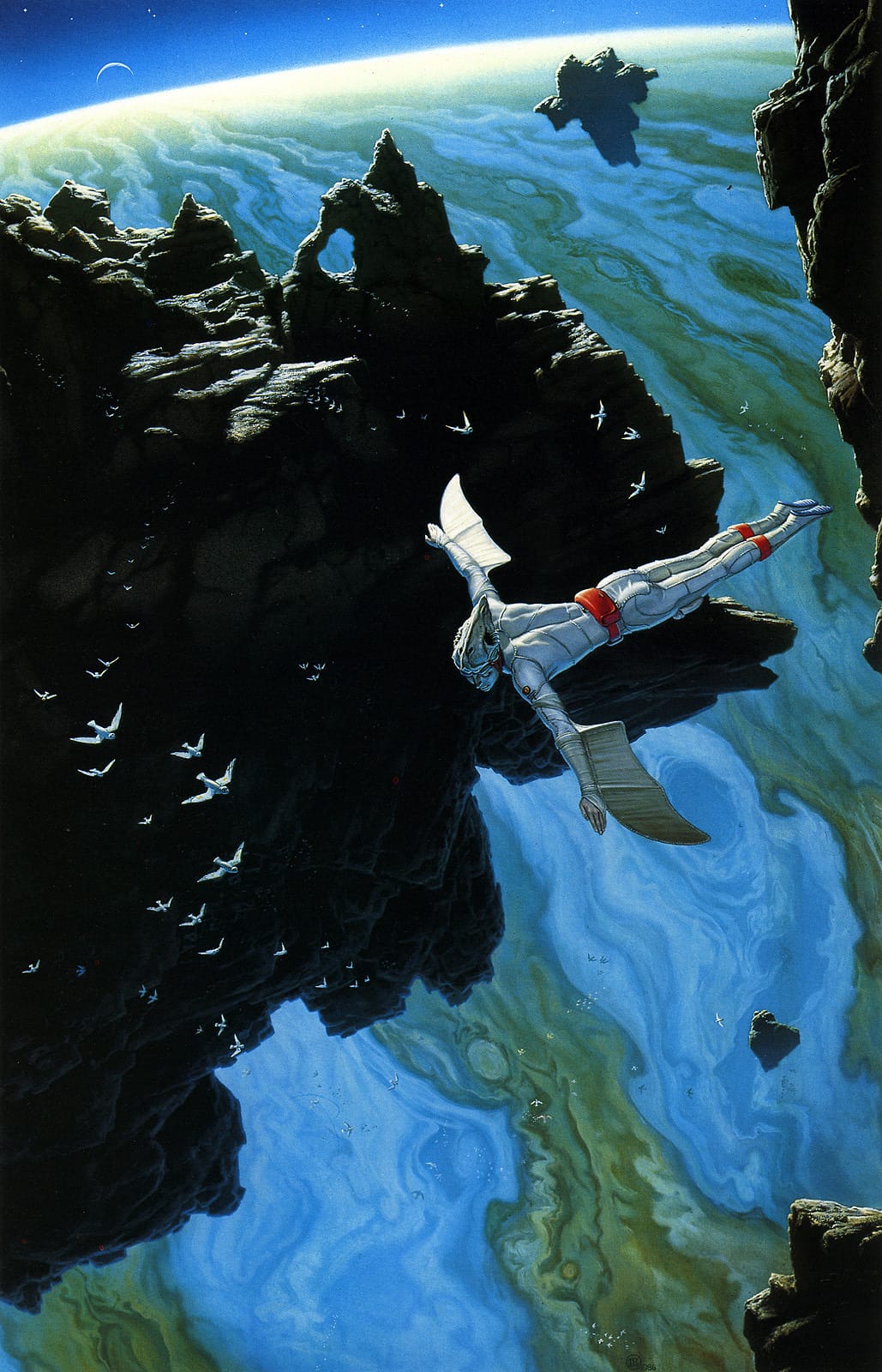
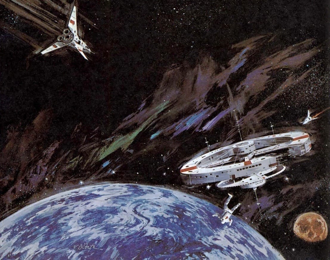
Vincent Di Fate...
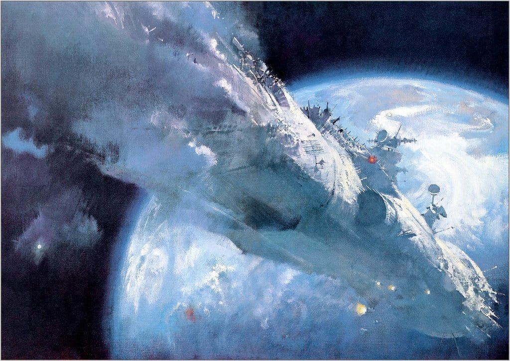
John Harris...
...and a couple from Tim White.
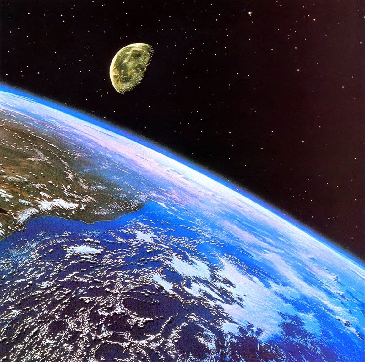
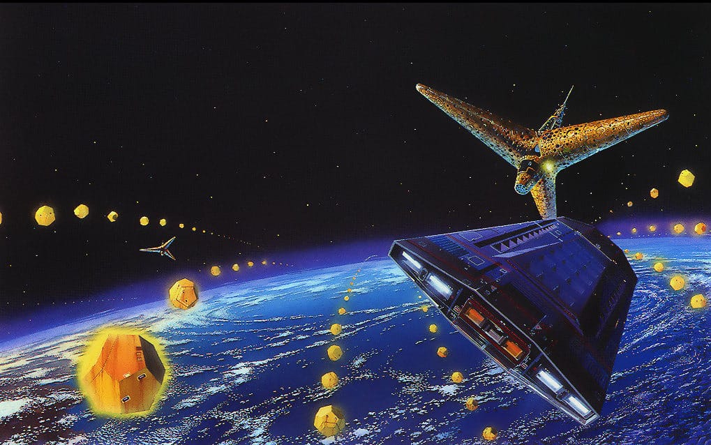
I think Tim White's the artist for this one, too, although I think Roger Dean contributed the design. These are the Martian Tripods approaching Earth, from H.G. Wells' novel War of the Worlds.
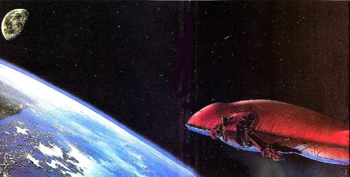
One from Tony Roberts, as seen in Spacecraft 2000-2100 A.D., by Stewart Cowley.
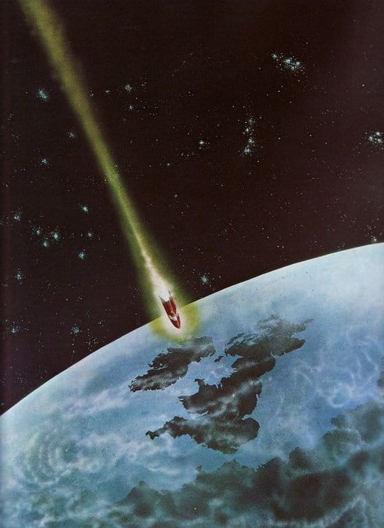
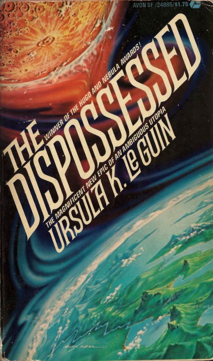
Not a great photograph here, but I love the composition of Alex Ebel's 1975 cover to The Dispossessed, by Ursula K. Le Guin.
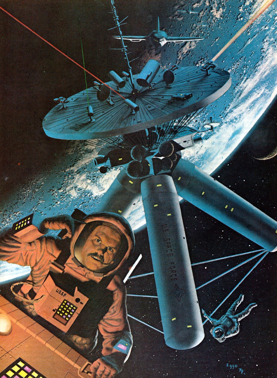
Let's wrap up on a particularly jaunty angle of the Earth by David Egge. Titled "War In Space," it was an interior illustration in Future Life, May 1979.
Cool links
Deb Chachra talks about The Hitchhiker’s Guide to the Galaxy - HiLobrow
Very brief article, but it's nice to be reminded how much Hitchhiker’s Guide rocks. What a great series.
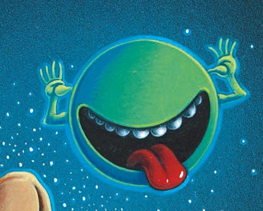
Also, this sent me down a rabbit hole in search of the origins of the jeering green spherical mascot for the novel covers of the US editions. Looks like cover artist Peter Cross invented the character? But he's never given an interview about it, and actually seems to have vanished off the face of the earth. (I can confirm that he's not this Peter Cross, who's a cool unrelated UK artist that ISFDB has incorrectly linked to.)
A look at the history of the '70s/'80s greeting-card-to-cartoon pipeline.
“For each new character property we ask questions like: Does the character have mass appeal? Does it offer opportunities for media exposure? Does it offer numerous possibilities for quality applications on a variety of products?”
Music Rec: My musical hot take is that a '90s mixtape isn't authentic unless it was actually compiled during the '90s. This "Spirits Of Nature" CD from 1996 is an incredibly artifact of the decade. Electronic, Tribal, Folk, World – it's got everything but the Gregorian chants.
Next Time: Paying users get a look at the beautiful but underappreciated work of Michelangelo Miani.