Colorful Spaceships
I found this 1976 Tim White illustration the other day. It's called 'Enemy Within the Skull' and this particular image was scanned by my art blogger friend Martin L Kennedy, from the 1981 collection The Science Fiction and Fantasy World of Tim White.

I was going to say this was the first time I saw it, but then I checked the tumblr post and I had apparently reblogged it at some point in the nine years since it was first posted. At any rate, it's pretty cool! I know publishers loved bright colors in the 70s, but this one feels like Tim White was really trying to push the envelope for the amount of pure bright red a cover could handle.
Speaking of red:

That's an Angus McKie, created for the 1978 cover of Nebula Award Stories 11 edited by Ursula K. Le Guin, and re-used a year later for Stewart Cowley's Great Space Battles collection.
One lesson to learn from those two images: If the background is red, the spaceship is blue. Blue and yellow are a great contrast as well, though. Here's an Alfred Kelsner.
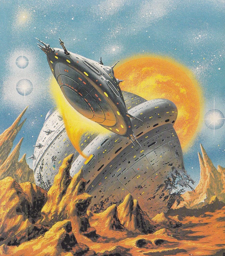
Other painters took a less eye-popping approach, like this Bob Layzell spaceship from Harry Harrison’s Mechanismo, 1978:
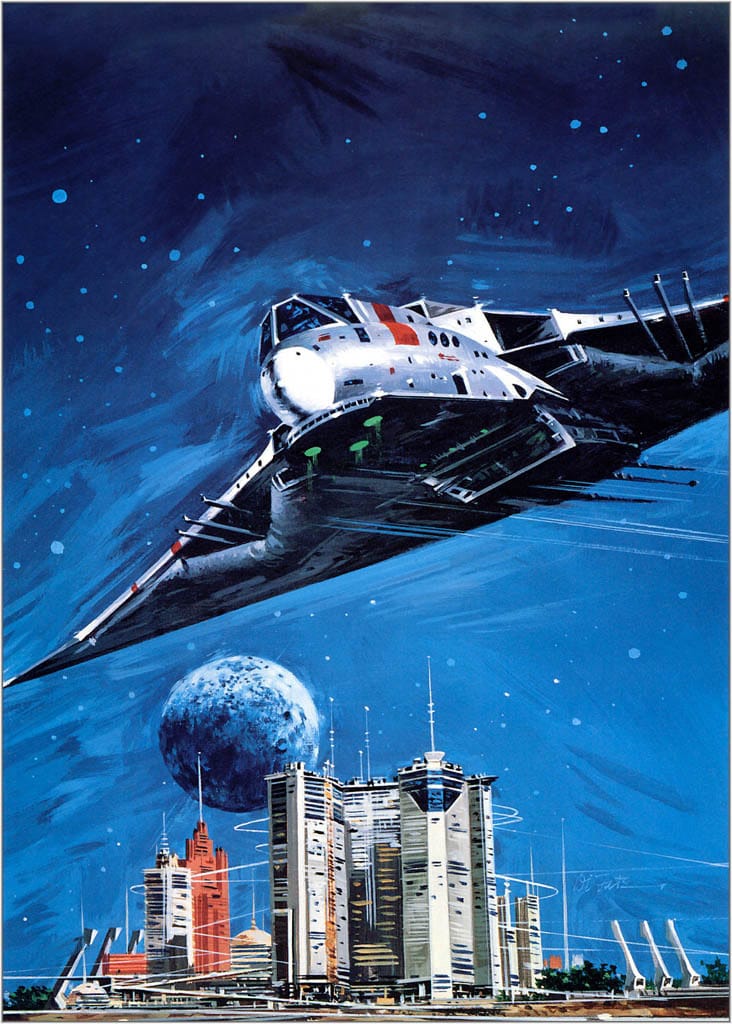
Same for Vincent Di Fate's April 1977 Analog cover, illustrating a George RR Martin story that had a bat-winged antigrav air car in it:
Here's one from the king of '70s-'80s American spaceship illustrations, John Berkey. This one's called "Single Ship" on his website, where the original is on sale for $7,000.
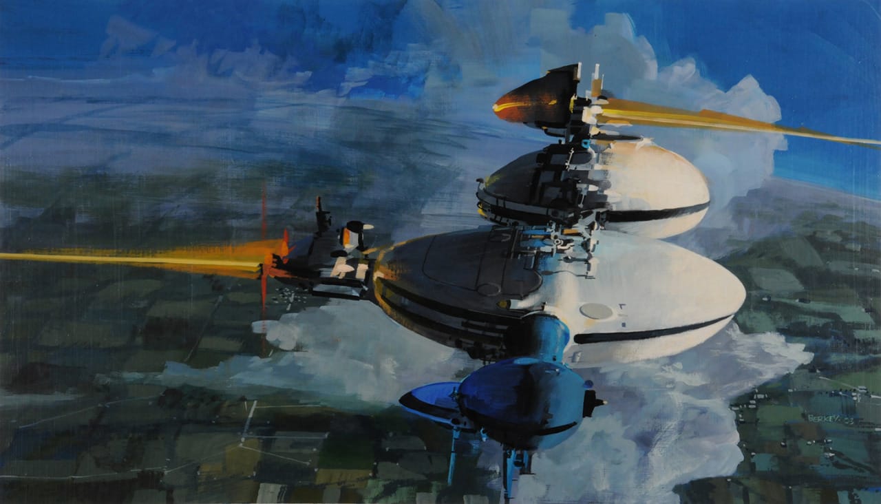
Who's the reigning champion of '70s-'80s spaceship illustration across the pond in the UK? Chris Foss. Here's one of his from 1969, "Sea-Horse in the Sky."
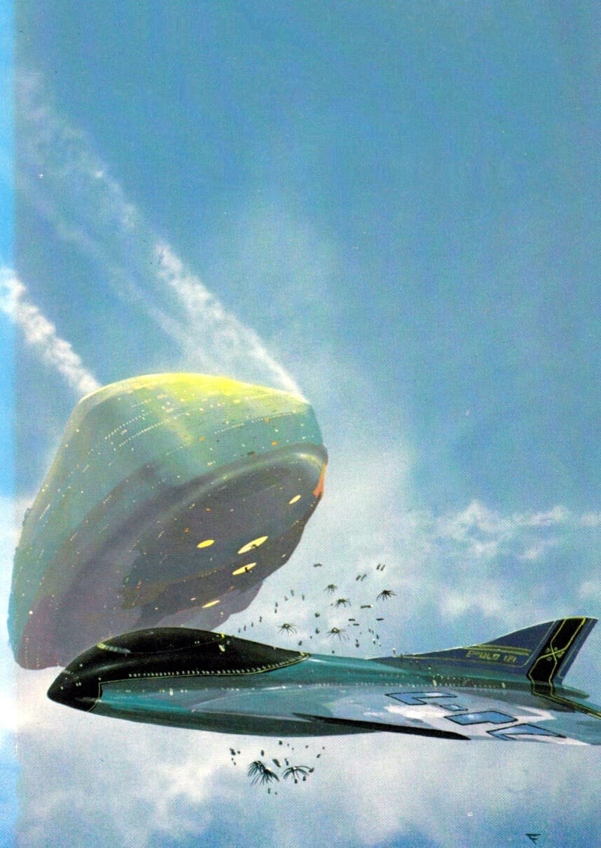
It's actually a little outside his norm, since the spaceship looks more like an airplane and it appears to be jettisoning spores. It still has the classic Foss iconography on the wings and tail, though: Incomprehensible industrial markings that look like an alien language.
Some artists stuck to the classics: Here's a spaceship that looks pretty clearly based off of a Saturn V rocket, done by Gene Szafran for the 1973 cover to All the Gods of Eisernon, by Simon Lang. The real attraction is the delightfully lush alien planet surrounding the ship.

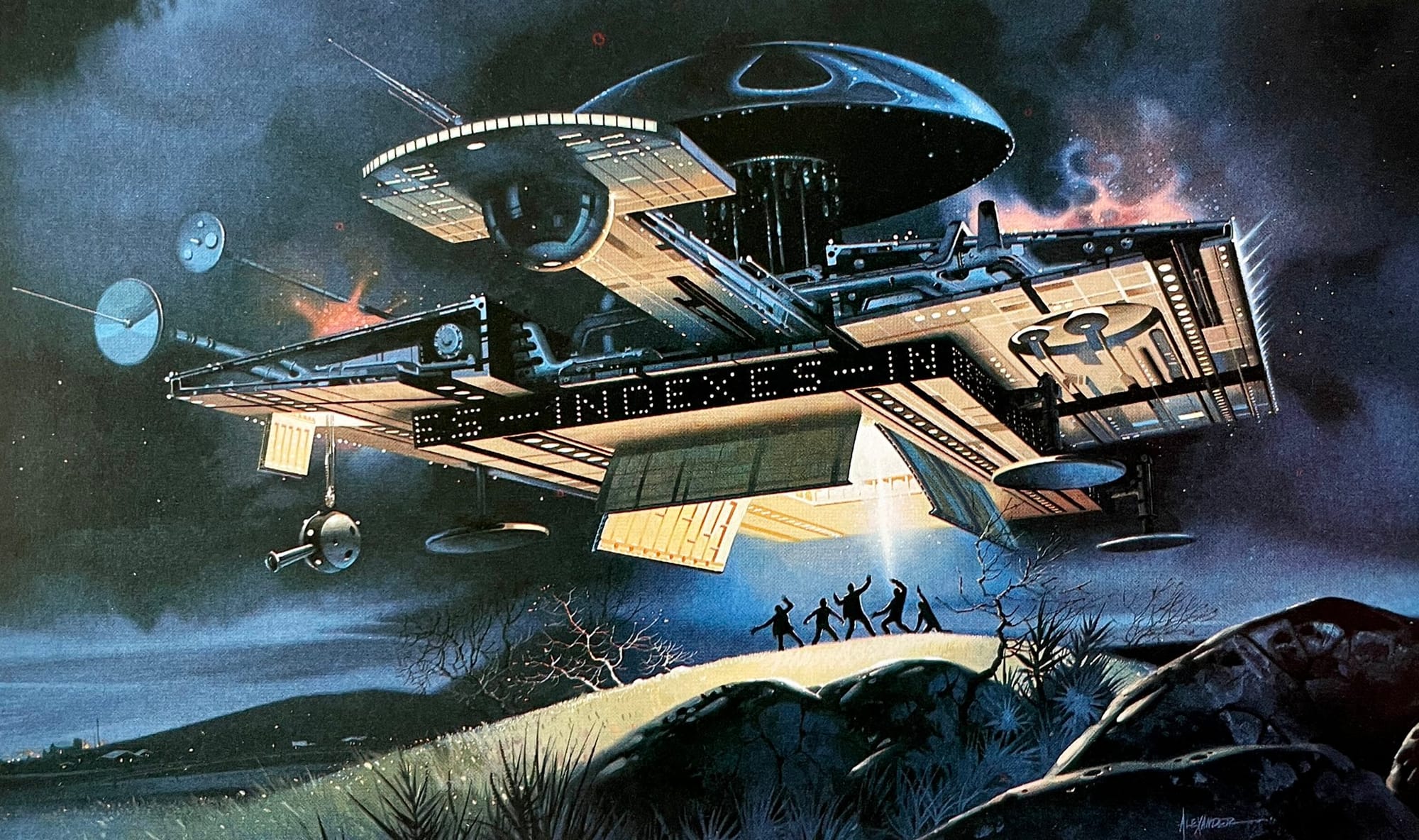
Other artists added all the bells and whistles possible. Here's an illustration by Paul Alexander – I couldn't find a date or publication with a quick search. It reminds me of the spaceship from Close Encounters of the Third Kind.

The scrolling LED sign is an incredible addition that all UFOs should add, for convenience and clarity.
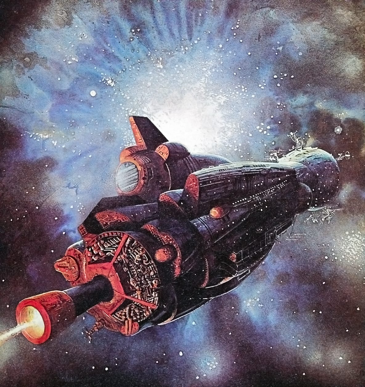
As much as I love highly detailed artwork, I always come back to John Harris and his dream-like ships.
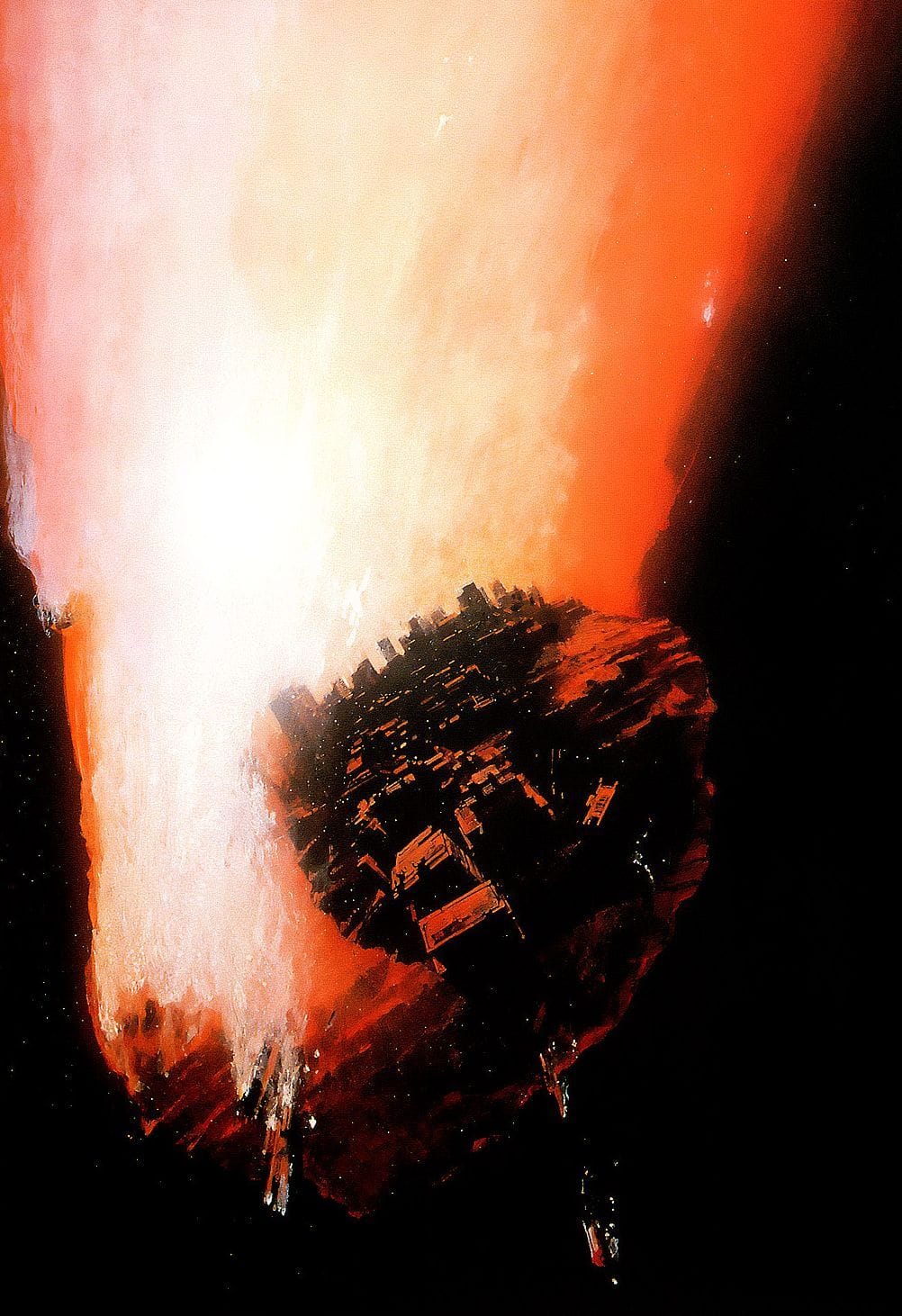
I don't think I'd want to ride in this one, by K. Kurbatov, 1980.
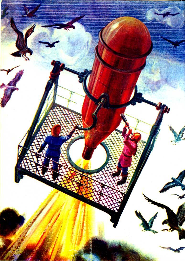
This option – by the same artist in the same year – looks much better.
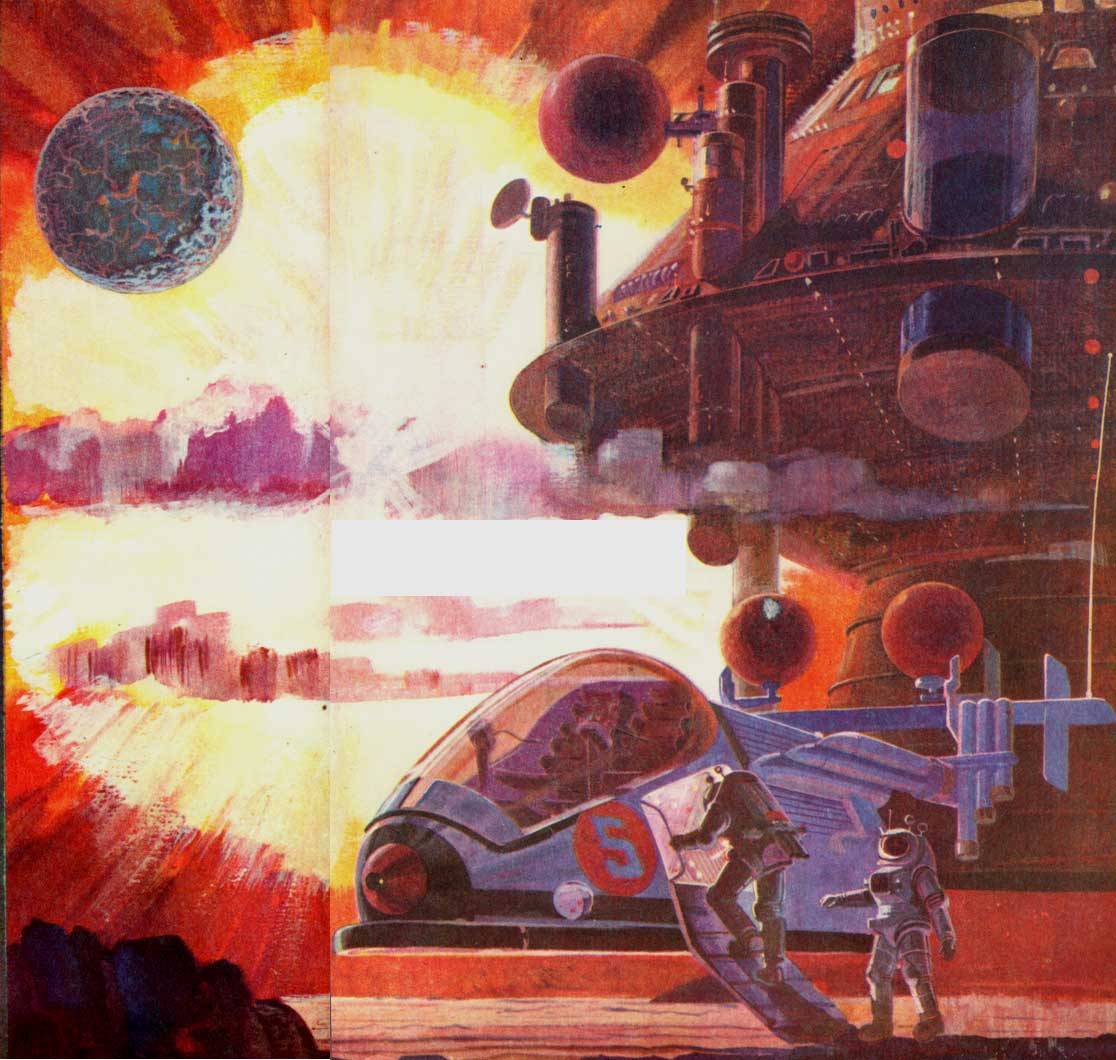
But let's not lose sight of what spaceship art is all about: A big bright red background. Here's a variant of Peter Andrew Jones' 1975 cover art for Berserker's Planet, by Fred Saberhagen.
Next Time: Medieval Computers
