Book notes: 'In Search of Forever'
Plus ice schooners, giant rideable snails, and Elric at the end of time
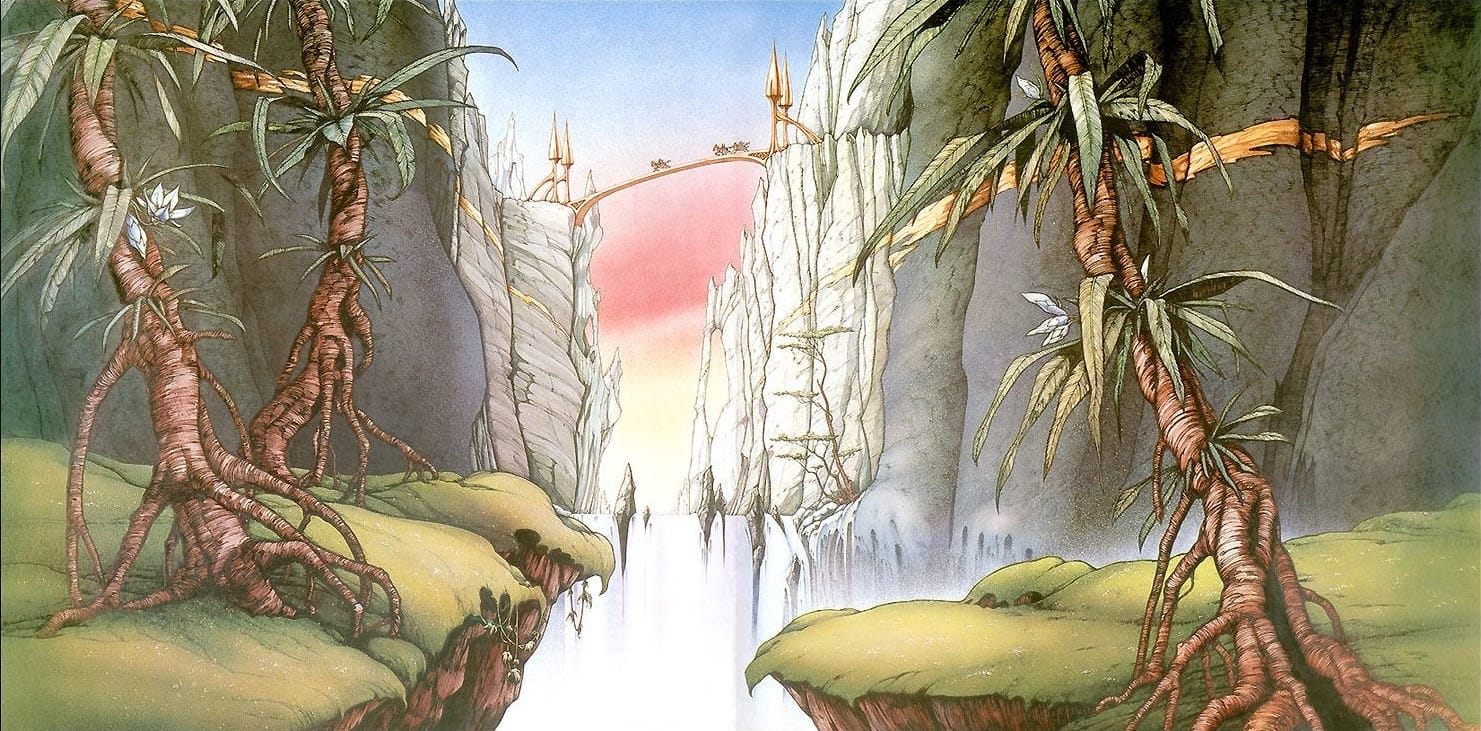
Today: My notes on fantasy illustrator Rodney Matthews’ 1985 art book, In Search of Forever, written by Matthews and Nigel Suckling, with a Chapter 4 intro by Michael Moorcock.
***
Page 8: Matthews was born in 1945 in North Somerset, growing up around the lakes, woods, lanes, and caves of southwest England. Which makes sense, as his fantasy art tends to feature similar settings.
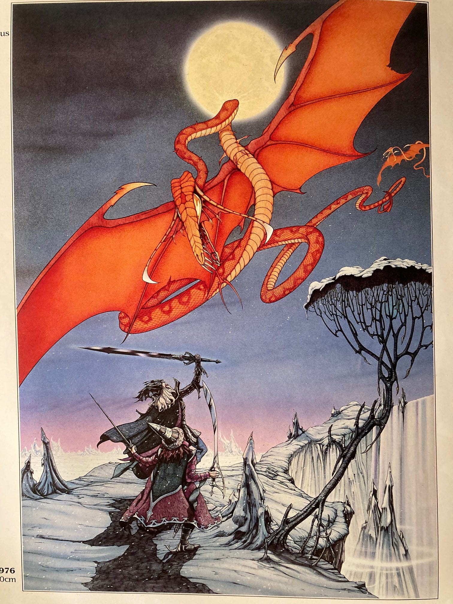
Page 11: Matthews usually picks a predominant color, and then makes sure the other colors are sympathetic or complementary to it, a trick he picked up from “classic Walt Disney cartoons.”
One exception: The flying snake in “Elric and Moonglum,” 1976, which is actually intended to clash with the surrounding colors:
Suckling also notes that Matthews doesn’t always love the layout and composition restraints of book and album covers: “This can sometimes be frustrating, apparently.” For book covers, he needs to add neutral areas to accomodate the title, as well as two separate focal points for the back and front on a wraparound cover.
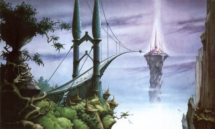
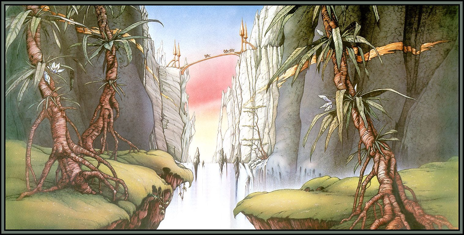
Compare to these images, where Matthews makes full use of the entire space:
Here’s “Sanctuary.” (The bridge is “largely supported across the abyss by imagination”)
And “Stop the Slaughter.”
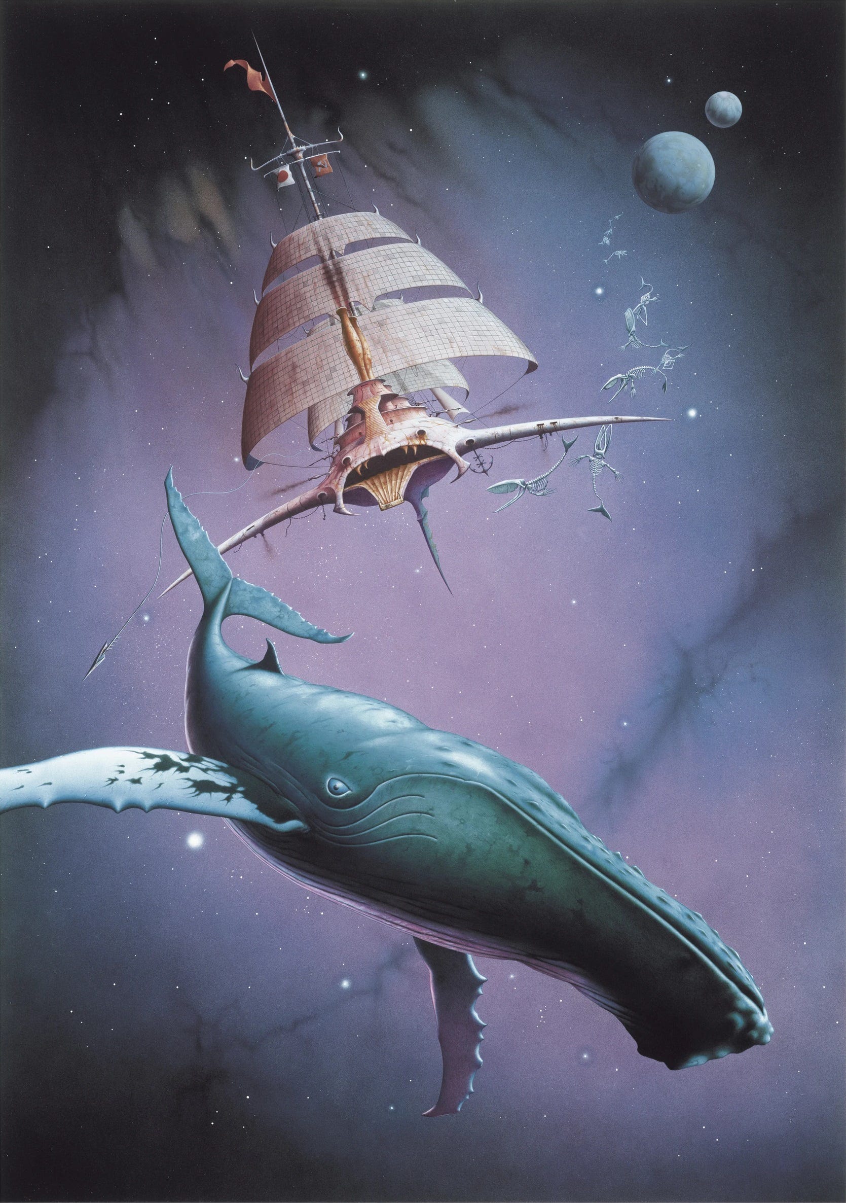
Page 12: Almost all of Matthews’ best-selling images have been “dominated by colors from the blue-purple end of the spectrum.”
Page 15: His work is set apart by his “affinity and sympathy with nature,” Suckling says.
A lot of Matthews’ 1970s work was in posters, which I guess answers the question of what those earlier illustrations were for if not books or albums. He worked for Big O posters, which went under in 1980.
Patrick Woodroffe is among those Matthews admires, along with many others including Chris Foss, Bruce Pennington, and Roger Dean. Matthews’ work absolutely reminds me of Woodroffe.
“Special mention has to be made, however, of Roger Dean who did so much in the early seventies to open up the field of posters and, to some extent, of books like this one to fantasy artists.”
Page 16: Here’s his first Big O commission, 1974’s The Last Armada. Giant insects are “an abiding obsession even though Matthews finds most insects unreasoning and brutal.”
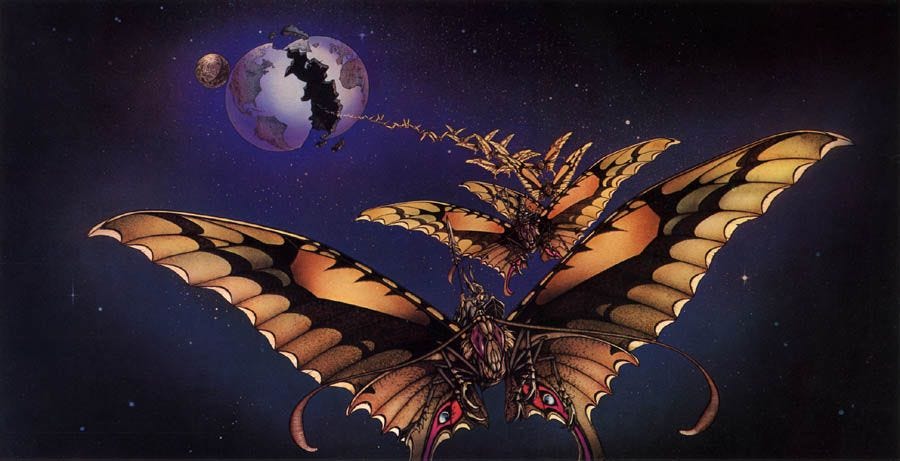
This poster sold well, and it combined with “In Search of Forever” (below) helped Matthews make his name in the 70s.
Page 17: Early in 1976, Matthews did a number of covers for Michael Moorcock, and then wanted to make more posters of Moorcock’s work for Big O, an idea which developed into a 12-poster series that doubled as a calendar. (The Elric image from earlier was one of them.)
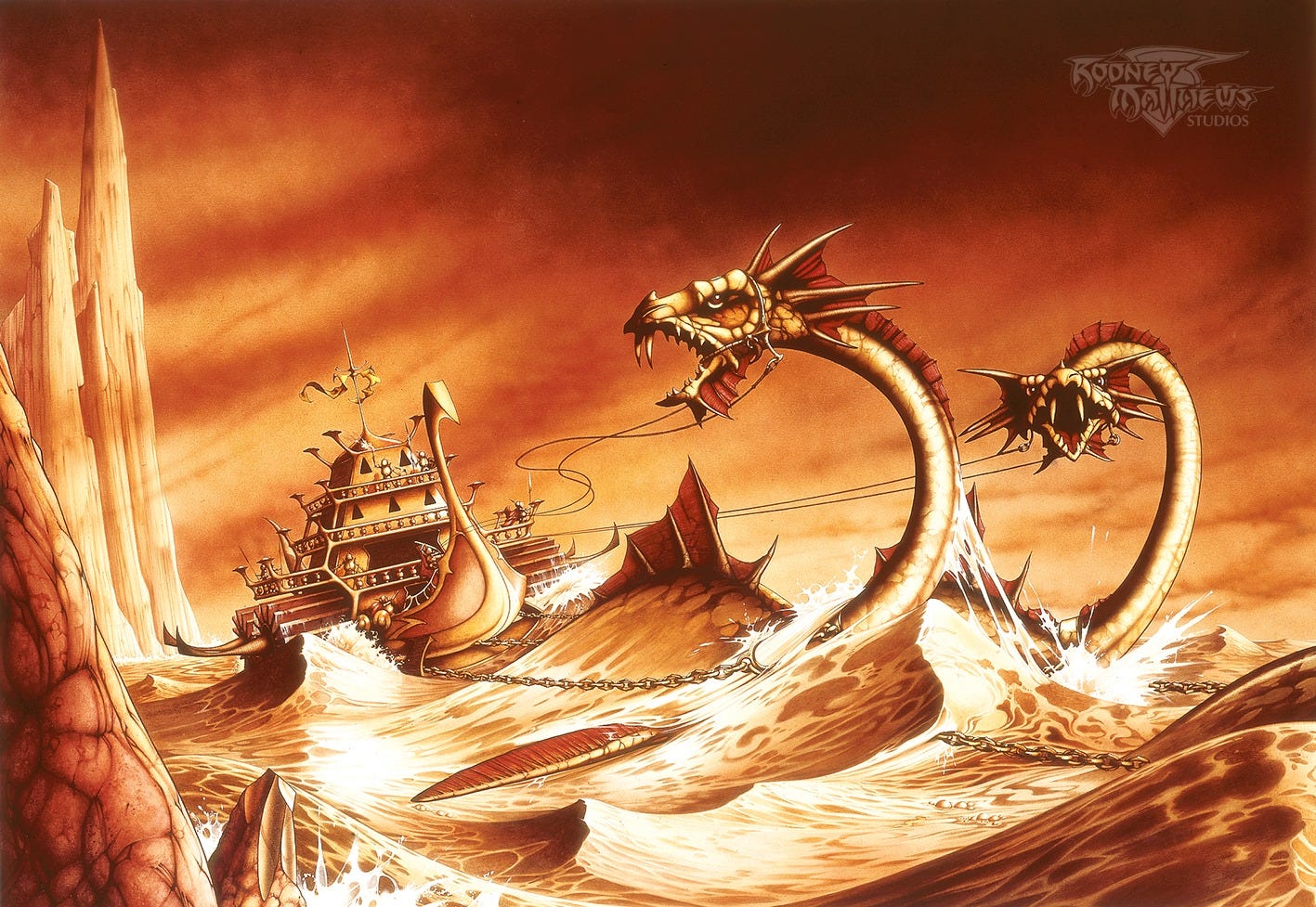
Page 28: Here’s the toughest one, which “severely tested Matthews’ skills and patience” — “The Sea Chariot of Rowernarc,” 1977.
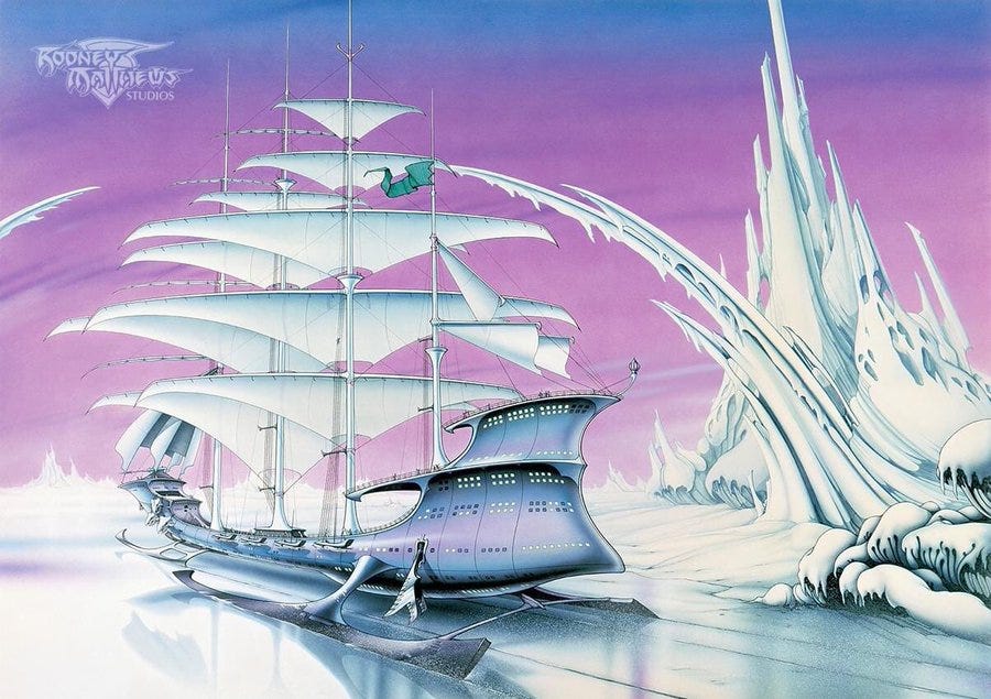
Page 30: ‘The Ice Spirit,’ another best-seller, is based on Moorcock’s Ice Schooner, a “tale about a race of people in a future ice age who make a great expedition to the far north in search of the legendary lost city of New York.” He had a tough time with the ice reflections until he made a model of the ship and set it on a mirror.
Page 45: Any runic inscriptions in Matthews’ works don’t actually have any real meaning.
Page 48: One of Matthews’ Christian works here, “Be Watchful,” 1983. It’s the future, with a guitarist who’s “symbolic of people who are blind to both the world around them and coming events,” watched over by the face of Christ.
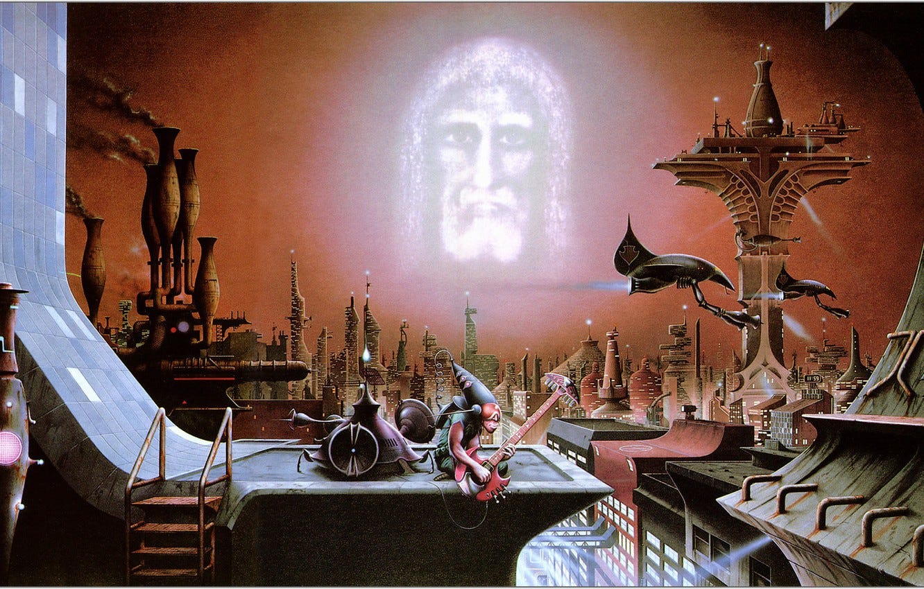
Page 56: Michael Moorcock’s chapter 4 intro covers the boom and bust of illustrated books, posters, and cards in the UK across around 1975-1980. Moorcock’s frustratingly vague about why the market grew at that time, though he attributes the collapse to publishers who swamped the market once they saw an opportunity.
Matthews had many Moorcock covers in England and Germany at the time of writing, with Germany, “strangely,” as the country where his work is most closely associated with Moorcock’s.
Page 57: London’s Granada-Mayflower published Matthews’ first Moorcock paperback cover in 1976, “Lord Jagged of Canaria,” (below) and requested bright colors in the brief. “Apparently it was almost a rule at the time that if an image was to be commercial it had to be bright.”
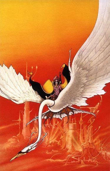
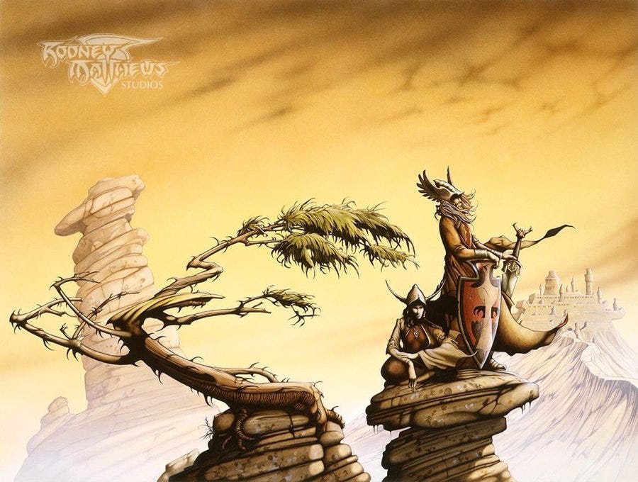
Moorcock is a good fit for Matthews, with source material that includes wacky flora and fauna like sea monsters, huge flowers, and giant rideable snails. His work for other authors tends to come across more stately. Here’s “Estcarp One,” for Andre Norton, 1977.
The rock that the figures are standing on here is based on a reference photo included in the book, as are elements in other paintings, like an odd ice outcropping.
Page 70: Matthews adds a lot of spikes, points and jagged edges to his monsters for a simple reason: They’d look too tame without them.
Page 78: Matthews did a handful of covers for the short-lived British speculative fiction Vortex magazine (1977-1977 — like I said, short-lived), which editor Keith Seddon ran on a shoestring budget for “about a dozen copies.”
Other recurring magazine cover gigs include Imagine, published by TSR Hobbies.
Page 87: Finally, an explanation for which side is up on this work, “Inverted Landscapes.” It was made for an illustrated Elric story that Matthews did with Moorcock, and appears “several” times in the book, flipped. This is the direction it’s oriented in this book, for what it’s worth:
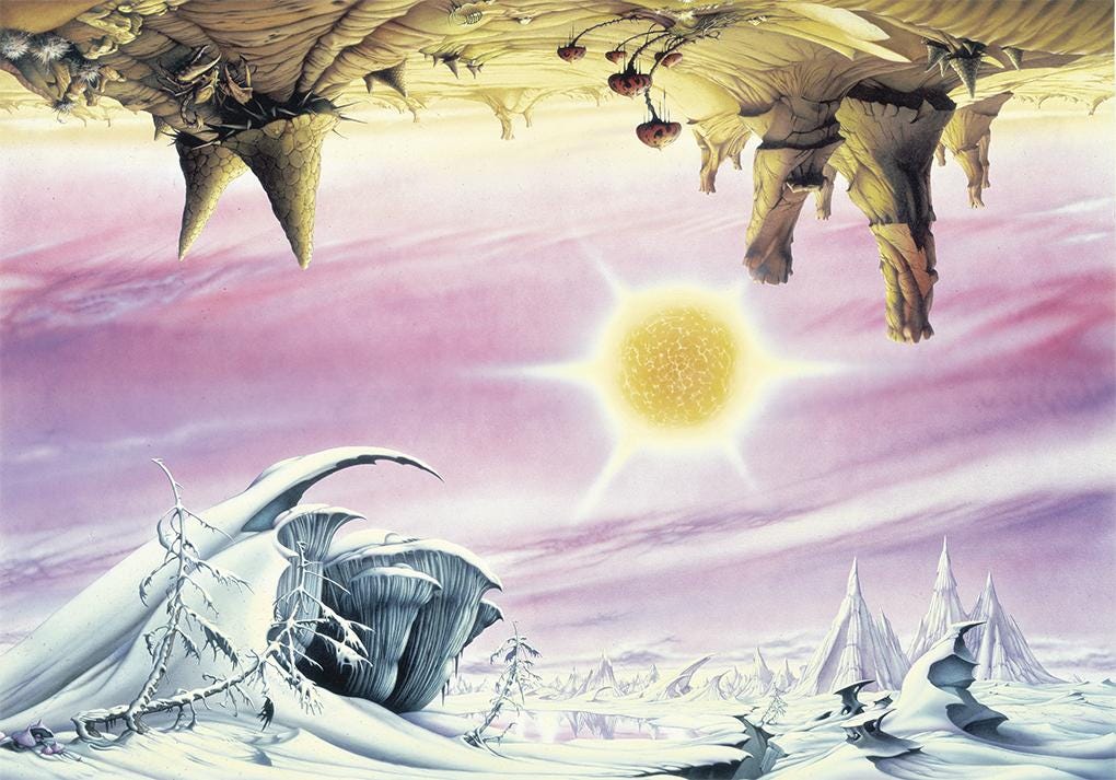
The story, titled “Elric at the End of Time,” is also the source material behind this image, “Encore at the End of Time,” 1981. It’s only a small moment in the story, but has been a big seller as a poster.
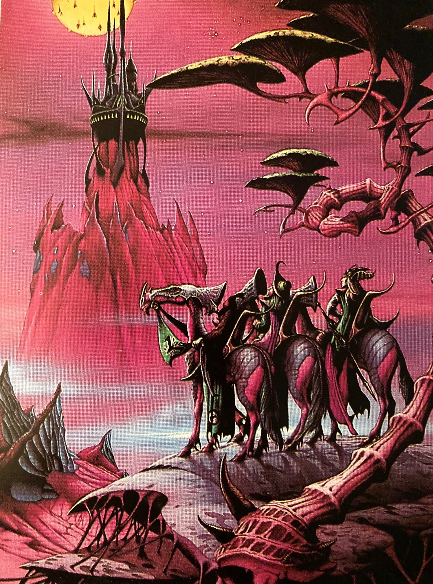
Here’s another image for that book, “Obsidian Castle,” 1980.
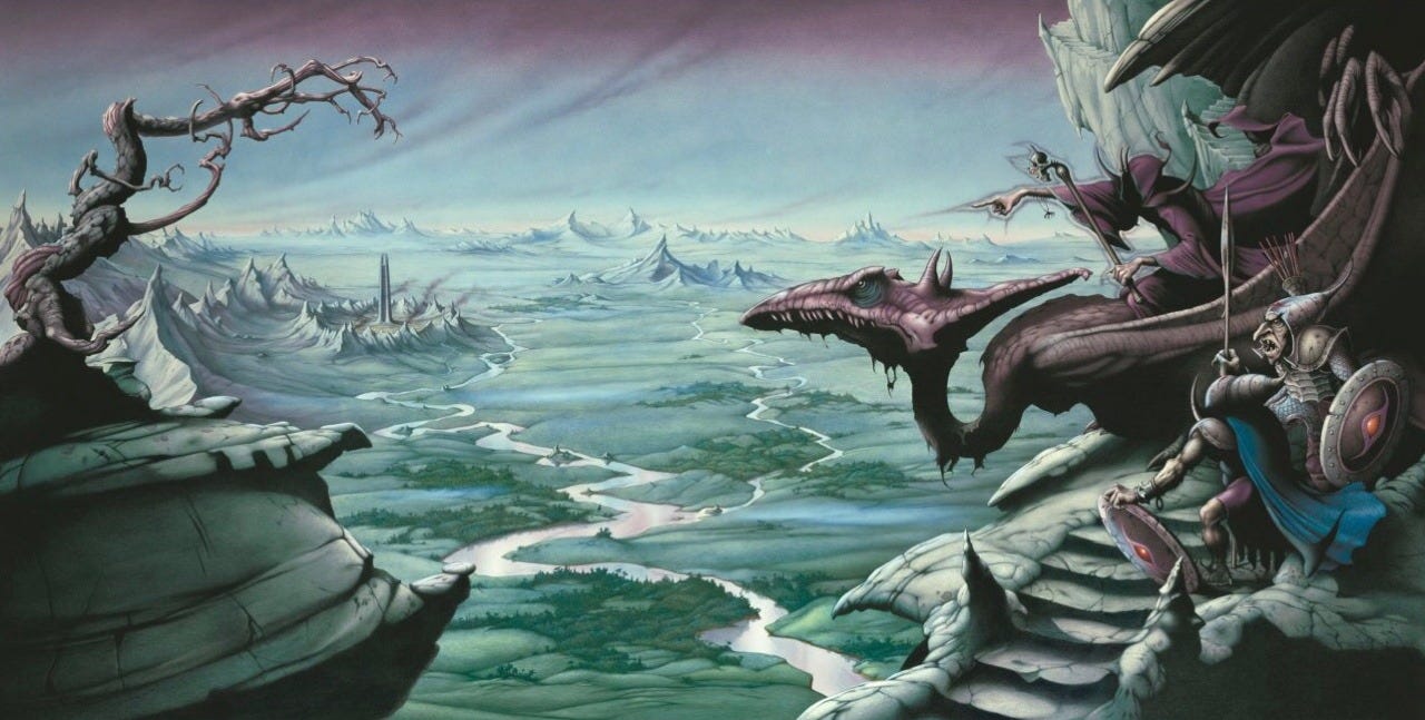
Page 92: Matthews conceived and drew a children’s book in 1973, Yendor (spell it backwards). It was published in 1978, featuring a young boy adventuring around creatures with names like “Grabsting” and “Snawk.”
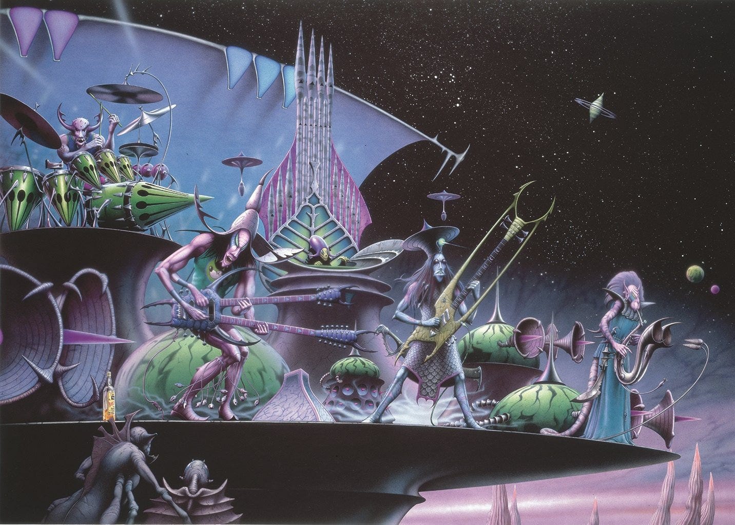
Page 100: Matthews and a few friends considered putting together a band while at art college in the early 60s, and it’s clearly a lingering interest, given the number of guitars and bands he’s stuck into his fantasy art.
Matthews was in advertising from 1962 to 1970, and did some album covers with more of a groovy psychedelic vibe than his later work. He was in a few bands, too, Originn and later Squidd.
Page 107: Matthews loves Lord of the Rings, and did some experimental pen-and-ink fan art in 1973. He got his chance to do it professionally when he was comissioned for the 1979 reissue of Bo Hansson’s 1970 prog rock album Music Inspired by Lord of the Rings:
The book ends with some fun logos and typography Matthews has designed, along with his earliest art. A very informative collection, rounding up the work of a fascinating artist.
