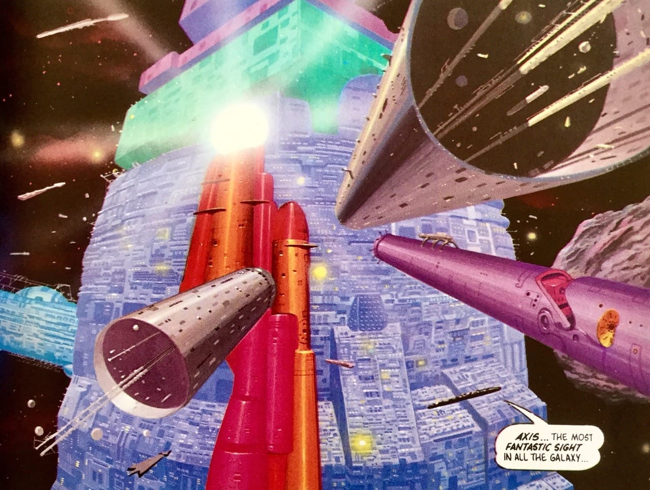
Angus McKie's Modular Future

Angus McKie's an elusive artist. He had a flurry of stellar science fiction paperback covers across the mid-to-late '70s, before slowing down across the '80s and '90s while working across a variety of other mediums, including his own graphic novels, the 1981 Heavy Metal film, some pioneering '90s work with CG for comics and graphic novels, and more recently, working on video games.
He hasn't done many interviews and doesn't have an art collection dedicated to him, but his colorful, detailed '70s paperback covers are some of my favorites.
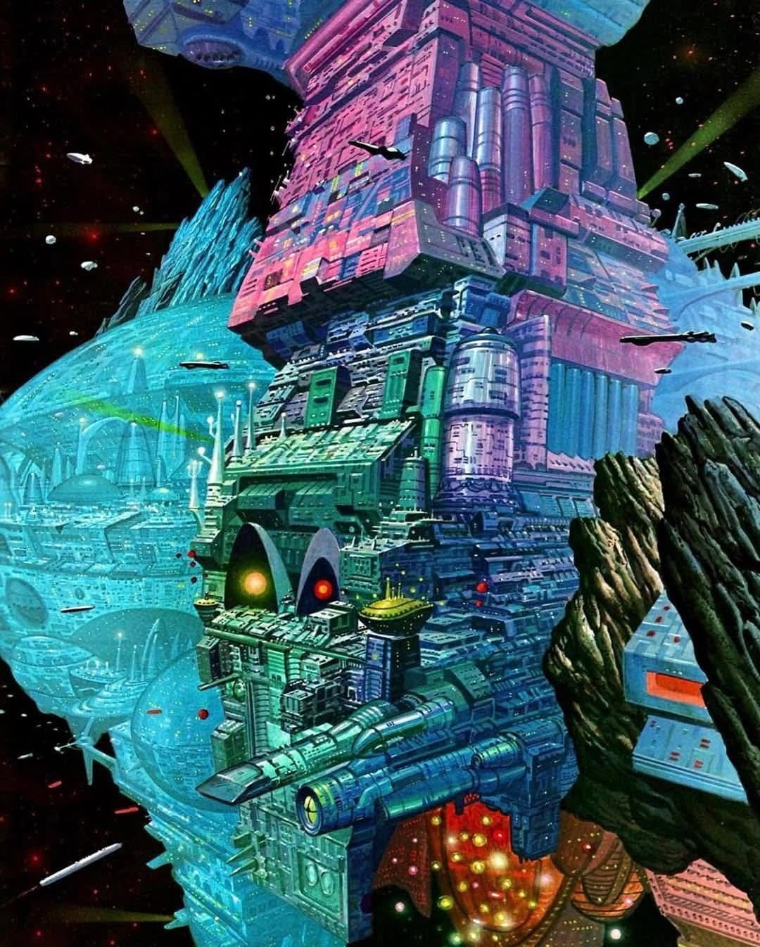
A little while back I posted one of McKie's works that's likely among his most well-known, given that it was the 1978 cover to the iconic Spacecraft 2000 to 2100 AD art collection.
I did a little riff on the right-to-repair laws that might have been behind the ship's aggressively modular appearance. Obviously, that green nose in the front was a replacement part, right? It reminds me of an old cobbled-together junker car my dad put together in his youth by combining halves of two different red 1973 Ford Capris.
But I've kept thinking about the concept.
The truth is, that colorful, slapdash, function-first-beauty-second feel is central to what I love about McKie's '70s artwork. To me, that's a comforting view of the future. It promotes a very "lived-in" idea of space travel, like the original Star Wars trilogy with more science, or the worlds of Bladerunner and Alien without the dsytopian corporate overreach.
Here in the real world, we went a different direction (due in large part to all that corporate overreach). We've got the Apple future, where everything is sleek and subscription-based, but nothing is ownable and repairable.
So for this post, I'm looking back at McKie's '70s illustration to highlight all the examples of the modular, piecemeal, repairable future McKie built.
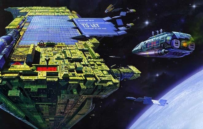
The first one that springs to mind is this delightful space station, the 1978 cover to New Writings in SF 30 edited by Kenneth Bulmer.
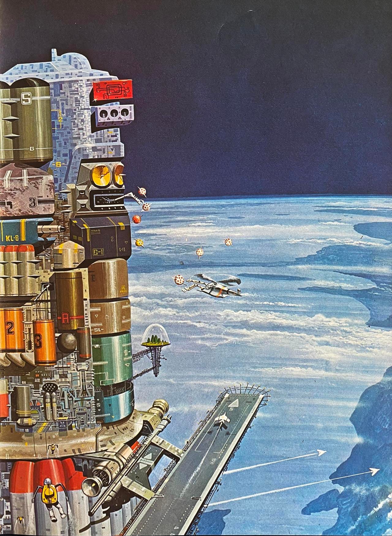
Once you get past the enchanting details like those floating polka-dotted drones or the domed trees, you'll see that many of these multicolored station modules are marked with seemingly disparate arrangements of numbers and letters.
It seems clear to me that this station was built through the cooperation of a range of foreign entities, whether terrestrial or extra-. In fact, given the connections McKie's work has to the Valérian and Laureline French comic series, I'm really reminded of the expansive, scattershot Point Central space station where every alien race has a presence.
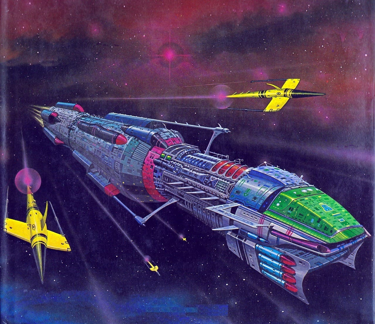
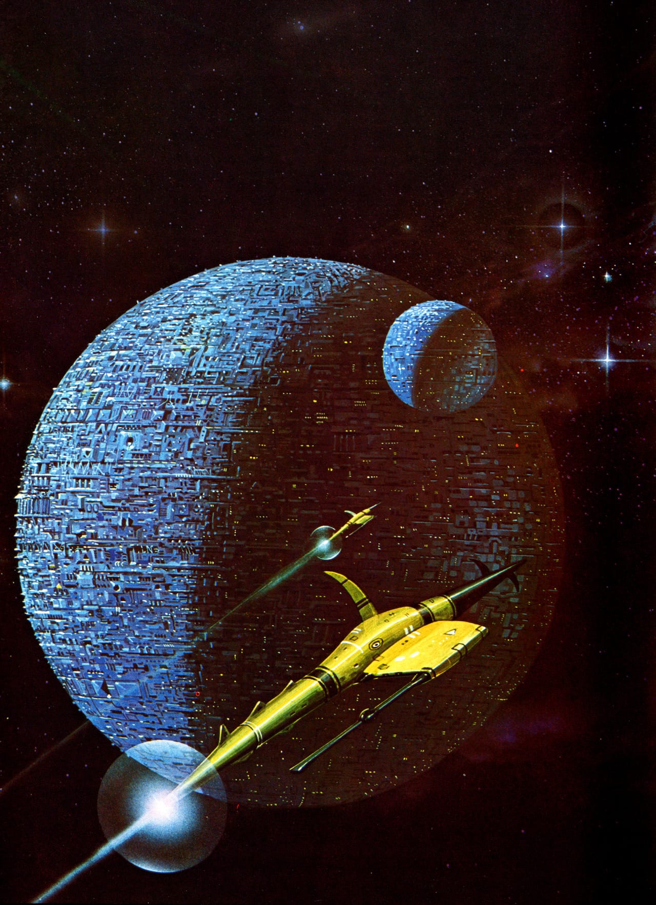
McKie's 1978 cover for The Fenris Device, by Brian Stableford, depicts another spaceship packed with various docking ports and gewgaws.
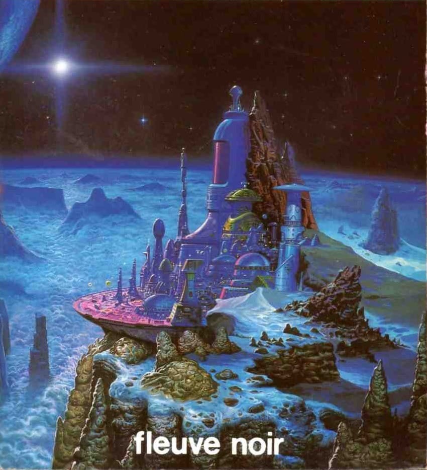
Some McKie works are arguably modular: The space city on his 1985 cover to Voyageuse Yeuse by G.-J. Arnaud, has a wide range of building shapes and sizes, although they're mostly given a uniform shade of blue.
Of course, I suppose it's a lot more rare for entire cities to not be built piece by piece over time. Like the planet-wide version on McKie's 1977 cover art for Perry Rhodan 31: Realm of the Tri-Planets, by K. H. Scheer.
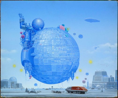
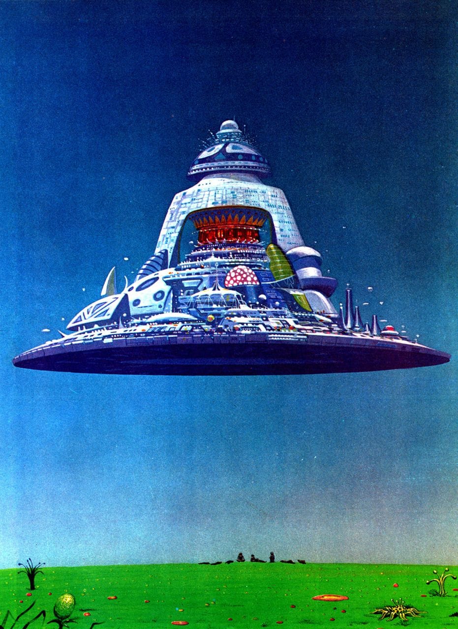
Speaking of big spheres, this one, “Floating World,” is amusing: Whoever owns this little Death Star has modded it out with extra kit that gives it a mishapen profile, exactly like a normal car with monster truck wheels.
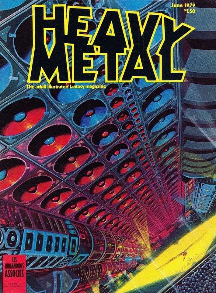
The modular approach is also a necessity when crafting the biggest sound system in the galaxy, for McKie's June 1979 Heavy Metal cover.
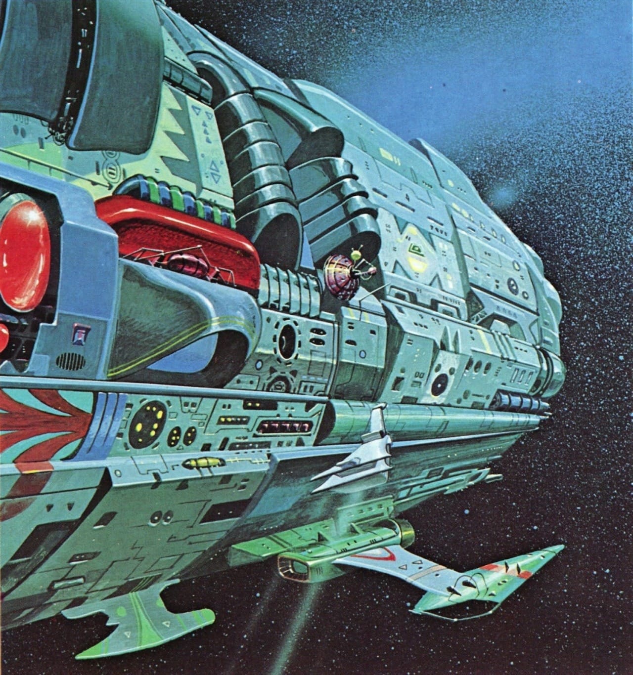
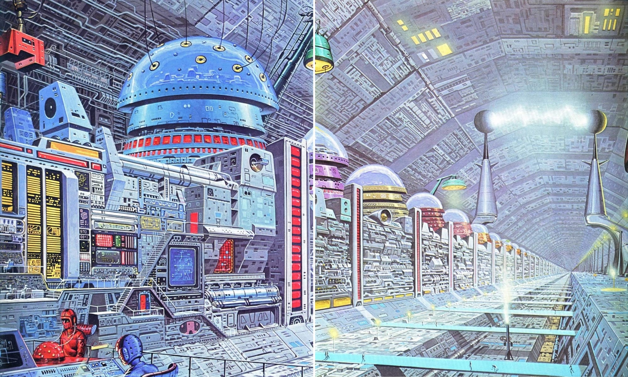
McKie's 1978 graphic novel So Beautiful, So Dangerous has a few modular spaceships, space stations, and flying saucers.

Interestingly enough, this next splash page is not from that graphic novel... It may from another Heavy Metal comic or from Omni magazine – I wasn't able to find the source. At any rate, it's impressive! This may be the most greebles McKie has ever packed into a single work.
Edit: It's "Computer TSB 567/b," from Harry Harrison's Mechanismo book, and has been reused a few times since. Thanks to John Coulthart for the info!
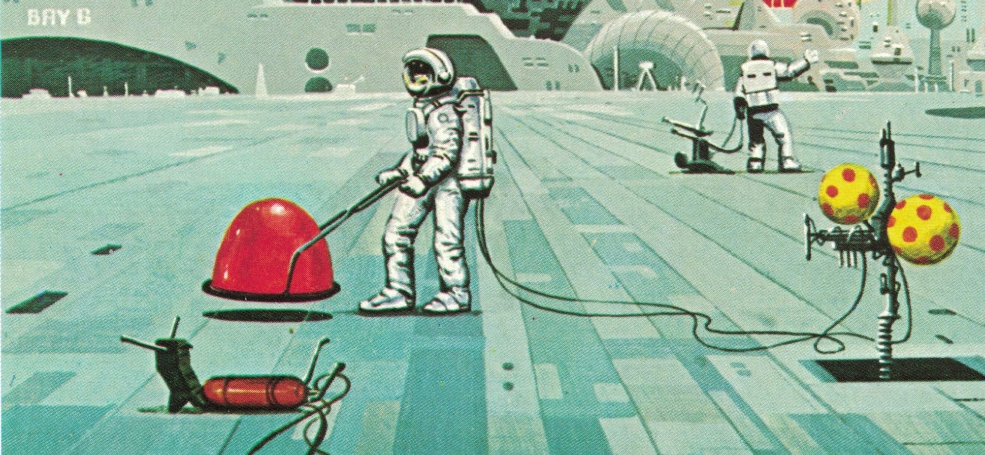
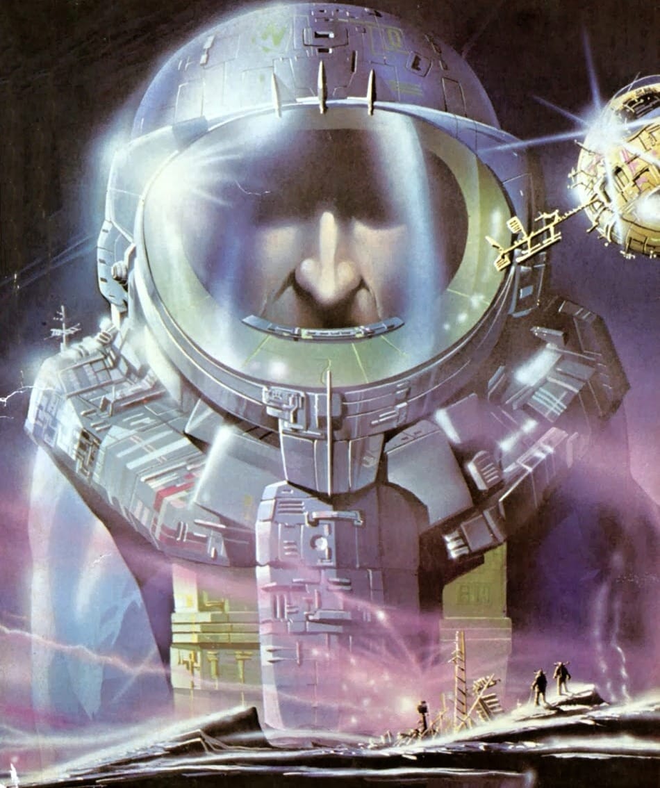
McKie's love for modular hardware extends to spacesuit design.
Both of these examples (the Oct 1975 cover of Science Fiction Monthly and the 1976 cover to The Year’s Best Science Fiction No. 8) feature a similar two-part chest piece on the front with an additional plate centered on top of it – perhaps a battery pack or an oxygen tank.
These two illustrations of a computer planet from Alan Frank's Galactic Aliens are actually uncredited, but I think we all know who did them. I mean, just look at those modules! Am I saying "modular" too much in this post?
Another good reason to divide your space station into descrete segments: It's easier to rent it out.
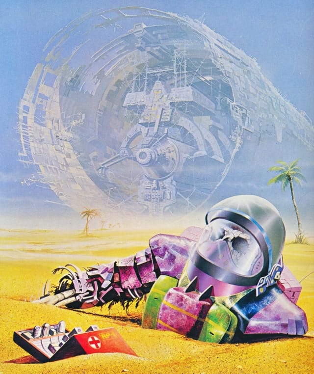
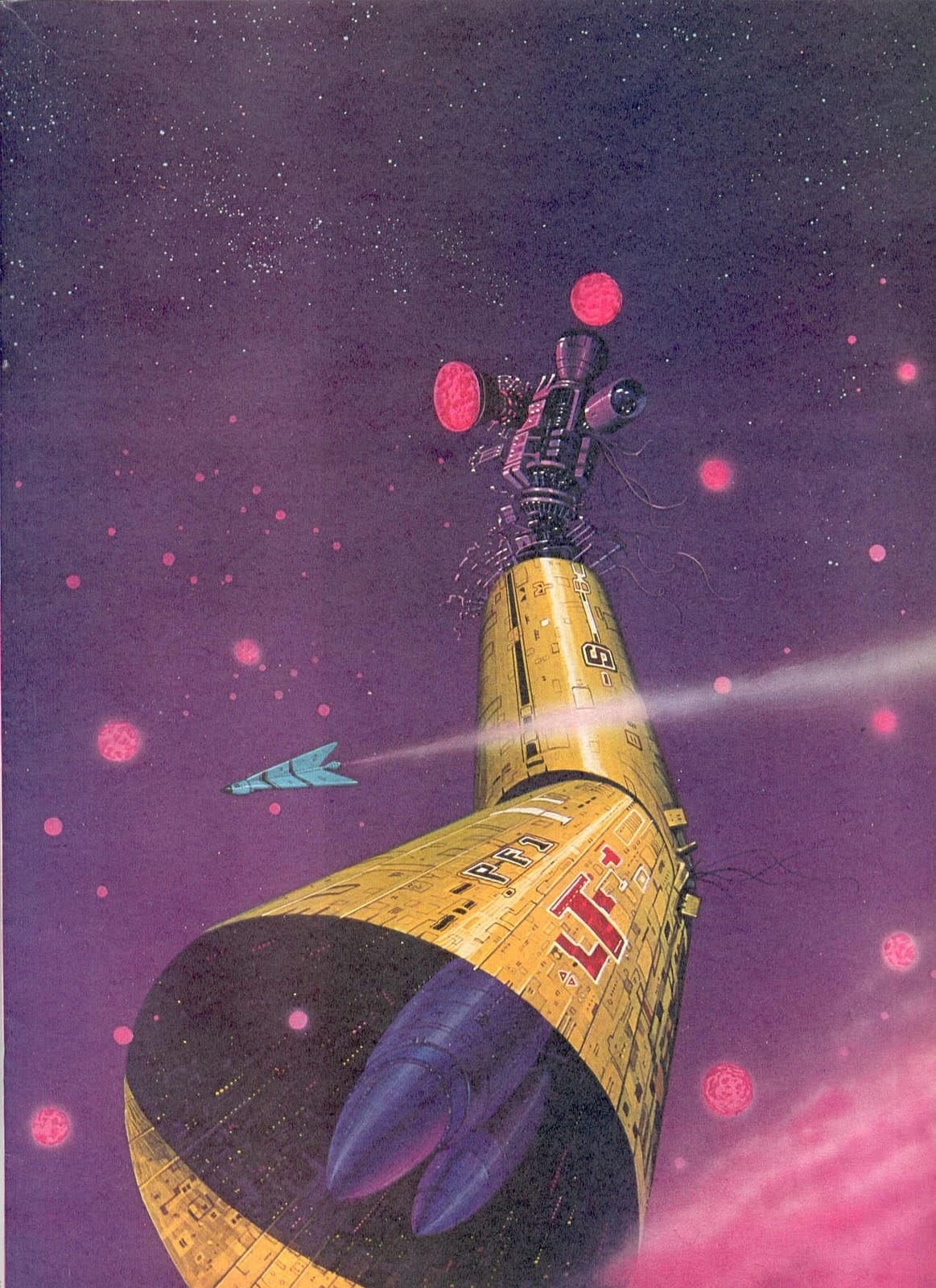
Finally, here's a rare example of Angus McKie's dedication to the modular nature of his sprawling spacefaring future: One of the sections of space hardware itself, en route to its destination.
This one's from the Italian-language compendium Fascìculo nº 1: Las Astronaves, but I ran the caption through Google Translate to confirm what I'm looking at:
"The 'Nouvelle Vague' of science fiction illustrators is Angus McKie, one of its greatest exponents. Here the emphasis is on the realization of an improbable, though suggestively pleasing, technology for a keen observer. This gigantic copy of disassembled containers has the obvious function of a hangar, while the complex group of instruments and bustling cargo machinery will perform all the indispensable functions. The environment, a space suggested in purple reflections, is the entrance to a strange planet with countless tiny satellites."
I'll leave you all with the most bizarre use of Angus McKie's illustration I've seen to date: As the backdrop to the “Space Rescue” dance, performed by Ballet Zoom on the 70s Spanish TV show “Señoras y Señores.” Groovy.
Cool Links
Maurice Leloir’s Three Musketeers - { feuilleton }
I love hearing about how book illustrators have influenced other adaptations (Bernie Wrightson's impact on the recent Frankenstein film, for example), so this post on the legacy of Maurice Leloir's 1894 illustrations was particularly fun.
"A couple of them so closely match scenes in the Richard Lester films that I’m sure the books must have been referred to for details of costuming. Douglas Fairbanks certainly saw them; after playing d’Artagnan in his own film production of The Three Musketeers he invited Maurice Leloir to advise with the costuming of another Dumas adaptation, The Iron Mask, in 1929."
A Far Side/Sting investigation - cow tools daily

"what if i told you, through the power of forensic analysis, we are closer than ever to knowing the exact Far Side cartoon that is making Sting smile in this iconic photo."
If you read through the comments, they actually do have a compelling argument for the specific cartoon! Amazing stuff.
The Importance of Being Earnest, starring Ncuti Gatwa, free on YouTube
The 2024 West End production is only free online from March 12-18, so hopefully you're not reading this in the future or this isn't really relevant. I'll check it out. Great actor, great play.
Music rec: Saturday Club Fever n°99 by icedjparis - a progressive electro house that I'm mostly sharing for the sick version of "Bring Me to Life" that starts around the 7:30 min mark.
Next Time: Space Shuttles