My visual guide to Paul Lehr
Featuring... lots of covers

Oddly enough, Paul Lehr doesn’t have an art collection to his name, as far as I can tell. He’s a big name, influential and distinctive, but for my entry on his work in my art book, I’ve had to go with online articles and Vincent Di Fate’s (very good) entry in his 1993 collection Infinite Worlds.
Here’s a few references, if anyone cares to read more about the guy:
- Ragged Claws — a blogger’s posts rounding up some cool covers, along with some light editorializing
- Writers of the Future biography
- SF Encyclopedia entry
- Muddy Colors art blog post
One of the most helpful resources was this lengthy list of many Lehr covers, available from ISFDB.org. They’re arranged by date, so I could click through all of them to get a tour of how Lehr’s style evolved over time.
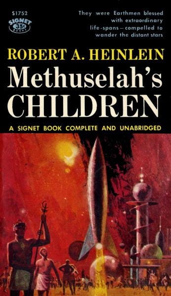
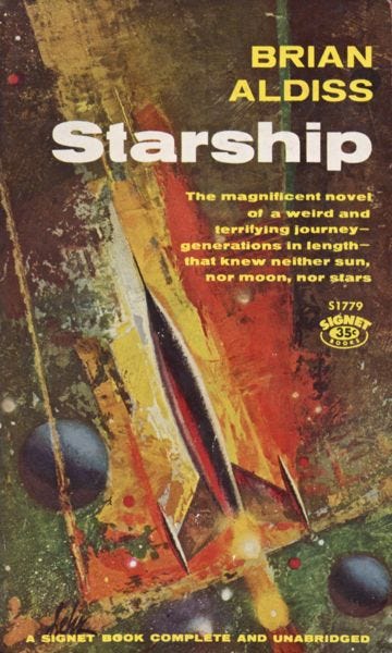
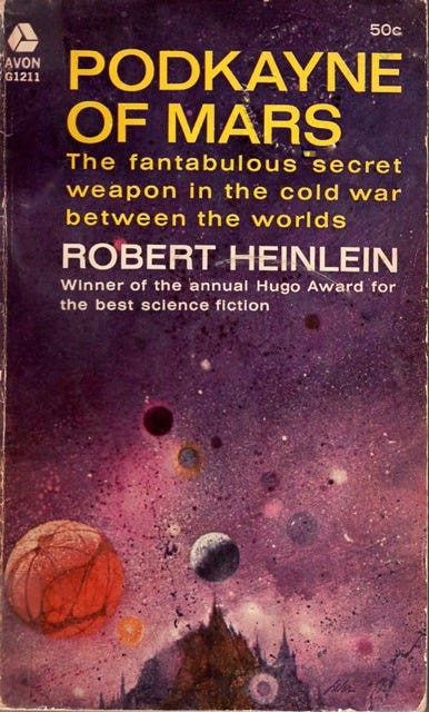
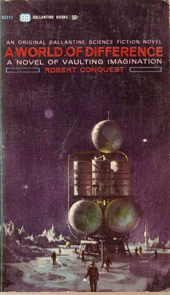
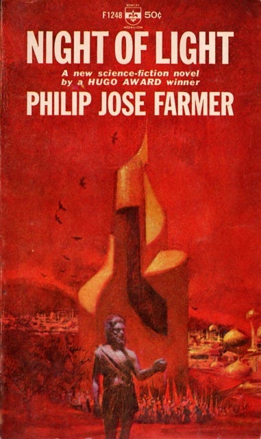
I’m only doing a two-page spread on him, using three or four covers, so I figured I’d give my newsletter subscribers the full experience that I won’t have room for in print. Or in email, either… Depending on your email client, you may have to open this email up into a separate page to see everything. It’s worth it!
Here’s Paul Lehr’s very first cover, sold in 1957 straight out of his art school portfolio. He stuck a ping pong ball on a toilet paper tube as a model for the spaceship.
The colors are very muted, and it’s very staid overall — not what he’s known for.
His first two or three years of covers had the same style. Here’s his 1959 cover to The Seedling Stars:
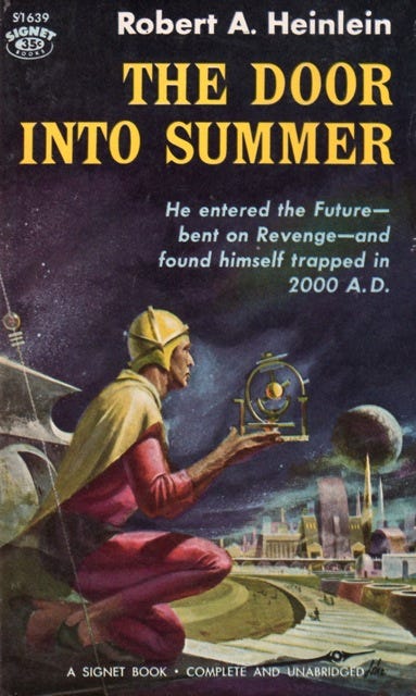
Here’s the cover to The Door Into Summer by Heinlein, also from 1959:
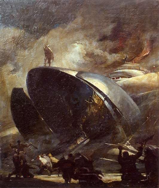
So where did this style come from? Well, Lehr’s mentor and art school teacher was Stanley Meltzoff, a talented artist who brought his expert spear-fishing knowledge to crafting innovative space art images in the 50s. He only did about seven sci-fi works, apparently, but they were influential.
So, these next three images are not from Lehr, they’re by Meltzoff. I want to be clear about that because the previous three Lehr covers are so darn similar.
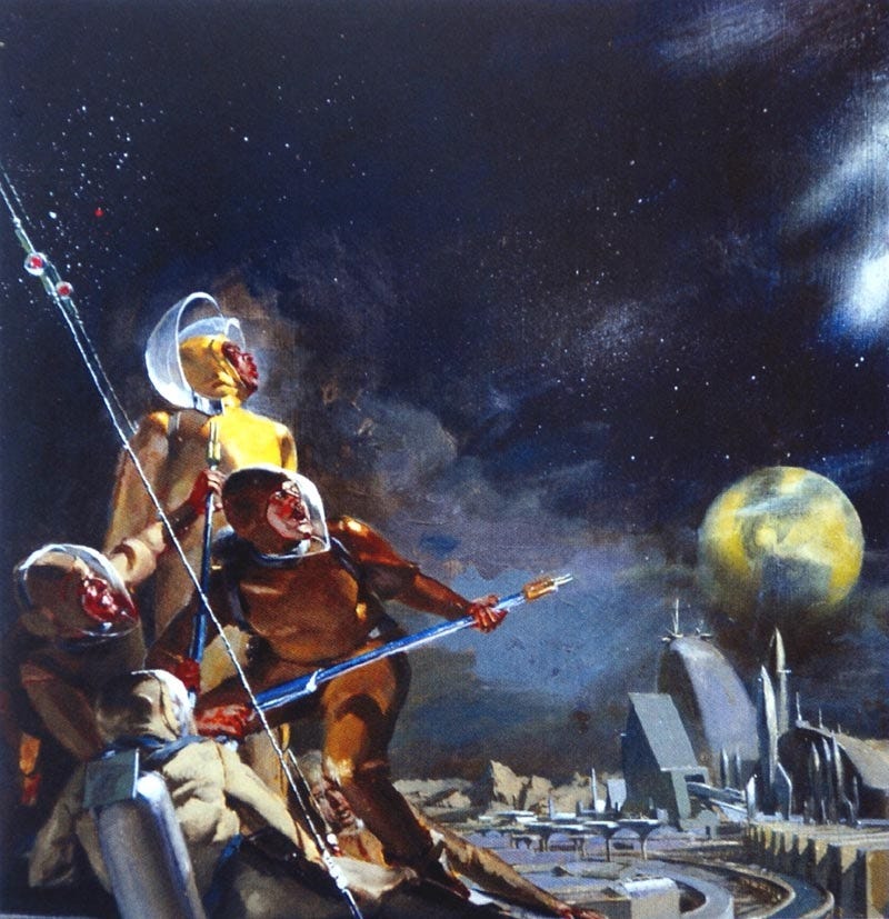
Sci-fi art historian Vincent Di Fate has called this next Meltzoff image one of just a handful of SF masterpieces, saying it has “influenced dozens of other illustrations for the genre with its classical treatment of fantastic subject matter.”
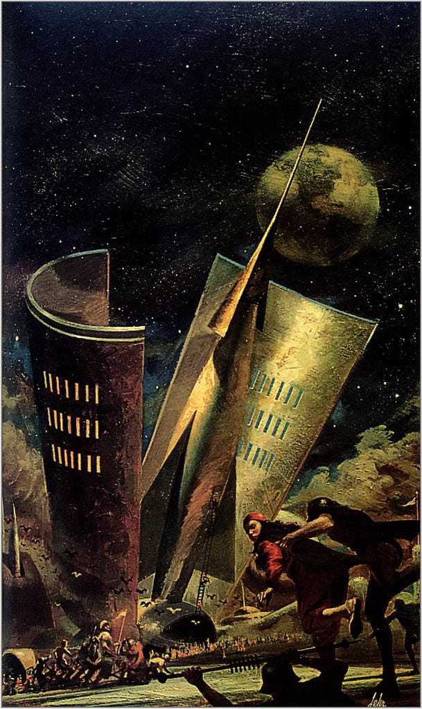
Finally, this Meltzoff showcases how influenced he was by underwater scenes and suits when painting outer space:
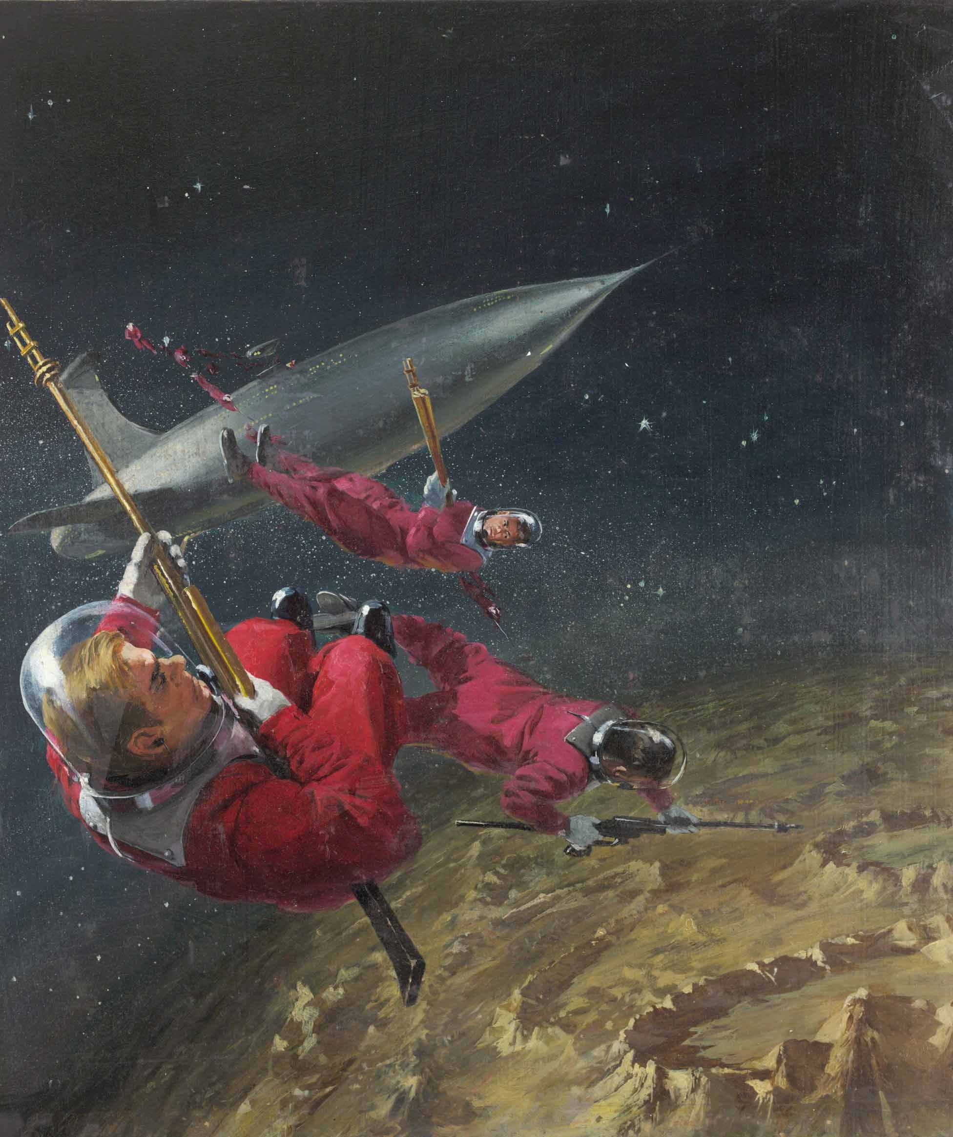
So how did Lehr go from a Meltzoff carbon-copy to one of the most original artists of the 70s? He started adding brighter acrylics and moving away from foregrounded figures. He added more surrealism, too, inspired by Richard Powers. Here are two transitional 1960 covers:
He really cuts loose with this 1964 cover:
But then this other 1964 is a bit of a throwback:
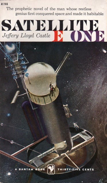
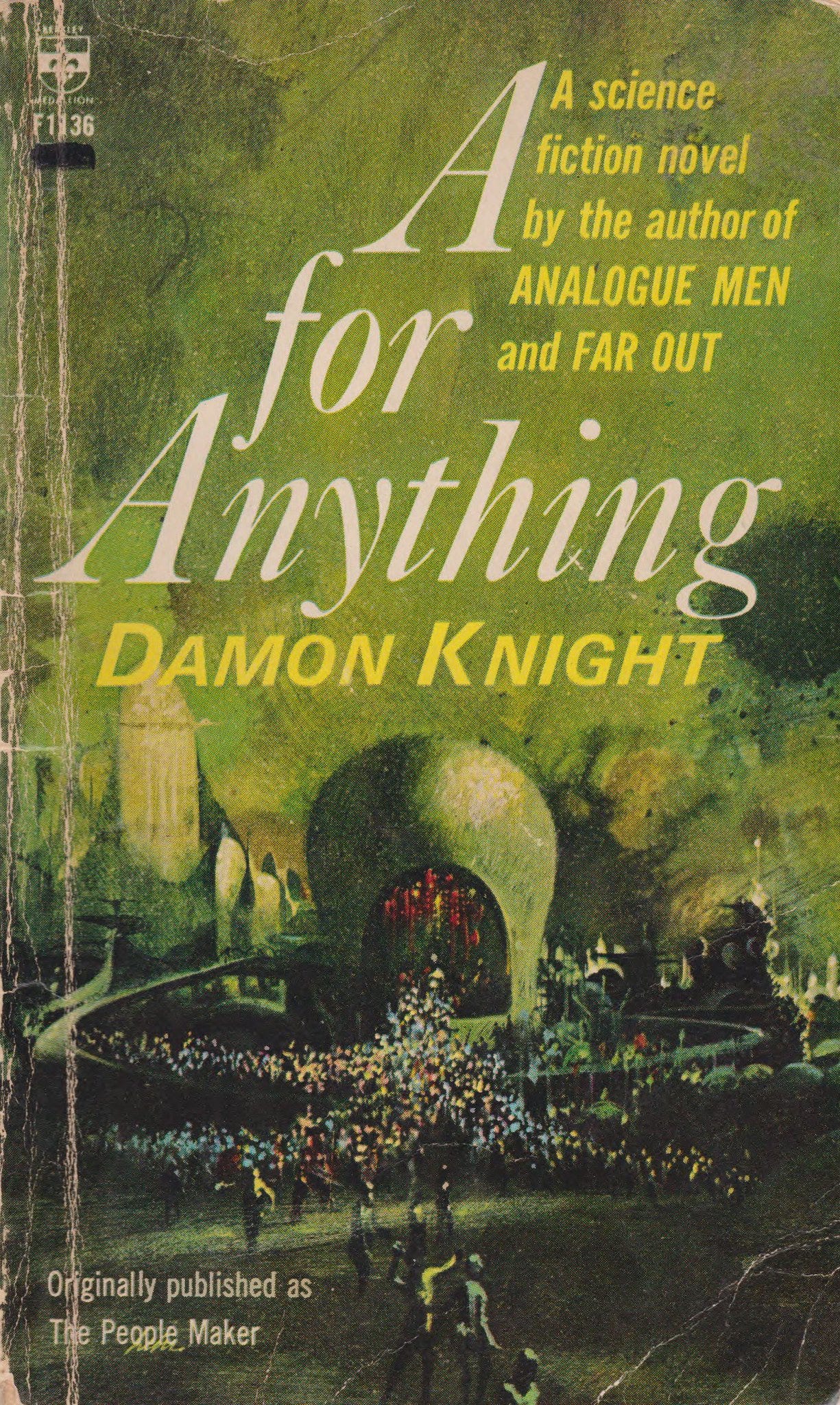
Here’s the earliest example (on ISFDB, at least) of the fully-fledged Paul Lehr style, debuting 8 years after his career started: His 1965 cover to Damon Knight’s A for Anything. It features a weird blobby building as the central object, surrounded by tiny figures for a sense of scale, with extra city details packed in, and a nice saturated green sheen over everything.
The overall effect is dreamlike, as if surrealism smuggled itself into a representational painting.
Here’s his very next cover, 1966, also featuring a central object, a single core color, a background cityscape, and even a few tiny figures crouching near the base of that sculpture. The guy in the foreground is a shake-up, but this is otherwise the classic Lehr formula.
I don’t mean to imply that Lehr didn’t have range for his whole career, of course. His next 1966 cover reminds me of a few Dean Ellis covers I’ve seen:

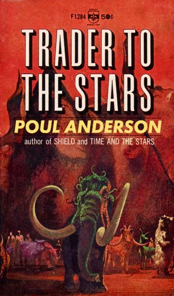
Here’s a bizarre alien elephant, also 1966:
This one keeps the monochrome and the central object, but cuts down on the surreal landscape:
And he would often just skip his template entirely for something a little more surreal, like this:
Or this:
Or this, kinda: (he still has tiny people in this one. Lehr loves a crowd of tiny li’l folks.)
Definitely whatever this is:
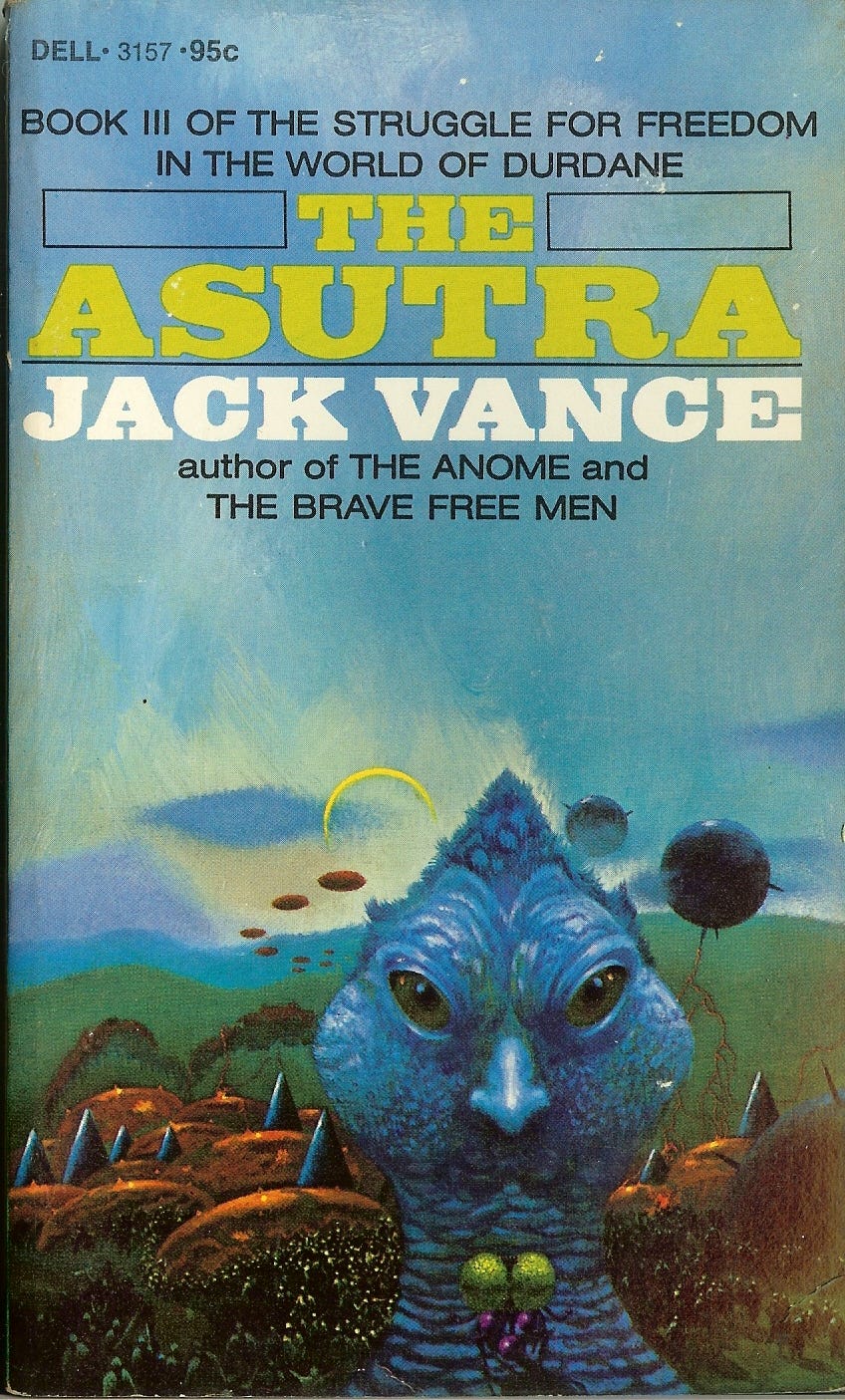
Paul Lehr’s color palette broadened in the 70s, though it stayed just as saturated for his whole career. Here’s a 1976 cover from his wheelhouse: Cool colors, clamoring crowds, craggy spacecraft.
Finally, by the late 80s and into the 90s, Lehr leaned into his defining traits, with even more saturated colors, details, and big, surreal landscapes. Here’s Island City in Green, 1988:

That should give you a good idea of Lehr’s evolution. Lehr remains one of the biggest names in 70s sci-fi art — the genre would be measurably less weird without him.