Ralph Brillhart's "D-99" cover

A Tumblr user asked me about a specific book cover the other week, and I figured I'd feature my response about the artist in this newsletter. They asked me:
Hello! I don’t know if you have a 60s scifi art equivalent or not, but do you know anything about the cover of D-99 by HB Fyfe? It was published in 1962, my friend and I found a copy of it in a second hand shop and literally have never been able to stop thinking about it ever since. Thank you!
Here's what I said:
I see why it stuck with you, it's very striking! haha
According to ISFDB, the artist is Ralph Brillhart, which makes sense. I like Brillhart! You can see some of his other covers over here, and they're almost all from the early 1960s, with another handful done in 1981-'82.
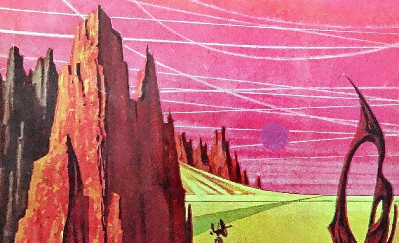
Like most 60s artists, his work doesn't have the finer detail or realistic perspectives that you tend to get with 1970s artists. But he has some great concepts, and I think he picks really interesting compositions - in my opinion, the cover here is unsettling entirely because that one wide-eyed alien in the foreground has stuck his face right up against the viewer. Very confrontational!
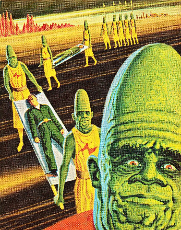
I bet Brillhart knew that, too, because he pulled the same trick for this 1965 cover:
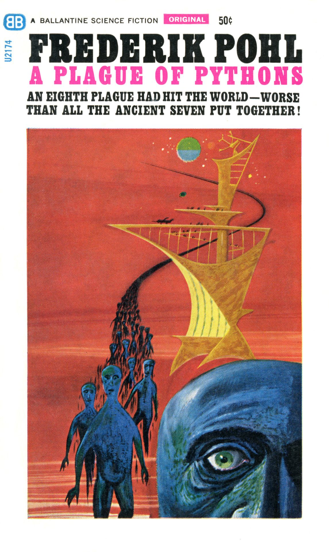
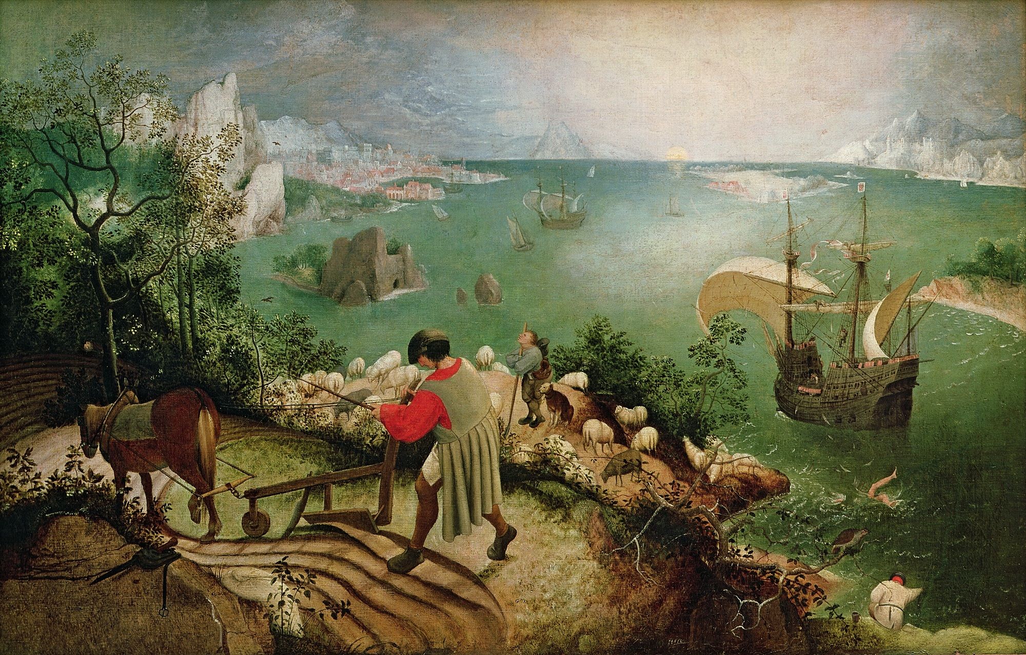
Here's my favorite Brillhart cover, used for Martian Time-Slip by Philip K. Dick, 1964. I love the odd color choices, like the pink sky.
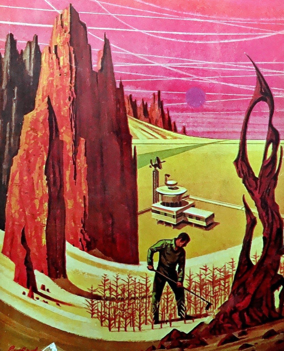
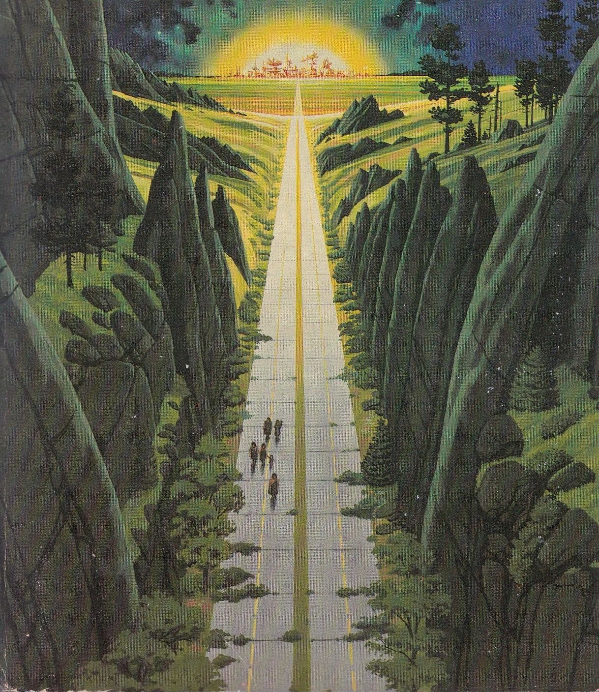
Here's a later one that Brillhart did in 1981, for The Ends of the Circle, by Paul O. Williams. He's using another bold perspective choice, with the perfectly straight road cutting down the center of the image, and it totally works for me!
Anyway, he's a good artist! You can see a fairly complete list of his covers here. They're not all winners, admittedly, but it's a bit of a shame he wasn't more well-known or prolific.
I got an interesting follow-up comment on the post from tumblr user onsomekindofstartrek:
That "Martian Time-Slip" cover looks like a bit of an homage to the Elder Brueghel "Landscape with the Fall of Icarus." What a genius move... the Breughel painting subverts the mythical scene by placing it, or rather, its aftermath, in the background of a conventional farming scene. So Brillhart does the same with the bizarre sky and landscape behind the farmer.
Here's that artwork:
I highly recommend this blog post on the history of the relationship between science fiction and global tech culture: We're sorry we created the Torment Nexus, by Charlie Stross.
Here's just one paragraph, but the whole thing is fascinating.
American SF was bootstrapped by a publisher feeding an engineering subculture with adverts for tools and components. There was an implicit ideology attached to this strain of science fiction right from the outset: the American Dream of capitalist success, mashed up with progress through modern technology, and a side-order of frontier colonialism. It's not a coincidence that the boom in planetary romances occured shortly after the American frontier was finally closed: the high frontier had a natural appeal and gradually replaced the western frontier in the popular imagination.
I didn't read all the comments – there are an impressive 750+ of them!
John Harris just did an interview with Andrew Liptak that you can read in full over here. Harris is a top artist here at 70s Sci-Fi Art, and he gives an entertaining interview. Liptak gets him to agree that his art is "a vibe."
No one beats Harris for epic scope, with images that feel beamed in from across the galaxy – and might well be, given how strongly Harris credits his own meditation and dreams as source material.
Here's one interesting excerpt from the interview.
When I was very young, I must have been no more than 12, 13, or 14, I saw a program from the National Film Board of Canada about the current state of astronomy and our view of the galaxy and all of this stuff. I remember watching it and thinking, "that's it. That the shape." – this might sound a bit odd – "that's the shape of my dreaming,"
I fell into it this sense of wonder about the universe, hook, line and sinker. That is probably the germination of what eventually came into fruition, as it were: this extraordinary black and white film of the newly discovered optical images of the galaxies.
Liptak was also kind enough to recommend my art collection in his 2023 holiday gift guide! If you want to pick up a copy yourself – it's 400+ images, 100+ artists, with lots of fun art history and jokes – it's on sale at all these places. You can pair it with Liptak's new book, an illustrated history of cosplay.
Older science fiction writers have a (deserved) reputation for indulging in silly puns. The short story "To Serve Man" is probably the most famous example, but there are plenty. One way that this urge manifested was in pen names – for example, the writer "Eando Binder" is actually two brothers, Earl Andrew Binder and Otto Binder – aka "E and O."
There's probably a cool essay to be written about the connections between this fun-fact hidden knowledge sensibility and the genre's overall reputation as the "literature of ideas." Anyway, I just found out about a new jokey pen name in an interview with crime caper author Donald Westlake:
Curt Clark was sort of a one-off, because I don’t write science-fiction and here I was with this science fiction novel. Science fiction writers tend to put cute or arcane messages into their pen names, so that’s the one time I did, too. Curt, of course, means short-tempered, and Clark is a variant in spelling and pronunciation of a word one of whose meanings is writer. Short-tempered writer.
Today, in my book promotion corner: This very kind review from S. Elizabeth at Unquiet Things! She writes:
“Well-informed, brimming with details, and powerfully engrossing sure, but Rowe’s voice is chatty, warm, and irreverent–like you’re being regaled by one of your smartest, funniest, nerdiest friends. You no doubt know of Adam Rowe from his Twitter and Tumblr accounts, where he shares otherworldly, alien retro sci-fi art on an almost daily basis…but while those are both awesome places to peek in at, it’s not the same as having this outstanding book at your fingertips.
Of course, the imagery he has curated is tremendous, but what makes this such a special collection is the enthusiasm, fondness, and overall spirit of curiosity and wonder that infuses every single word in this book. You never doubt even for a second that Adam Rowe is absolutely jazzed about these artworks–and he wants you to be, too.”
This is exactly the response I’m hoping for in my readers!
My book was also featured on the Vintage RPG podcast over here.
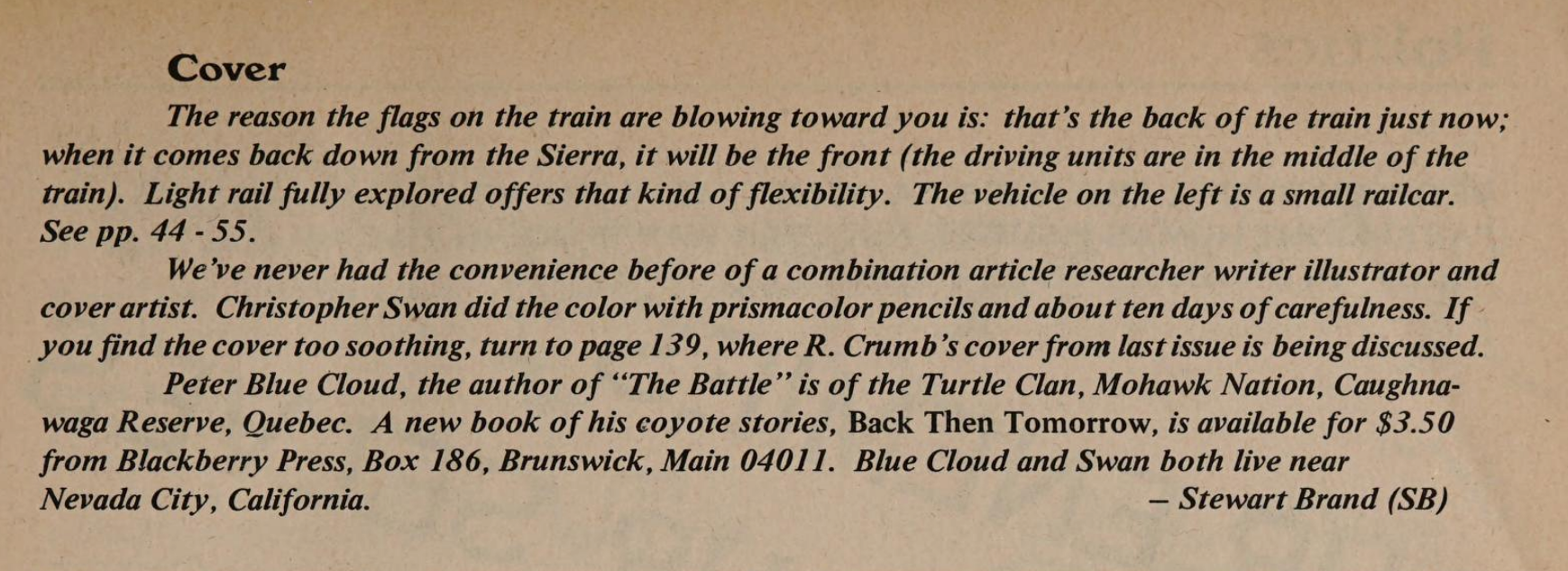
If you follow the same newsletters that I do, you've seen this half a dozen times already, but the entire scanned archives of the Whole Earth Catalog are available online now. This Wired article has the links, as well as some context as to why people care about the 50-something-year-old "techno-hippie" magazine.
I, of course, raided the archive for cover art like Christopher Swan's depiction of a lightrail train for the Spring 1980 issue of "CoEvolution Quarterly."
There's a little blurb inside explaining the cover a little bit, which I always appreciate in old magazines:
(And if that mention of a controversial R. Crumb cover intrigued, you can check out the full five (!) pages of discussion in the magazine over here.)