Hipgnosis, MC Escher, and Spy Vs Spy

I'd love to write a book about M.C. Escher's impact on pop culture (although he apparently hated pop culture, so getting the rights might be a challenge). I'd probably have to dedicate multiple chapters to this lithograph, Relativity, since it's referenced far more than the rest of his oeuvre – just check out how Wikipedia broke down its "M. C. Escher in popular culture" page.

Seriously, it's a fun read! Where else will you see Night at the Museum: Secret of the Tomb (2014), Dario Argento's Suspiria (1977), Labyrinth (1986) and A Nightmare on Elm Street 5: The Dream Child (1989) all on the same list?
That's for the "Relativity in film" list, of course, and there are more lists for references to that one artwork in Television, Video games, Music, and Other. The one list of references to all of Escher's other works includes the 1982 Doctor Who episode Castrovalva, the first Sonic the Hedgehog game, a 2006 Audi commercial, The Thief and the Cobbler, and Inception.
Anyway, here's a quick but interesting article about the guy's life.
The Impossible Worlds Of M.C. Escher
Adam Hencz, Artland Magazine
Best known for his iconic optical illusions, impossible constructions defying logic and his prints playing with patterns and symmetry, Dutch graphic artist Maurits Cornelis Escher’s lithographs, mezzotints, woodcuts and wood engravings express a high level of technical expertise and meticulous attention to detail. His images of upside-down staircases and infinite structures appear on posters, album covers and sci-fi books, although people most likely do not know their origin. Escher remained a relatively unknown figure in the art world and students of geometry and crystallography are more likely to have encountered him than students of art history.
Speaking of essays only tangentally related to the topic of this newsletter, here's a fun one: A history of MAD magazine artist Antonio Prohías’ Spy vs. Spy.
I wish it went a little more in-depth about the history so I could get a better sense of the political context, but I never knew there was this much to say about the comic, and it's certainly very engaging. I need to actually read through the Prohías run of that strip.
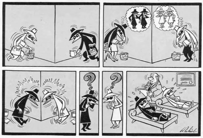
A Hand From One Page, A Bomb From Another: Rethinking “Spy vs. Spy”
Gyasi Hall, Longreads
Think about how many satirical pitfalls Spy vs. Spy avoids simply by the nature of its setup. The spies are obvious stand-ins, but despite the loaded nature of their black and white designations, they aren’t direct send-ups of any particular country or regime. They’re both treacherous and stupid, because the two of them being on the same level better develops the metaphor and subverts the classic Tom/Jerry, Elmer/Bugs, Coyote/Roadrunner dynamic. (Prohías and the editors went so far as to “keep score” of who won and lost in every strip so neither would ever pull ahead.) There’s no overarching plot or story, including even the most basic details of the strip’s presumed “wartime” setting, and whatever lore can be said to exist is thin and deliberately vague.
This article covering the history of the art design group Hipgnosis is packed with odd fun facts about them: Apparently, two of the founding members were in an art collective before Hipgnosis along with the guy who would go on to play that torture Nazi from Raiders of the Lost Ark. Also, they got the name from graffiti left on one of their apartment doors.
Squaring the Circle: Anton Corbijn's documentary on Hipgnosis
Simone Sbarbati, Frizzi Frizzi
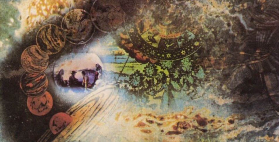
The cover they come up with after a series of super-precarious work sessions is a complex photomontage that represents a sort of psychedelic travel vision and incorporates elements taken from one of the Doctor Strange comics from Marvel. They have the approval of Pink Floyd and also that of the record company, EMI, which for the second time in its history (the first was for the Beatles) allows a band to enlist external designers for the graphics of an album.
Here's the cover being described above, Pink Floyd's A Saucerful of Secrets, which was the first cover that got the studio off the ground.
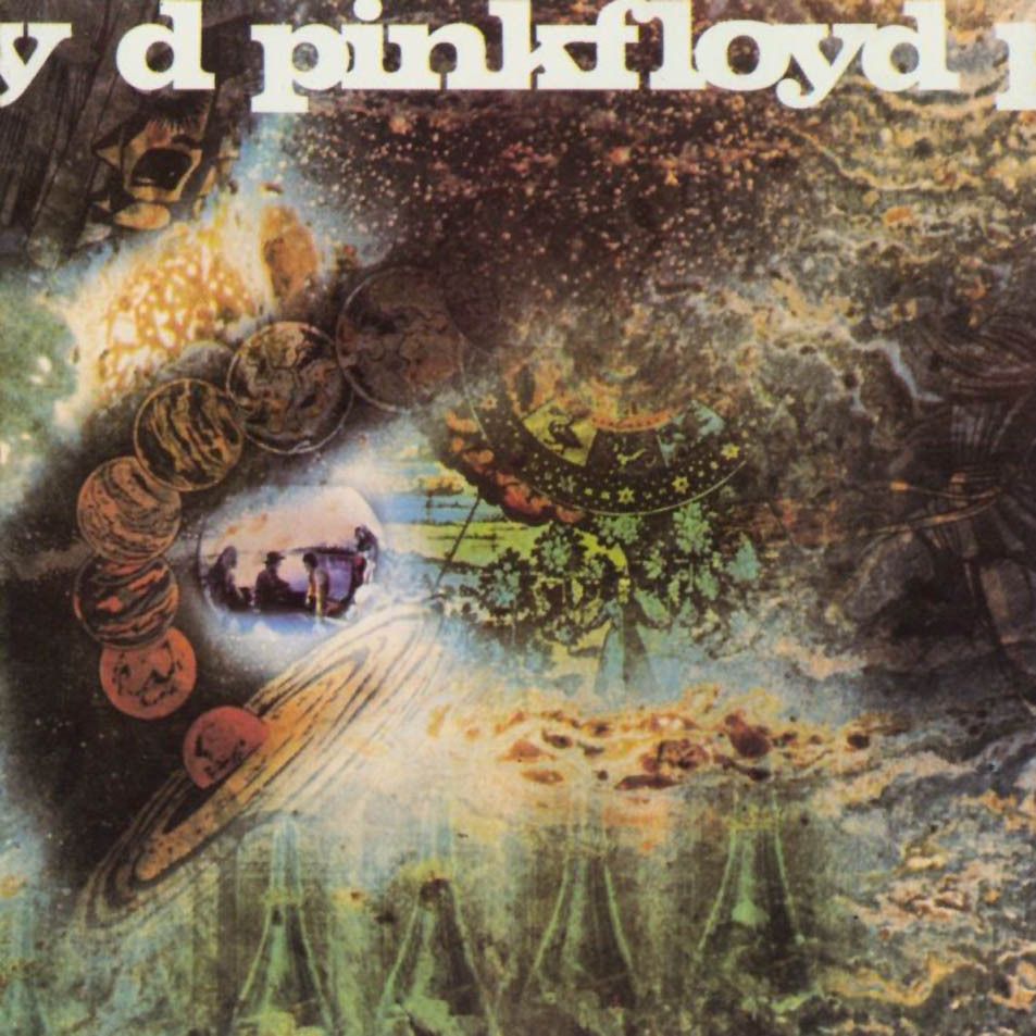
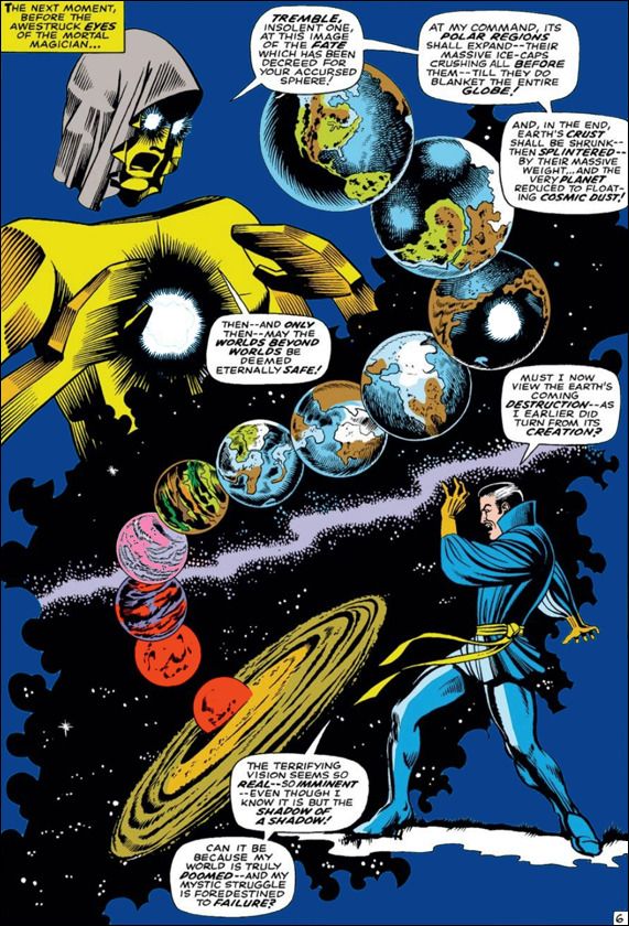
The article doesn't get into this, but since I have the chance, here's the 1967 Doctor Strange comic book panel that the album cover steals, from issue #158 of the comic book Strange Tales, illustrated by Marie Severin.
Okay, I don't think there's enough material here for more than two images, so, here, take a look at how two different artists tackle "robot hearts."
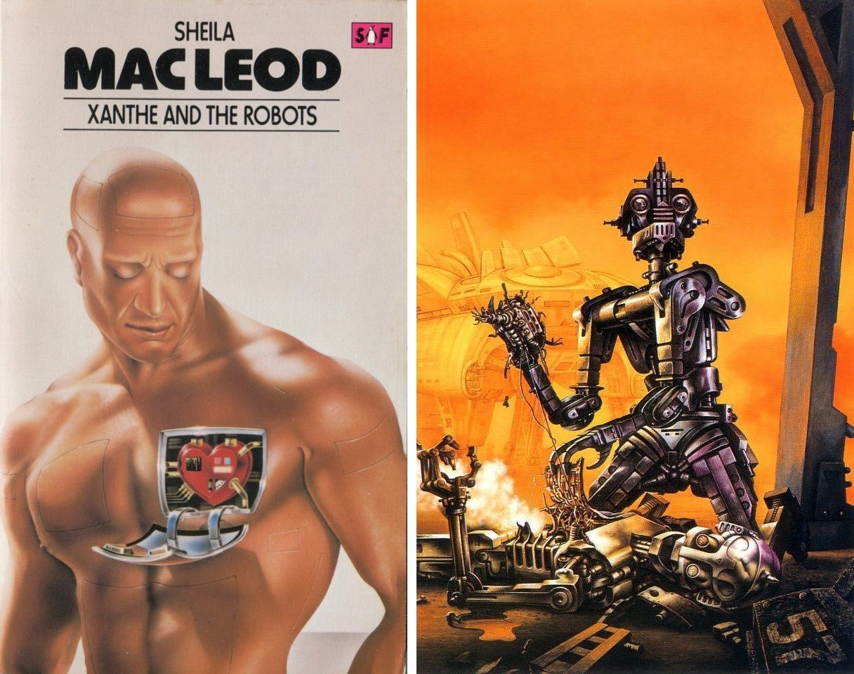
I'd love to learn what the robot is up to on the right-hand artwork – someone on Tumbler thinks it's a robot cannibal, but I assumed it was just trying to save its friend's hard drive for the reboot process.
Also, here's my most popular post in the last few weeks: Bruce Pennington's 1985 cover art for Sundiver, by David Brin.
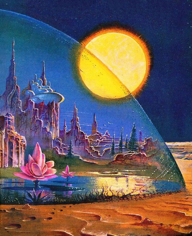
It's another example of Pennington's skill in taking a well-established visual trope (like an ecosystem under a dome) and delivering a particularly straightforward yet beautiful, painterly example.
Today, in book promotion news:
I received a great positive review from author and pulp fiction critic Andrew Nette. He says:
"I have no doubt that Worlds Beyond Time: Sci-Fi Art of the 1970s will in the not too distant future be one of those publications that become a rare collector’s item fetching a fortune online, and people will kick themselves for not getting it when they had the chance. Don’t be one of those people, pick up your copy."
I also got a review of sorts from John Wilson at First Things – I was happy to see that he had never heard of any of my social media accounts before picking up the book, since that indicates some word of mouth beyond my built-in audience.
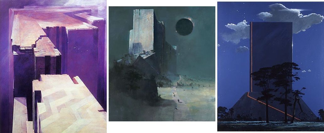
But my favorite one is this writeup of artist John Harris, by artist John Coulthart. I love Coulthart's blog, and he apparently found Harris through my blog and book!
I might never have paid much attention to John Harris’s paintings if they hadn’t appeared so often at Adam Rowe’s 70s Sci-fi Art. Harris is also featured in Rowe’s new book, Worlds Beyond Time, with a few examples that sent me looking for more. I like science-fiction art when it’s dealing with megastructures, especially if those structures aren’t readily interpretable as buildings, spaceships or alien artefacts. This is SF art in the service of the philosophical Sublime, a quality which, since the 1940s, you don’t find very much in painting outside the work of illustrators or artists of the fantastic.
John Harris' artwork is really one of a kind, and he's among my personal favorite artists, so it's definitely rewarding to see that I've been able to introduce Harris to an audience that appreciates him.
Finally, here's a fun reading list for one of my favorite genres, nonfiction on fiction: Ten Great Works of Non-Fiction About Science Fiction and Fantasy, by James Davis Nicoll for Tor.com.
Check out the comments for even more recommendations, including one that I really love, James Gleick’s Time Travel: A History (2016).