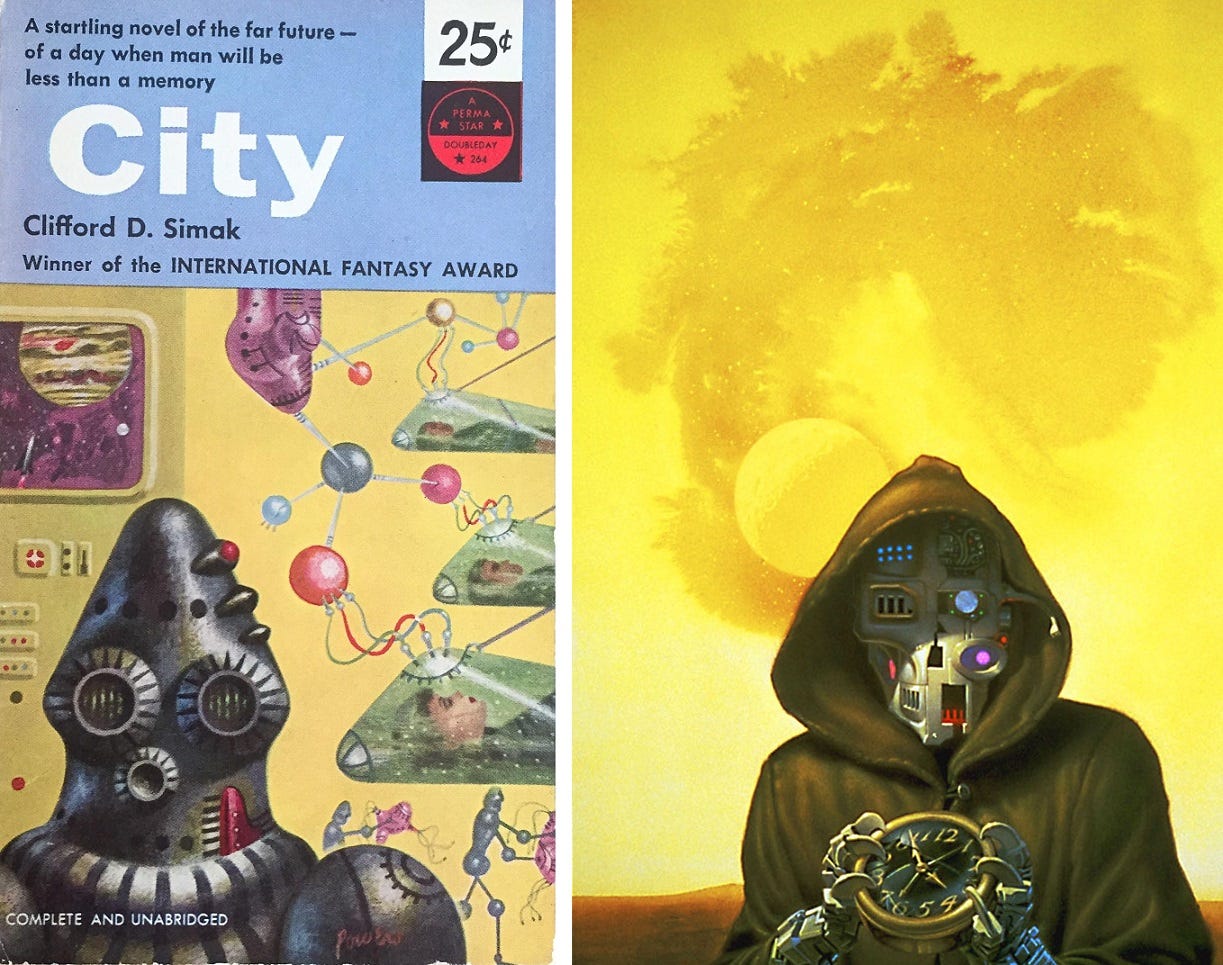
Book Notes: 'The Art of Michael Whelan'
Featuring bee spaceships, blood vessel trees, and symbolism galore

Welcome to part two of my readthrough of the 1992 art book The Art of Michael Whelan. It’s a great book — informative, with high-quality art reproductions.
Here are the thoughts and quotes that struck me as I worked my way through it:
***
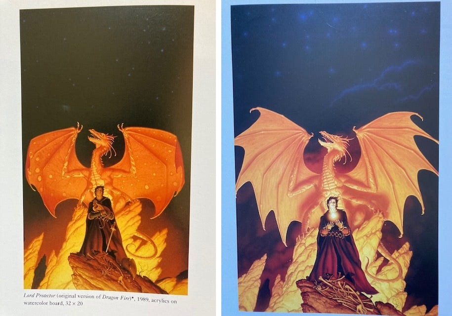
Page 56: Whelan has a strong dedicatation to details — he re-did the entire cover for Melanie Rawn’s Sunrunner’s Fire after realizing that his dragon’s anatomy didn’t match the same type of dragon from his previous covers for the series. And that’s despite the clients telling him they didn’t want him to re-do it! Here are the original (left) and redone paintings. Looks like the dragon fingers are different.
Page 60: Whelan scours a novel for the best possible symbolic image to pull from it for a cover. “I loath the montage as a book cover approach.” Fair.
Page 64: Whelan uses the same symbolism in these two covers, for Mike Resnick’s Paradise in 1988 and for his famed Martian Chronicles cover in 1990. In both, a downward-arcing contrail means that “mankind’s arrival signals the end of a beautiful native balance and harmony.”
Page 72: Whelan also does a fair amount of straight up horror covers. This one for a DAW collection of The Year’s Best Horror Stories is just very upsetting! I hate it, so a job well done here.
Page 78: Whelan again notes that he wanted to redo a cover after re-reading the source material and realizing it wasn’t quite accurate, but the art director convinced him not to. The question of whether a cover artist read the book they’re illustrating comes up a lot in fandom circles, and Whelan definitely passes the test.
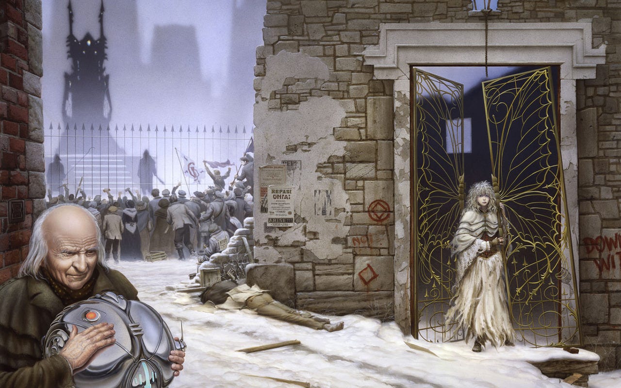
Page 80: Cover to Paula Volsky’s Illusion, 1991. In another example of Whelan’s symbolism, the butterfly wing design on the gate represents a major theme of the book, the main character’s metamorphosis. Plus, she’s moving from dark to light as well.
Page 98: “Although covers for anthologies don’t pay well, they offer as close to complete freedom as a book cover commission can get.”
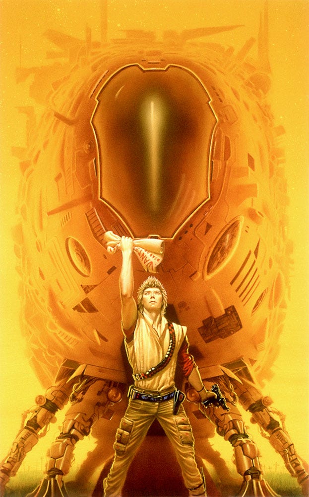
Page 102: “For the cover of the novel Santiago, by Mike Resnick, the essential challenge was to give the ship behind the central character a sentient, living quality.” Whelan made it reminiscent of a bee.
Page 118: Whelan did this Dark Tower cover sometime in winter 1980-81, while dealing with a lot of work, a newborn daughter, and cold weather. He doesn’t mention the cover itself much on this page, but it’s one of my favorites. I love the simplicity yet impossibility.
Page 123: Whelan started using symbolism “as a way to solve illustration problems,” since it opened up “new ways to represent literary themes nonliterally.”
He identifies “Destroying Angel,” a 1982 anthology cover, as the first work that he “gave unreservedly to a theme employing symbols.”
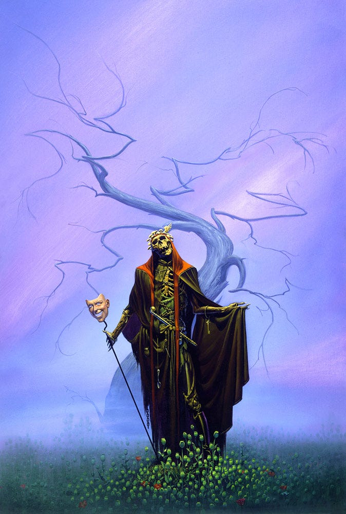
The themes, from page 158:
“For an allegory on the use of opium and its derivatives, specifically heroin, I posed the Angel of Death amid a field of poppies, offering a false mask of friendship. He is accompanied by diverse symbols and various accoutrements of the drug user. He wears on his head a single wing, representing false freedom of thought and the illusion of flight, and he wears a crown of Destroying Angel mushrooms. The tree is meant to suggest the dendritic branching of blood vessels, but it is withered. And the background consists of a purple haze—a reference to the reason I got to ruminating on the whole subject to begin with, the death of Jimi Hendrix.”
Whelan also separates out the types of symbolism he uses: “Narrative,” which refers to the text being illustrated; “conscious,” which refers to personal symbols and concerns of his own; and “subconscious” symbolism, which refers to something even he wasn’t aware of when putting together the image.
He gives two examples of subconscious symbolism. One’s this Foundation cover, for which he’s convinced he subconciously shaped Trantor’s cooling towers like mushroom clouds (I believe him!).
The other example is his Brother Assassin cover, which stands out for its asymmetrical robot face. He realized after painting it that he likely borrowed the concept from an older Richard Powers illustration that he had been fascinated by as a five year old, mostly because of the asymmetrical head.
Here’s Whelan’s cover on the right. On the left is the Powers cover that was included in the art book alongside Whelan’s story, and must be one he was talking about (it looks moderately symmetrical to me, but I also don’t have the budding artistic talent of a five year old Whelan, so maybe that’s on me):
Page 125: Terry Booth runs a Q&A with Whelan, and he has an insightful point to make here, saying “One of the reasons your art is so successful is that you can reach people who are unsophisticated about the art world but open to emotions and ideas. One shouldn’t have to have a college degree to understand art.”
This is why Whelan’s work reminds me of Spielberg blockbusters: They’re immediately fun, with symbolism buried just deep enough that the average viewer still has a chance at breaking it down. (If I haven’t bullied you into seeing this half hour lecture on Jurassic Park’s subtext yet, you really should!)
Page 126: Whelan did an art series titled “Passage,” that signaled a shift in his career towards more personal works. They’re more moody, medatative, and tend to have fewer people. Here’s “Passage: The Avatar.”
Page 129: Whelan’s asked how, as a perfectionist, he would want his work displayed. His response starts, “First, no food.” I read that literally as I was chewing on a big bite of the turkey, stuffing and cranberry sauce sandwich I’m eating for lunch. Oops. I feel bad, but not enough to stop eating.
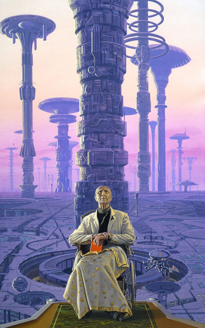
Page 144: Whelan casually drops some SF criticism while describing this 1990 painting, Armenia:
“On one level it is a reaction to the naive futurism underlying the pristine “floating city” cliche so often seen in SF art. The creators of those works never seem to take account of unchanging human nature: I always wonder where the graffiti, the police, and the litter are — the negative aspects of society as it is and probably ever will be.”
Well put! I’m a cynic too, and a lot of 70s-80s sci-fi art feels too optimistic to me as well, which introduces a certain tension when it comes to writing an entire art book celebrating it.
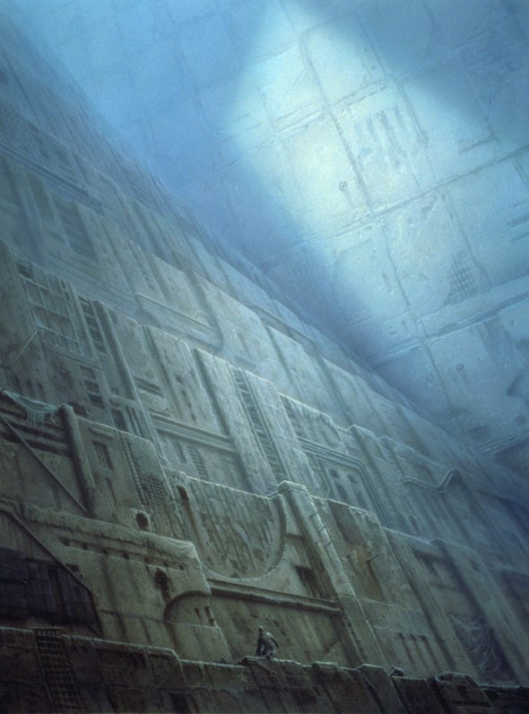
This image, Subterraneans, stands out because Whelan intentionally used a false perspective, after finding that following the conventional perspective laws made it lose the “feeling of curving immensity going on forever.”
Page 183: Whelan worked with oils in school and for the first year or so of his career, before switching to acrylics, mostly because they dried faster.
Page 184: He tends to work from the background to the foreground, although this is the only procedural standard he uses. He also estimates he works 60 or 70 hours a week — and that’s because he’s slowed down over the years.
That’s it! You can check out all the illustrations featured here on Michael Whelan’s very well-maintained website, along with a whole lot more.
Next time: We’re dipping into space art with one of the GOATs, David A Hardy.